
Thank you! Your submission has been received!
Oops! Something went wrong while submitting the form.
Get SaaSFrame Pro
Monthly
$18
Quarterly
$48
Yearly
$180
Upgrade to access this feature
Browse all screens & flows
Filter and search screens & flows
Access Figma files
Access mobile versions
Bookmark screens & flows
Join now
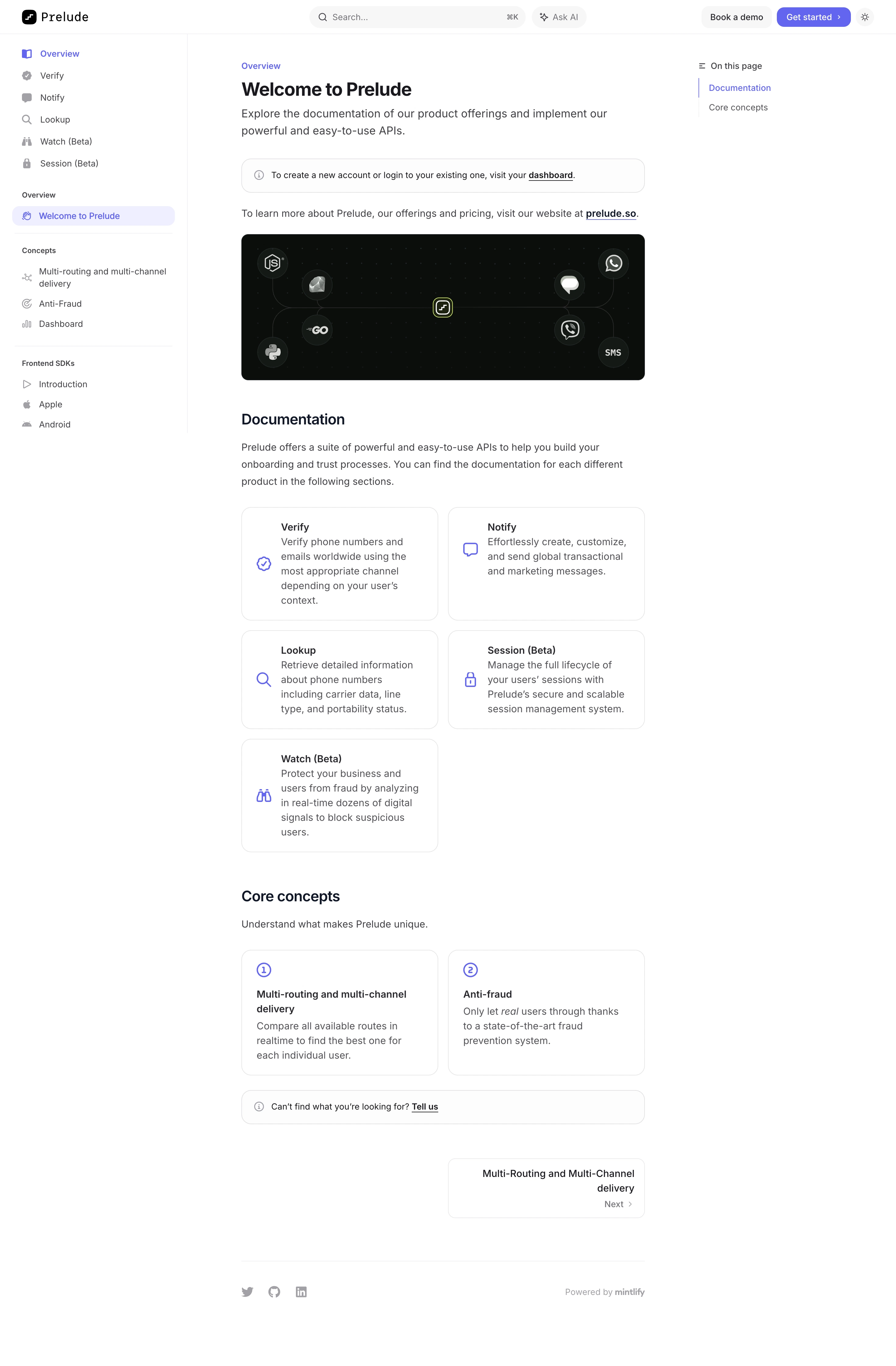

Prelude Documentation

Prelude
Send verification phone messages
Designed by
No items found.

Bookmark
Bookmark

Design with AI
Thank you! Your submission has been received!
Oops! Something went wrong while submitting the form.
# Design from Reference: Prelude Documentation
Create an original, high-fidelity visual design inspired by the reference. Prioritize composition, typography, colors, spacing, and component styling over technical implementation.
## Reference
- **Product:** Prelude
- **Category:** Documentation
- **Screenshot:** https://cdn.prod.website-files.com/5e9dc792e1210c5325f7ebbc/6acad3a7c2028efdec71afec_6acad151ba38b07cf05d6de6_cms-9eb2cd996d3e718ff890f704.webp
Analyze the screenshot first. If inaccessible, request it rather than guessing.
## Content
{{content.instructions}}
{{content.data}}
Preserve essential messaging and factual accuracy. Adapt structure and copy length for visual balance; never invent product claims.
## Visual Design
### Overall aesthetic
- **Style:** Minimal developer-documentation portal with a three-column reading layout and restrained violet navigation emphasis.
- **Character:** White canvas, dark text, thin gray rules, rounded outlined link cards, and one dark integration illustration.
- **Surface treatment:** Mostly flat; pale selection fills and fine borders distinguish navigation, callouts, and cards.
### Page composition
- **Capture and scale:** 2940 × 4480 image px. CSS estimates assume a 2× capture, approximately 1470 × 2240 CSS px; scale is unverified.
- **Header:** Brand left, broad search with keyboard hint and Ask AI center, demo/get-started/theme utilities right.
- **Left rail:** Approximately 308px wide with product destinations, selected overview page, concept group, and frontend SDK links.
- **Article:** Approximately 662px wide, starting near x=396 CSS px.
- **Right rail:** Small On this page list with two section anchors and a violet active marker.
- **Introduction:** Eyebrow, welcome heading, two-line description, outlined account callout, and external-site sentence.
- **Hero image:** Dark rounded banner with language/channel logos connected around the brand symbol.
- **Documentation:** Intro paragraph and five product cards in a two-column grid, leaving the final lower-right position empty.
- **Core concepts:** Short intro and two numbered cards.
- **Article close:** Support callout, right-aligned next-page card, fine rule, social icons, and documentation-platform attribution.
### Information hierarchy
- **Location:** Violet Overview and selected welcome destination establish the current page.
- **Article identity:** Bold welcome heading precedes explanatory text and the product illustration.
- **Product cards:** Violet icon, bold title, and gray description form consistent documentation-entry units.
- **Concept cards:** Circled numbers distinguish conceptual reading from product documentation.
- **Progression:** Next-page card gives a clear continuation route at the article bottom.
- **Secondary context:** Right rail provides section navigation without competing with the article.
### Typography
- **Family:** Neutral proportional sans serif; exact identity is unverified.
- **Article title:** Approximately 30–32px bold with 38px line-height.
- **Intro:** Approximately 20px with 28px leading.
- **Section headings:** Approximately 24px semibold.
- **Body/card copy:** Approximately 16px with 24–28px line-height.
- **Navigation:** Approximately 14px regular; group labels around 12px semibold.
- **Header:** Small monospaced-looking brand wordmark; exact family is unverified.
- **Precision:** CSS sizes and weights are visual estimates.
### Colors & surfaces
- **Canvas / cards:** Sampled #FFFFFF.
- **Dark illustration:** Sampled #0C0E0C and #151916.
- **Body text:** Sampled #535357 and #414145.
- **Pale controls:** Sampled #F7F7F8.
- **Selected navigation:** Sampled #EFEFFE.
- **Boundaries:** Sampled #E6E6E7.
- **Accent:** Violet links, icons, selected page, and primary header action.
- **Illustration accents:** Subtle green dot grid and small lime central outline remain within the dark banner.
### Components
- **Search:** Pale rounded capsule with magnifier, placeholder, and keyboard shortcut hint.
- **Header actions:** Pale demo button and violet rounded get-started button with chevron.
- **Selected rail item:** Pale-violet pill with violet icon/text.
- **Callouts:** Full article-width rounded outlined strips, small info icon, short sentence, and underlined link.
- **Integration banner:** Approximately 662 × 240px with 12px radius, dark fill, connected circular language/message marks.
- **Product cards:** Two columns around 322px wide, approximately 16px radius, thin outline, violet icon, title, and descriptive paragraph.
- **Concept cards:** Similar outlined geometry with circled number above heading.
- **Next card:** Approximately half article width, right aligned, with title and small Next/chevron line.
- **Footer:** Small gray socials and platform attribution beneath a fine rule.
- **State limits:** No search results, AI response, menu, or alternate theme is visible.
### Visual rhythm
- **Stable rails:** Navigation and on-page outline frame a narrow readable article.
- **Card rhythm:** Consistent two-column gaps and shared edges organize products and concepts.
- **Section spacing:** Broad breaks separate image, documentation cards, concepts, and next-page navigation.
- **Color restraint:** Violet is concentrated in navigational cues; the dark banner supplies the major contrast.
### Responsive
- **Observed state:** Desktop only; mobile behavior is unverified.
- **Rails recommendation:** Collapse left navigation and move on-page anchors to a compact menu.
- **Cards recommendation:** Stack product/concept cards on narrow screens.
- **Article recommendation:** Use 20–24px gutters and retain comfortable body leading.
- **Header recommendation:** Reduce search/utility width while keeping documentation search available.
### Adaptation guidance
- **Preserve:** Three-column documentation hierarchy, violet selection, outlined entry cards, and a clear next-page route.
- **Starting geometry:** Approximately 308px rail, 662px article, 16px card radius, 16px body, and 24px section headings under the unverified 2× assumption.
- **Content fidelity:** Populate actual product/concept links and supplied descriptions.
- **Illustration fidelity:** Use approved SDK/channel assets and do not infer supported integrations solely from decorative logos.
- **Implementation recommendation:** Provide accessible search, navigation landmarks, anchor states, and keyboard focus.
Use this context to reproduce the reference's visual language: layout, typography, colors, spacing, borders, radii, and distinctive elements. The screenshot takes priority if descriptions conflict.
## Direction
{{preferences.fidelityInstructions}}
## Output
{{output.instructions}}
Deliver a polished, cohesive design with precise alignment, hierarchy, and spacing. Produce the requested visual artifact, not just a description. If unsupported, explain the limitation.


Category
Patterns
No items found.


Added on
January 7, 2026
Similar screens




Upgrade to SaaSFrame Pro now to see similar examples.
Monthly
$18 /month
Billed $18 monthly
Browse all screens & flows
Filter and search screens & flows
Search text in screenshots
Access Figma files
Access mobile versions
Join now
Quarterly
$16 /month
Billed $48 quarterly
Browse all screens & flows
Filter and search screens & flows
Search text in screenshots
Access Figma files
Access mobile versions
Join now
Yearly
$15 /month
Billed $180 yearly
Browse all screens & flows
Filter and search screens & flows
Search text in screenshots
Access Figma files
Access mobile versions
Join now