Design with AI
Generate a new design based on this screen using your own content.
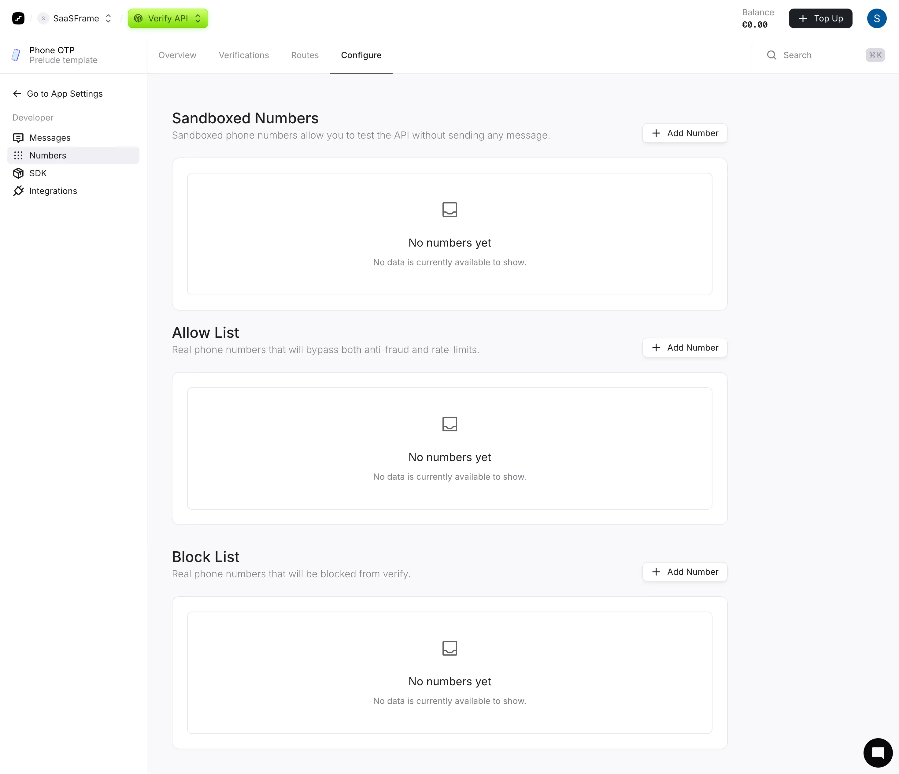
# Design from Reference: Prelude Configure Numbers
Create an original, high-fidelity visual design inspired by the reference. Prioritize composition, typography, colors, spacing, and component styling over technical implementation.
## Reference
- **Product:** Prelude
- **Category:** Empty State
- **Screenshot:** https://cdn.prod.website-files.com/5e9dc792e1210c5325f7ebbc/697b7650fb4ed0be6040a8b3_oECxXMhWAQ3zKST_YbRqk95ISQzdA2mQHPIiRbDnNMw.avif
Analyze the screenshot first. If inaccessible, request it rather than guessing.
## Content
{{content.instructions}}
{{content.data}}
Preserve essential messaging and factual accuracy. Adapt structure and copy length for visual balance; never invent product claims.
## Visual Design
### Overall aesthetic
- **Style:** Light developer-console configuration page with repeated empty-state cards and a small lime product accent.
### Page composition
- **Canvas:** 2940 × 2530 image px; CSS estimates assume an unverified 2× capture.
- **Header:** Workspace/product selectors, balance, top-up action, profile, then app tabs and search.
- **Sidebar:** Approximately 240 CSS px wide with Developer navigation.
- **Main:** Three stacked sections for Sandboxed Numbers, Allow List, and Block List.
- **Section structure:** Heading/description left, Add Number right, then a large bordered empty-state panel.
### Information hierarchy
- **Primary:** Section titles identify distinct number policies.
- **Actions:** Repeated Add Number buttons remain aligned at right.
- **Empty states:** Small outline icon, No numbers yet label, and muted explanation.
- **Location:** Configure tab underlined; Numbers selected in the sidebar.
### Typography
- **Family:** Neutral sans serif; exact family unverified.
- **Section headings:** Approximately 24 CSS px, medium under assumed 2×.
- **Descriptions:** Approximately 16px.
- **Empty-state heading:** Approximately 18px.
- **Body/navigation/buttons:** Approximately 14px.
- **Precision:** Font values and scale are estimates.
### Colors & surfaces
- **Cards/header/sidebar:** #FFFFFF.
- **Main background:** #F9F9FB.
- **Borders:** #E8E8EC.
- **Selected navigation:** #F0F0F3.
- **Primary text:** #1C2024.
- **Muted text:** #7F838D and #8C8D98.
- **Dark controls:** #09090B.
- **Product selector:** Vivid lime gradient; exact flat token unverified.
- **Precision:** Flat colors sampled after embedded-profile conversion where applicable.
### Components
- **Top tabs:** Quiet labels with thin dark underline for Configure.
- **Add Number:** Small white outlined button with plus icon and subtle shadow.
- **Outer cards:** Approximately 12px CSS radius with about 24px padding under assumed 2×.
- **Inner empty state:** Thin border, small radius, centered icon and copy.
- **Section gaps:** Approximately 24–32 CSS px.
- **Help:** Black circular chat bubble at lower right.
### Visual rhythm
- **Repetition:** Three near-identical sections create a predictable scanning pattern.
- **Alignment:** Titles, descriptions, cards, and right-side actions follow consistent edges.
- **Whitespace:** Large empty panels communicate absence of data.
- **Density:** Compact top navigation contrasts with spacious configuration body.
### Responsive
- **Observed:** Desktop only.
- **Recommendation:** Collapse sidebar, wrap app tabs, and place Add Number below headings if necessary.
- **Panels:** Reduce empty-state height on small screens while keeping copy readable.
### Adaptation guidance
- **Preserve:** Repeated policy-section pattern, understated empty states, and consistent Add Number actions.
- **Content:** Use actual number policies and explanatory copy.
- **Behavior:** Addition, deletion, validation, and tab transitions are not demonstrated.
Use this context to reproduce the reference's visual language: layout, typography, colors, spacing, borders, radii, and distinctive elements. The screenshot takes priority if descriptions conflict.
## Direction
{{preferences.fidelityInstructions}}
## Output
{{output.instructions}}
Deliver a polished, cohesive design with precise alignment, hierarchy, and spacing. Produce the requested visual artifact, not just a description. If unsupported, explain the limitation.