Design with AI
Generate a new design based on this screen using your own content.
# Design from Reference: Popwork Dashboard
Create an original, high-fidelity visual design inspired by the reference. Prioritize composition, typography, colors, spacing, and component styling over technical implementation.
## Reference
- **Product:** Popwork
- **Category:** Dashboard
- **Screenshot:** https://cdn.prod.website-files.com/5e9dc792e1210c5325f7ebbc/6acb65d2b206c0d3f8f0f8a8_6acb6518b79140e81e48ffd6_cms-75aca87b102b44b1def18ddb.webp
Analyze the screenshot first. If inaccessible, request it rather than guessing.
## Content
{{content.instructions}}
{{content.data}}
Preserve essential messaging and factual accuracy. Adapt structure and copy length for visual balance; never invent product claims.
## Visual Design
### Overall aesthetic
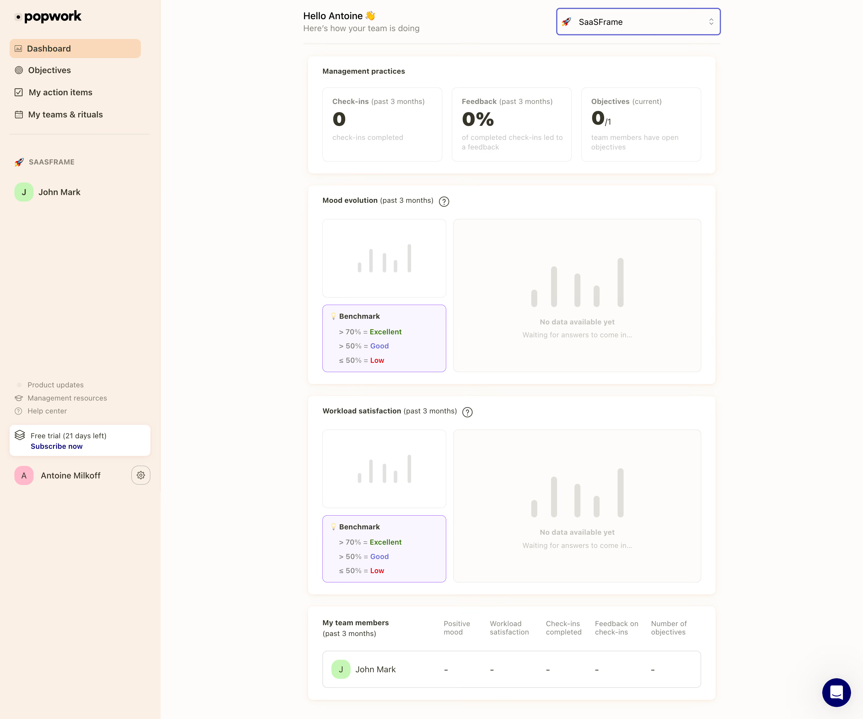
- **Character:** Warm team-management dashboard with peach navigation, off-white canvas and softly bordered white analytics cards.
- **Evidence and scale:** Screenshot measures 2880 × 2400 image pixels. Sizes estimate a 1440px CSS canvas at 2× capture scale; DPR and font identity are unverified.
### Page composition
- **Sidebar:** Approximately 268px CSS wide, with brand, primary destinations, one team member, lower help/trial/account controls.
- **Main column:** Narrow centered dashboard around 690px wide, leaving broad white margins to the right.
- **Header:** Greeting/subtitle at left and team selector at right above a thin rule.
- **Cards:** Management-practice metrics, mood evolution, workload satisfaction and team-member summary stack vertically.
- **Support:** Dark navy circular chat control sits lower-right.
### Information hierarchy
- **Summary:** Three large zero-valued metrics lead the dashboard.
- **No-data state:** Mood/workload panels explicitly show no data, with faint bar placeholders and waiting text.
- **Benchmarks:** Small lavender-bordered benchmark boxes explain color-coded thresholds separately from the empty chart.
- **Team detail:** Final table row shows one member and dash-like values rather than populated analytics.
### Typography
- **Header:** Greeting around 16px CSS; subtitle around 14px muted.
- **Card titles:** Around 12–13px bold; metric values around 32px bold.
- **Body/data:** Around 12–14px; helper/no-data text smaller and pale.
- **Family:** Neutral sans-serif; exact font identity and computed weights remain unverified.
### Colors & surfaces
- **Measured grounds:** Warm #FEFCFA, white #FFFFFF and peach #FAF0E6 dominate.
- **Measured subtle card:** Pale lavender #FAF6FF supports benchmarks.
- **Measured accents:** Deep navy #00006B, violet #6969D3 and brighter #8D3DFF occur in links/controls/borders.
- **Local color:** Peach #F9D9BA marks active navigation; green/pink initials badges and green/red benchmark text add small semantic accents.
### Components
- **Sidebar rows:** Icon-led links and pale peach rounded active fill; lower white trial card and small account/settings row.
- **Team selector:** Outlined violet rectangle with emoji, label and chevrons, around 274 × 46px CSS.
- **Metric shell:** White rounded card with three equal thin-bordered inner cards, labels, large values and pale explanations.
- **Analytics panels:** Small left placeholder chart over benchmark box; larger right empty-state chart, both with thin warm-gray borders and 8px radii.
- **Team table:** One rounded bordered row, circular initials avatar and five compact metric columns.
- **Support:** Navy circle with white chat glyph and subtle outer shadow.
### Visual rhythm
- **Stack cadence:** Approximately 20px between main cards; consistent 24px internal padding.
- **Metric rhythm:** Three equal cards with roughly 16px gaps.
- **Whitespace:** Narrow main column and muted no-data visuals maintain a calm first-use state.
- **Alignment:** Header, card edges and team table share a stable vertical grid.
### Responsive
- **Observed limit:** Desktop empty-analytics state only; selectors, navigation and mobile behavior are unobserved.
- **Recommended layout:** Collapse sidebar, stack metric cards and place benchmark guidance beneath charts.
- **Recommended data:** Preserve no-data explanations and use adaptive table rows on small screens.
- **Recommended controls:** Keep team selector and support reachable without overlaying content.
### Adaptation guidance
- **Preserve honesty:** Show empty metrics and waiting states explicitly instead of implying measured trends.
- **Keep warmth:** Peach navigation and soft white cards distinguish management analytics from a technical dashboard.
- **Implementation:** Provide chart summaries, accessible benchmark labels, table semantics and focus. Thresholds, trial timing and team data are captured content requiring separate verification.
Use this context to reproduce the reference's visual language: layout, typography, colors, spacing, borders, radii, and distinctive elements. The screenshot takes priority if descriptions conflict.
## Direction
{{preferences.fidelityInstructions}}
## Output
{{output.instructions}}
Deliver a polished, cohesive design with precise alignment, hierarchy, and spacing. Produce the requested visual artifact, not just a description. If unsupported, explain the limitation.