Overall Style and Aesthetic
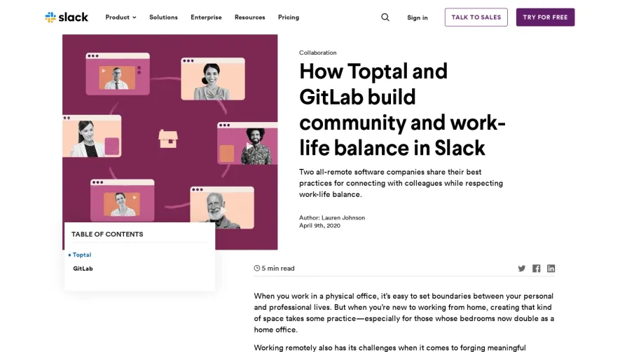
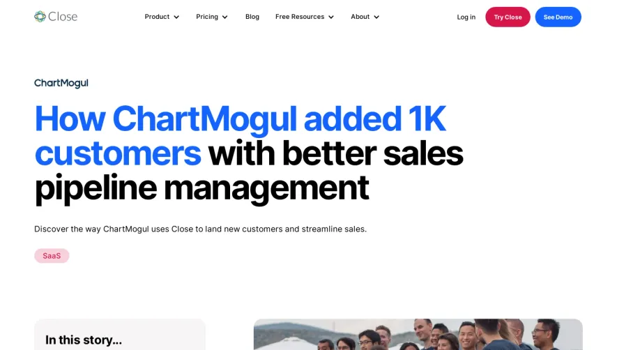
Placid’s Metorik customer page embraces a modern, minimalist aesthetic that radiates professionalism and calm. The design steers clear of clutter, giving each content block generous white space and a crisp sense of order. Pops of brand color energize the page without competing with content, resulting in a balanced look that feels both trustworthy and welcoming for SaaS audiences. Layout and Structure
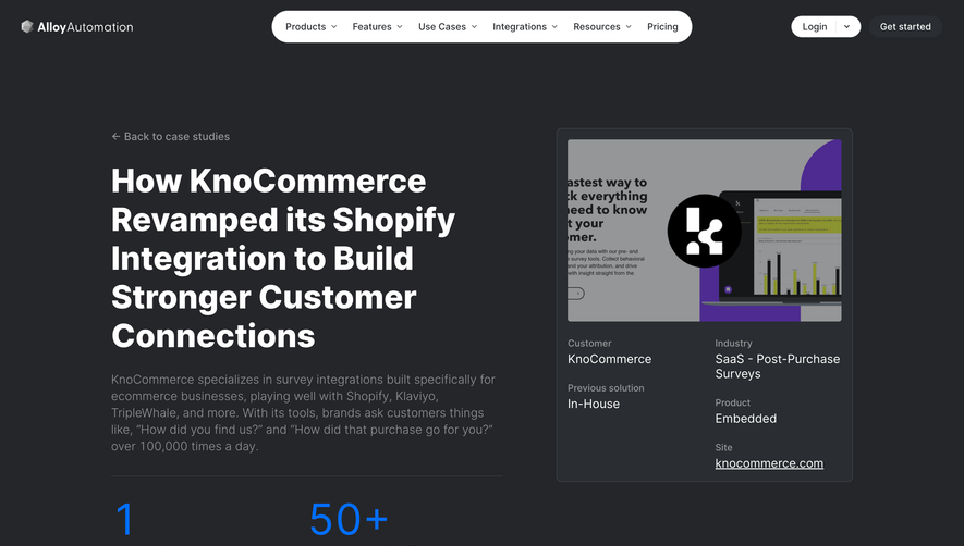
This case study page uses a linear, narrative-driven flow. A distinct hero section introduces Metorik with a concise headline, app store badges, and contextual screenshot. Subsequent sections alternate background shades for subtle visual rhythm and improved content separation. Features, solution highlights, and customer testimonials follow, each neatly contained and easy to scan. The footer remains compact but informative, guiding users toward further engagement. Visual Elements
Screenshots of both Placid and Metorik provide real context, while custom icons and subtle illustrations support key points without stealing focus. The hero’s illustrated app preview draws the eye and immediately communicates the SaaS nature. There’s no intrusive animation, but interactive hover effects on buttons and links maintain engagement. Color Palette and Typography
A palette dominated by cool blues, soft grays, and vibrant accent hues matches both Placid’s branding and modern SaaS sensibilities. Simple yet strong sans-serif fonts deliver clarity and hierarchy, with bold headlines and friendly body text that read effortlessly across devices. User Experience Patterns
Navigation remains intuitive, with sticky headers and clear calls-to-action that guide visitors to learn more or try Placid. Scrolling is smooth, and CTA buttons stand out thanks to sharp color contrasts. Testimonial placement builds credibility without disruption, and responsive design ensures seamless browsing on any device. Unique or Notable Design Choices
The subtle combination of customer quotes, real metrics, and visuals of actual assets sets this case study apart—demonstrating real-world impact visually and textually. The friendly yet authoritative tone, paired with tangible results, fosters confidence and connection, making this a strong reference point for anyone crafting SaaS case study experiences.