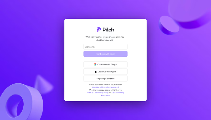
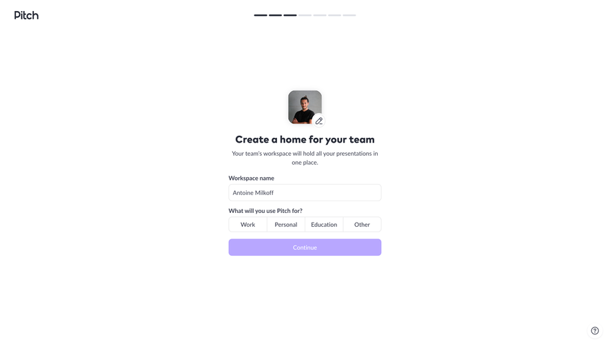
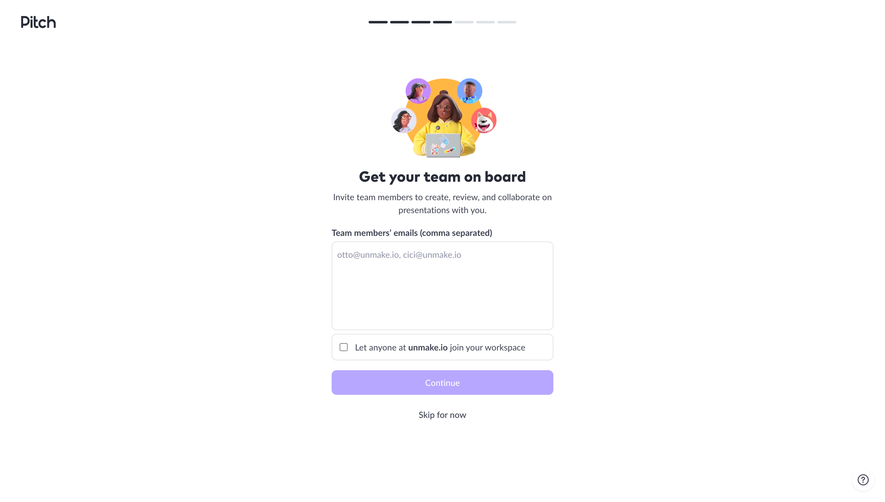
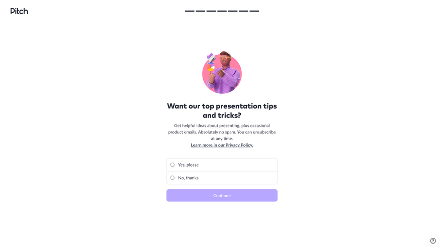
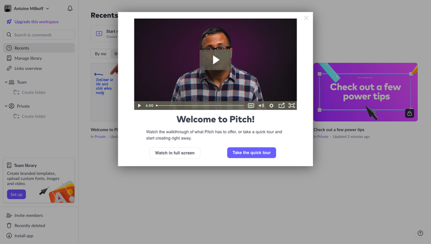
Generate a new design based on this screen using your own content.
Thank you! Your submission has been received!
Oops! Something went wrong while submitting the form.
# Design from Reference: Pitch Privacy Optin
Create an original, high-fidelity visual design inspired by the reference. Prioritize composition, typography, colors, spacing, and component styling over technical implementation.
## Reference
- **Product:** Pitch
- **Category:** Account Setup
- **Screenshot:** https://cdn.prod.website-files.com/5e9dc792e1210c5325f7ebbc/6aca27ecaca7079066e8e868_6aca270bfc79d3a6f5db2b90_cms-3e062060863a8763362f02e8.webp
Analyze the screenshot first. If inaccessible, request it rather than guessing.
## Content
{{content.instructions}}
{{content.data}}
Preserve essential messaging and factual accuracy. Adapt structure and copy length for visual balance; never invent product claims.
## Visual Design
Use this context to reproduce the reference's visual language: layout, typography, colors, spacing, borders, radii, and distinctive elements. The screenshot takes priority if descriptions conflict.
## Direction
{{preferences.fidelityInstructions}}
## Output
{{output.instructions}}
Deliver a polished, cohesive design with precise alignment, hierarchy, and spacing. Produce the requested visual artifact, not just a description. If unsupported, explain the limitation.
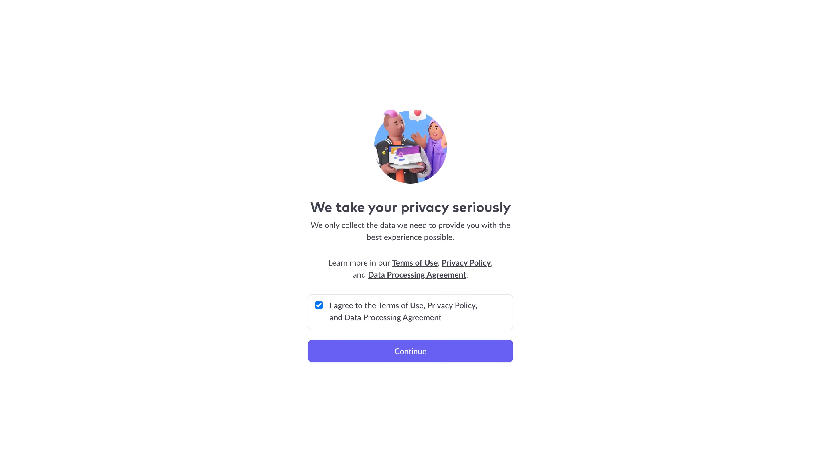
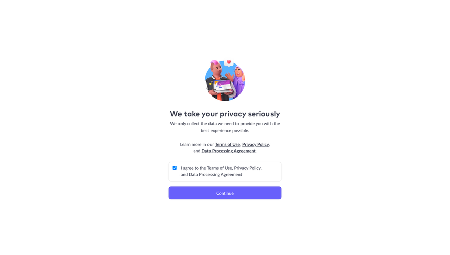
First thing you notice is that 3D illustration. Two characters holding a laptop with a heart floating above them. It's warm, friendly, and immediately softens what could be a dry legal checkpoint. Smart move.
Dead Simple Layout
Everything is stacked center-aligned. Illustration, heading, subtext, links, checkbox, button. That's it. No sidebar, no distractions, no wandering eye. The hierarchy is crystal clear and you know exactly what to do in under two seconds. The heading "We take your privacy seriously" is set in a bold serif or heavy sans that carries just enough weight without shouting.
Color Does the Heavy Lifting
The purple CTA button dominates the lower half of the page. It's the only saturated element besides the checkbox, which is already ticked by default. Interesting choice there. The rest is white space and gray text. Terms of Use, Privacy Policy, and Data Processing Agreement are underlined links but kept understated.
What Makes It Work
It's confident in its minimalism. No progress bar, no extra fluff. Just trust-building through clarity and a single action to take.