Generate a new design based on this screen using your own content.
Thank you! Your submission has been received!
Oops! Something went wrong while submitting the form.
# Design from Reference: Pitch Login
Create an original, high-fidelity visual design inspired by the reference. Prioritize composition, typography, colors, spacing, and component styling over technical implementation.
## Reference
- **Product:** Pitch
- **Category:** Login
- **Screenshot:** https://cdn.prod.website-files.com/5e9dc792e1210c5325f7ebbc/6aca27ecaca7079066e8e865_6aca270d70735ac224819ba3_cms-1b96dce0c49135915ae9a993.webp
Analyze the screenshot first. If inaccessible, request it rather than guessing.
## Content
{{content.instructions}}
{{content.data}}
Preserve essential messaging and factual accuracy. Adapt structure and copy length for visual balance; never invent product claims.
## Visual Design
Use this context to reproduce the reference's visual language: layout, typography, colors, spacing, borders, radii, and distinctive elements. The screenshot takes priority if descriptions conflict.
## Direction
{{preferences.fidelityInstructions}}
## Output
{{output.instructions}}
Deliver a polished, cohesive design with precise alignment, hierarchy, and spacing. Produce the requested visual artifact, not just a description. If unsupported, explain the limitation.
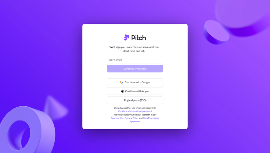
The gradient background is bold. Like, really bold. That deep violet with the 3D geometric shapes floating around gives this login page way more personality than it needs to have. And that's exactly why it works. Pitch clearly doesn't want you to forget who they are, even on a utility screen.
Clean Center, Loud Edges
The white card sits dead center and does its job without fuss. You've got the logo up top, a short friendly line of copy, then the email field followed by a strong purple CTA button. Below that, three alternative auth options stacked neatly with Google, Apple, and SSO. The visual hierarchy is textbook. Your eye goes logo, input, button, alternatives. No confusion.
The Details That Land
The "Continue with email and password" fallback link is a thoughtful touch for users who hate magic links. Typography is simple and readable. Nothing fights for attention inside the card. The contrast between the chaotic, playful background and the calm, structured form is what makes this page feel distinct. It's functional but full of brand energy.