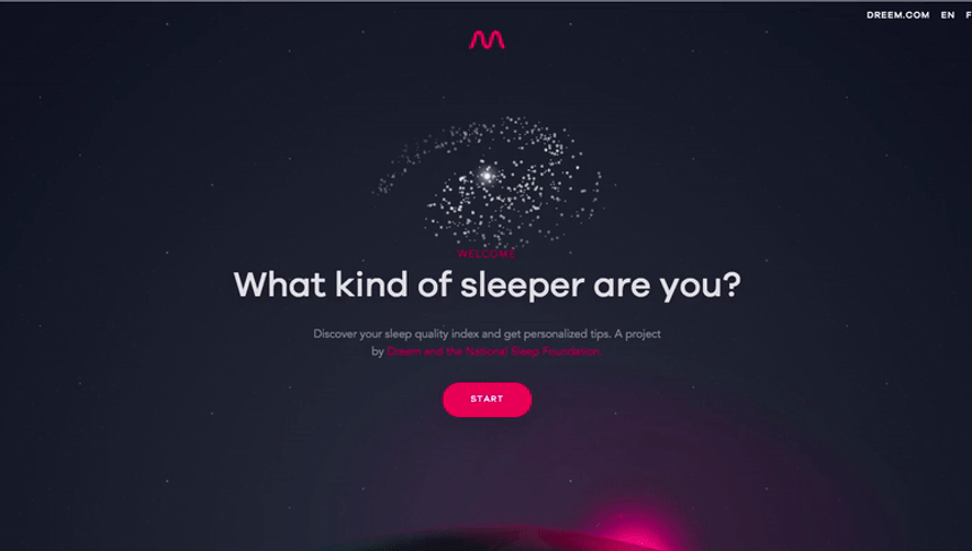
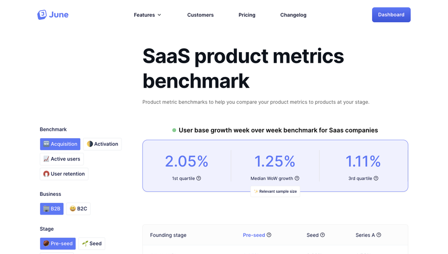
Generate a new design based on this screen using your own content.
Thank you! Your submission has been received!
Oops! Something went wrong while submitting the form.
# Design from Reference: Pitch Free Side Product
Create an original, high-fidelity visual design inspired by the reference. Prioritize composition, typography, colors, spacing, and component styling over technical implementation.
## Reference
- **Product:** Pitch
- **Category:** Free Side Product
- **Screenshot:** https://cdn.prod.website-files.com/5e9dc792e1210c5325f7ebbc/62ec9c5e0c7b921072e18b3f_1659620379379-screenshot-device-e40d49630b48a3e16506a4597c4788a6-1659598051298.webp
Analyze the screenshot first. If inaccessible, request it rather than guessing.
## Content
{{content.instructions}}
{{content.data}}
Preserve essential messaging and factual accuracy. Adapt structure and copy length for visual balance; never invent product claims.
## Visual Design
Use this context to reproduce the reference's visual language: layout, typography, colors, spacing, borders, radii, and distinctive elements. The screenshot takes priority if descriptions conflict.
## Direction
{{preferences.fidelityInstructions}}
## Output
{{output.instructions}}
Deliver a polished, cohesive design with precise alignment, hierarchy, and spacing. Produce the requested visual artifact, not just a description. If unsupported, explain the limitation.
The Pitch Game’s website embodies a playful yet modern aesthetic, masterfully balancing lighthearted fun with SaaS credibility. The interface embraces whitespace to create an open, inviting atmosphere while bold, colorful accents energize each section. The visual tone combines startup professionalism with a party-game twist, making the platform feel both trustworthy and accessible.
Layout and Structure
The landing page employs a classic, high-conversion SaaS layout: a prominent hero section with a concise value proposition and engaging call-to-action, followed by three clear sections showcasing how the game works, testimonials, and FAQs. Subtle dividers and well-padded containers maintain clarity and breatheability, while the sticky header streamlines navigation across the experience.
Visual Elements
Vivid custom illustrations and playful icons inject personality throughout the page, replacing photography to reinforce the game’s imaginative premise. Micro-interactions—such as hover animations on buttons and card flips—add delight while guiding user attention. The design feels exceptionally interactive yet never overwhelming.
Color Palette and Typography
A lively color palette—anchored by purple and citrus orange—draws the eye to critical elements and call-to-actions, while gradients give the site a dynamic, youthful vibe. Rounded sans-serif headlines pair with legible body fonts, establishing hierarchy and readability. Consistent font weights and sizes ensure every section feels cohesive.
User Experience Patterns & Unique Choices
Navigation is intuitive, with persistent CTAs that invite immediate action. The single-column design aids scannability, while layered cards, playful shadow effects, and contextual tooltips set the experience apart. Clever copywriting and a friendly tone further immerse users, building trust and excitement for the product.