Generate a new design based on this screen using your own content.
Thank you! Your submission has been received!
Oops! Something went wrong while submitting the form.
# Design from Reference: Pitch Checkout
Create an original, high-fidelity visual design inspired by the reference. Prioritize composition, typography, colors, spacing, and component styling over technical implementation.
## Reference
- **Product:** Pitch
- **Category:** Checkout
- **Screenshot:** https://cdn.prod.website-files.com/5e9dc792e1210c5325f7ebbc/6acad469886583e9d96b6f54_6acad3675a5fdf4c3030788f_cms-5a79fcfc2ba7af07505bcf55.webp
Analyze the screenshot first. If inaccessible, request it rather than guessing.
## Content
{{content.instructions}}
{{content.data}}
Preserve essential messaging and factual accuracy. Adapt structure and copy length for visual balance; never invent product claims.
## Visual Design
Use this context to reproduce the reference's visual language: layout, typography, colors, spacing, borders, radii, and distinctive elements. The screenshot takes priority if descriptions conflict.
## Direction
{{preferences.fidelityInstructions}}
## Output
{{output.instructions}}
Deliver a polished, cohesive design with precise alignment, hierarchy, and spacing. Produce the requested visual artifact, not just a description. If unsupported, explain the limitation.
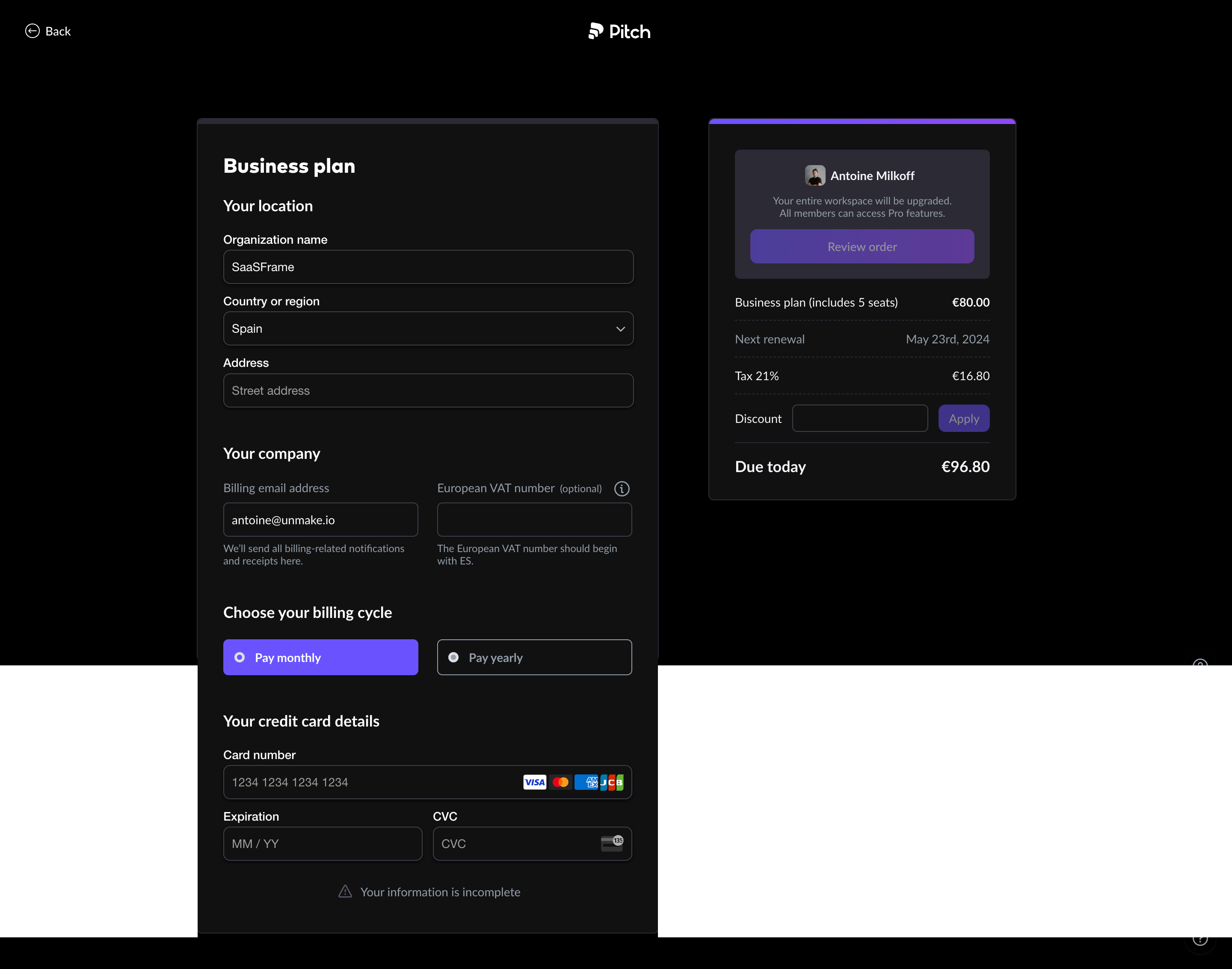
Pitch nails the business plan upgrade flow here. The dark background makes everything feel premium without trying too hard. What grabs you first is that purple accent on the order summary card on the right. It's just a thin gradient bar at the top but it pulls your eye straight to the pricing breakdown.
Two-Column Layout That Actually Works
Left side handles all the input heavy lifting. Organization, location, billing, payment. Right side stays fixed with your order summary and that satisfying "Due today €96.80" at the bottom. The hierarchy is clean. Bold white section headers like "Your location" and "Your company" break the form into digestible chunks so it doesn't feel like a wall of fields. Smart move putting the billing cycle toggle as big tappable buttons with that filled purple state on "Pay monthly."
Small Details Worth Stealing
The credit card brand icons inline with the card number field feel polished. The VAT number field marked as optional with an info icon shows they thought about their European audience. That warning at the bottom, "Your information is incomplete," is subtle but effective. No aggressive red. Just a quiet triangle icon and gray text. Respectful.