Generate a new design based on this screen using your own content.
Thank you! Your submission has been received!
Oops! Something went wrong while submitting the form.
# Design from Reference: Pipe Inverstors Page
Create an original, high-fidelity visual design inspired by the reference. Prioritize composition, typography, colors, spacing, and component styling over technical implementation.
## Reference
- **Product:** Pipe
- **Category:** Landing Page
- **Screenshot:** https://cdn.prod.website-files.com/5e9dc792e1210c5325f7ebbc/6acbbd99d6be908889c4e4c5_6acbbc47007da85685c24d8f_cms-7d95836afdc3e92d7870b295.webp
Analyze the screenshot first. If inaccessible, request it rather than guessing.
## Content
{{content.instructions}}
{{content.data}}
Preserve essential messaging and factual accuracy. Adapt structure and copy length for visual balance; never invent product claims.
## Visual Design
Use this context to reproduce the reference's visual language: layout, typography, colors, spacing, borders, radii, and distinctive elements. The screenshot takes priority if descriptions conflict.
## Direction
{{preferences.fidelityInstructions}}
## Output
{{output.instructions}}
Deliver a polished, cohesive design with precise alignment, hierarchy, and spacing. Produce the requested visual artifact, not just a description. If unsupported, explain the limitation.
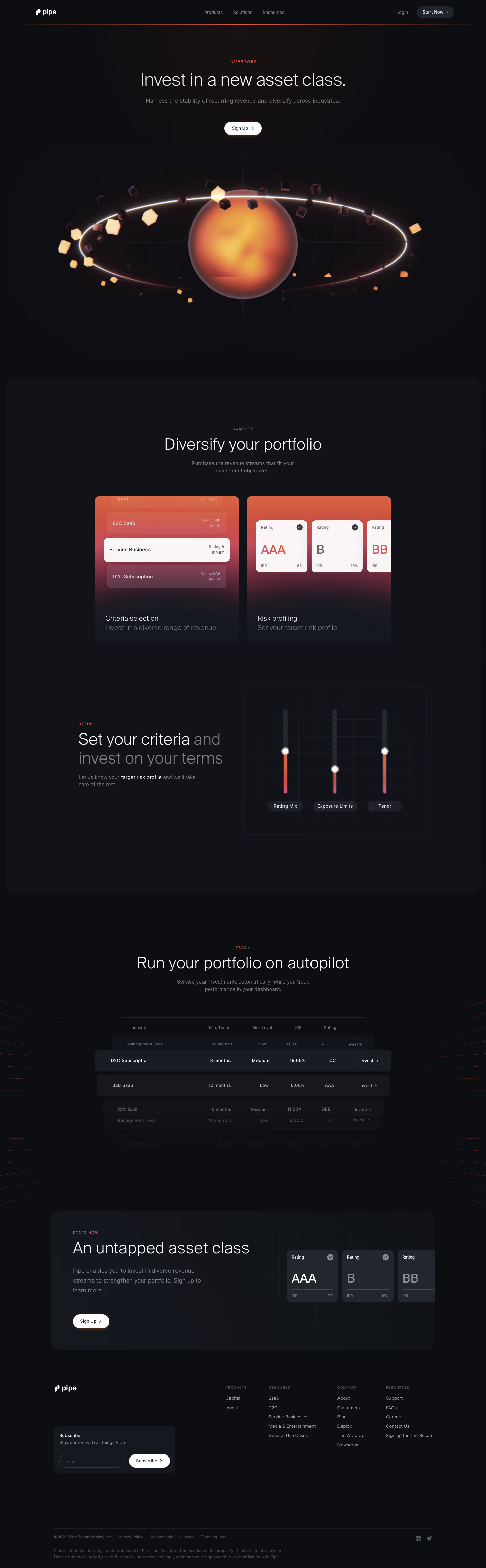
Pipe’s investors page showcases a crisp, minimalist design that immediately exudes professionalism and innovation. The visual weight of the page is balanced through generous use of whitespace, sleek lines, and a subtle interplay of color. This approach communicates both credibility and forward-thinking, making visitors feel confident in the brand’s stability and modern relevance.
Layout and Structure
The page structure is straightforward yet impactful, beginning with a hero section that features a concise headline and supporting copy. A prominent investor logo wall follows, leveraging social proof and trust. The logical flow guides visitors seamlessly downward, culminating in a straightforward contact form and informative, unobtrusive footer.
Visual Elements
Clean vector logos and minimalist iconography dominate the visuals, eschewing heavy illustrations or distracting graphics. Subtle hover animations give the page a sense of interactivity without overwhelming the visitor. Instead of conventional photography or video, the emphasis is on showcasing investor credibility through well-organized logo displays.
Color Palette and Typography
The palette is dominated by white backgrounds with touches of muted blue and soft neutrals, reinforcing a sense of calm authority. Typography pairs a bold, easily legible sans-serif for headlines with a lighter, modern body font, enhancing readability and hierarchy.
User Experience Patterns and Unique Choices
Sticky navigation keeps key links accessible as users scroll, while prominent, single-action CTAs ("Learn more" or "Contact us") simplify decision-making. The investor wall stands out for its grid-like, almost editorial presentation, giving equal prominence to each backer. Overall, the tone feels trustworthy and refined—an excellent template for SaaS brands aiming for both gravitas and distinction.