
Thank you! Your submission has been received!
Oops! Something went wrong while submitting the form.
Get SaaSFrame Pro
Monthly
$18
Quarterly
$48
Yearly
$180
Upgrade to access this feature
Browse all screens & flows
Filter and search screens & flows
Access Figma files
Access mobile versions
Bookmark screens & flows
Join now
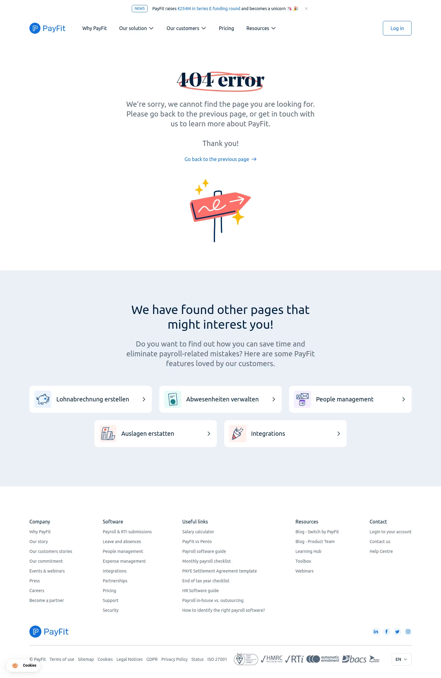

Payfit ayFit 404 Page

Payfit
Payroll management
Designed by
No items found.

Bookmark
Bookmark

Design with AI
Thank you! Your submission has been received!
Oops! Something went wrong while submitting the form.
# Design from Reference: Payfit ayFit 404 Page
Create an original, high-fidelity visual design inspired by the reference. Prioritize composition, typography, colors, spacing, and component styling over technical implementation.
## Reference
- **Product:** Payfit
- **Category:** 404 Page
- **Screenshot:** https://cdn.prod.website-files.com/5e9dc792e1210c5325f7ebbc/62ec9c6a8ef1085cce0f3ba5_1659621408209-screenshot-device-7c0d1342640f4778af083c632156f7da-1659600509321.webp
Analyze the screenshot first. If inaccessible, request it rather than guessing.
## Content
{{content.instructions}}
{{content.data}}
Preserve essential messaging and factual accuracy. Adapt structure and copy length for visual balance; never invent product claims.
## Visual Design
### Overall aesthetic
- **Style:** Friendly branded 404 page with a centered error message, playful hand-drawn illustration and useful recovery links.
- **Character:** White canvas, navy typography, blue navigation/actions, coral scribble accents and a pale blue-gray recommendation section.
- **Surface treatment:** Mostly flat page regions. Recommended destinations use white rounded horizontal cards with small pastel icon tiles.
### Page composition
- **Capture dimensions:** 1440 × 2211 image px. Approximate CSS reconstruction assumes an unverified 1× capture.
- **Announcement strip:** A small centered news message sits at the top, with outlined NEWS badge, blue linked phrase and close symbol.
- **Header:** Logo left, navigation across the middle and outlined login action right, within a container approximately 1250 px wide.
- **Error region:** Centered 404 error heading, three-line explanatory copy, short thank-you line and blue previous-page link. A coral directional-sign illustration sits beneath.
- **Illustration:** Small hand-drawn signpost with navy support lines, white squiggle/arrow and yellow sparkle marks, centered within substantial whitespace.
- **Recovery region:** A full-width pale blue-gray band begins around y=880 px. A centered two-line heading and three-line explanation precede five destination cards arranged as three across, then two centered below.
- **Footer:** White five-column navigation area follows. Lower rows contain logo/social links, a divider, legal links, compliance/payment marks and language selector.
- **Persistent utility:** A small Cookies pill floats at the lower left.
### Information hierarchy
- **Error emphasis:** The 404 heading is the primary signal, with a coral hand-drawn oval/scribble behind it.
- **Recovery action:** The previous-page link is the clearest immediate route away from the error.
- **Alternative discovery:** The pale section offers five feature destinations using consistent cards and right chevrons.
- **Secondary navigation:** Standard header and footer remain available, providing additional routes beyond the error message.
- **Captured content:** Recovery-card labels mix languages in the screenshot. Treat that as source content rather than a recommended localization strategy.
### Typography
- **Error heading:** High-contrast serif display treatment, approximately 64 px, bold, with tight 70 px leading. Exact family is unverified.
- **Supporting family:** Rounded/humanist sans serif for navigation, body copy, recommendations and footer. Exact identity is unverified.
- **Error explanation:** Approximately 24 px with 32 px leading, centered and muted blue-gray.
- **Recovery heading:** Approximately 40 px with 48 px leading, medium weight and navy.
- **Recovery explanation:** Approximately 24 px with 32 px leading.
- **Cards and navigation:** Approximately 18–20 px for destination labels; header links around 16 px; footer links around 14 px.
- **Measurement limit:** All font sizes and weights are visual CSS estimates under the assumed 1× scale.
### Colors & surfaces
- **Main canvas:** Sampled sRGB #FFFFFF fills header, error area, destination cards and footer.
- **Recovery surface:** Sampled #EAF0F5 supplies the pale blue-gray recommendation band.
- **Coral accent:** Sampled #FE7069 is a principal reference for the error scribble and sign illustration.
- **Foreground:** Navy headings and muted blue-gray body copy are clearly distinct, while blue identifies links and brand controls. Their exact hex values are not established by the dominant-color sample.
- **Icon tiles:** Pastel blue, mint, lavender and peach backgrounds differentiate recovery-card illustrations.
- **Illustrative detail:** Yellow sparkle marks and navy outlines add warmth and contrast without introducing additional actions.
### Components
- **Error scribble:** Thin irregular coral loop behind the serif heading, extending beyond the word shape without obscuring readability.
- **Previous-page link:** Blue text with a small right arrow, centered and separated from the explanatory copy.
- **Recovery cards:** Approximately 400 × 88 CSS px, white fill, about 12 px radii and no pronounced shadow.
- **Icon tiles:** Approximately 56 px square, softly rounded pastel surfaces containing small outlined feature illustrations.
- **Card labels:** Left-aligned beside the icon, with a small navy chevron near the far-right edge.
- **Header login:** White outlined blue button, approximately 95 × 48 px, with modest radius.
- **Footer social links:** Small light-blue rounded-square controls aligned to the right of the brand row.
- **Language control:** Compact outlined rectangle with locale abbreviation and chevron.
- **Cookies control:** Small white pill with cookie icon and dark label, softly elevated above the footer.
### Visual rhythm
- **Vertical pacing:** Spacious error explanation leads into a denser recovery band, then a detailed footer.
- **Centering:** Heading, explanation, recovery link and signpost share one central axis.
- **Card rhythm:** Equal-height destination cards and consistent icon/chevron placement create a clear recovery menu.
- **Color blocking:** White and pale blue-gray sections distinguish error context from recommended next steps.
- **Footer density:** Small grouped links provide many routes while remaining visually subordinate to recovery actions.
### Responsive
- **Evidence limit:** Only desktop is visible; recommendations below are not observed behavior.
- **Error recommendation:** Reduce the heading toward 44–48 px and supporting copy toward 18–20 px while preserving centered hierarchy.
- **Cards recommendation:** Stack destination cards on phones or use two columns at intermediate widths.
- **Navigation recommendation:** Collapse header links and progressively stack footer groups.
- **Utility recommendation:** Keep cookie and language controls clear of legal links and safe-area insets.
- **Touch recommendation:** Maintain comfortable card and action hit areas without shrinking labels.
### Adaptation guidance
- **Preserve recovery utility:** Explain the missing page plainly and provide a dependable return route plus relevant destinations.
- **Use appropriate destinations:** Populate recovery cards from actual target-site pages; do not copy unrelated payroll features.
- **Keep localization coherent:** Use the target page's intended language consistently, despite the mixed source labels.
- **Retain friendliness:** Use restrained illustration and warm accent marks without reducing the clarity of the error.
- **Use verified business content:** Replace news, legal, compliance and payment marks with accurate target-brand material.
- **Accessibility recommendation:** Provide a meaningful error title, clear link names and decorative-image handling; return-link behavior is not verified by the screenshot.
Use this context to reproduce the reference's visual language: layout, typography, colors, spacing, borders, radii, and distinctive elements. The screenshot takes priority if descriptions conflict.
## Direction
{{preferences.fidelityInstructions}}
## Output
{{output.instructions}}
Deliver a polished, cohesive design with precise alignment, hierarchy, and spacing. Produce the requested visual artifact, not just a description. If unsupported, explain the limitation.


Category
Patterns
No items found.



Added on
June 20, 2020
Similar screens




Upgrade to SaaSFrame Pro now to see similar examples.
Monthly
$18 /month
Billed $18 monthly
Browse all screens & flows
Filter and search screens & flows
Search text in screenshots
Access Figma files
Access mobile versions
Join now
Quarterly
$16 /month
Billed $48 quarterly
Browse all screens & flows
Filter and search screens & flows
Search text in screenshots
Access Figma files
Access mobile versions
Join now
Yearly
$15 /month
Billed $180 yearly
Browse all screens & flows
Filter and search screens & flows
Search text in screenshots
Access Figma files
Access mobile versions
Join now