Design with AI
Generate a new design based on this screen using your own content.
# Design from Reference: ParityDeals Integrations Library
Create an original, high-fidelity visual design inspired by the reference. Prioritize composition, typography, colors, spacing, and component styling over technical implementation.
## Reference
- **Product:** ParityDeals
- **Category:** Integrations Library
- **Screenshot:** https://cdn.prod.website-files.com/5e9dc792e1210c5325f7ebbc/6acad793fbf1299940aab4ef_6acad145b2165b6c7fffb25c_cms-c6f614fef238ae718c7c3727.webp
Analyze the screenshot first. If inaccessible, request it rather than guessing.
## Content
{{content.instructions}}
{{content.data}}
Preserve essential messaging and factual accuracy. Adapt structure and copy length for visual balance; never invent product claims.
## Visual Design
### Overall aesthetic
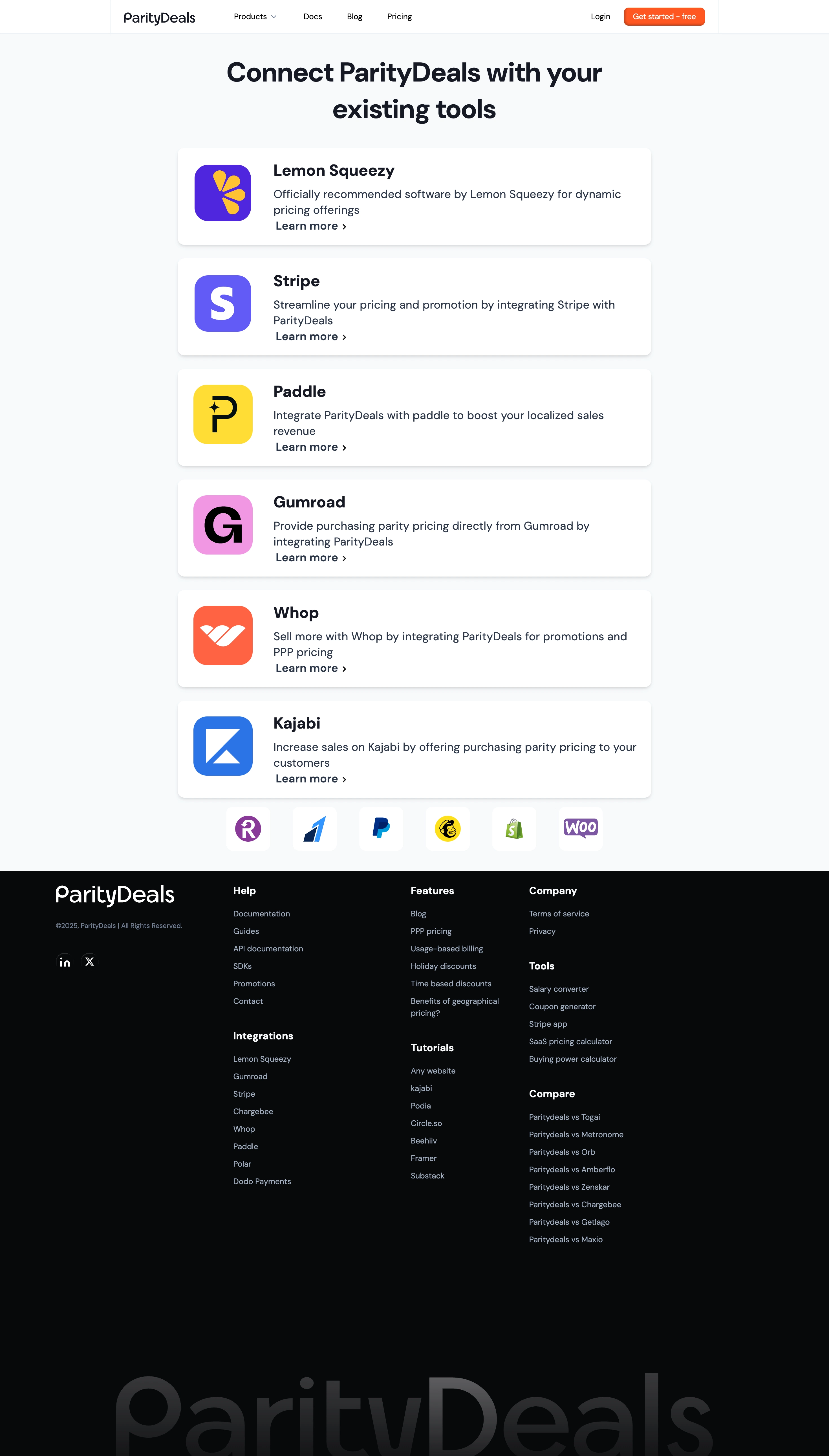
- **Character:** A restrained integration directory uses large white cards on a pale cool background, followed by a dramatically dark footer.
- **Branding:** Colorful square service marks provide the main visual variety; a small orange signup button supplies the site's own action accent.
### Page composition
- **Capture scale:** The original is 2940 × 5162 pixels. A roughly 2× capture is plausible but unverified; dimensions below estimate CSS pixels at half source resolution.
- **Header:** A centered horizontal navigation row places brand left, product/documentation/blog/pricing links centrally and account actions right.
- **Directory:** A large centered two-line heading precedes six vertically stacked integration cards: Lemon Squeezy, Stripe, Paddle, Gumroad, Whop and Kajabi.
- **Transition:** A row of six smaller service-logo tiles sits below the main cards.
- **Footer:** A near-black region contains a brand/social column and three link columns with multiple subgroups, ending in an oversized low-contrast wordmark near the bottom.
### Information hierarchy
- **Purpose:** The large heading establishes connection to existing tools before individual integrations.
- **Cards:** A large logo and bold service name precede a short description and repeated Learn more link.
- **Footer:** White subgroup headings stand above muted links; the giant wordmark is decorative rather than a reading priority.
### Typography
- **Family:** A rounded modern sans serif is used; exact identity is unverified.
- **Display:** Main heading is approximately 48 pixels, bold, with about 64-pixel leading across two lines.
- **Cards:** Names are around 28 pixels and bold; descriptions and Learn more links are approximately 20 pixels with 28-pixel leading.
- **Utilities:** Navigation is roughly 14 pixels; footer headings around 18 pixels and links about 14 pixels.
### Colors & surfaces
- **Measured foundation:** White #FFFFFF cards sit over pale cool #F7FAFC, with nearby #F6F9FB variations.
- **Measured text:** Deep charcoal #171923 and blue-gray #2D3748 provide heading/body contrast.
- **Measured footer:** Near-black #07080A creates a strong closing band.
- **Accent relationships:** Orange marks the header CTA; individual service marks retain purple, yellow, pink, coral and blue branding.
### Components
- **Integration cards:** Approximately 840 × 172 estimated CSS pixels, with about 14-pixel radii, a soft downward shadow and roughly 30-pixel padding.
- **Service marks:** Approximately 100-pixel square logo tiles align left of a broad text block.
- **Card action:** Bold text and a small right chevron form the repeated action; no separate filled button is visible within cards.
- **Header CTA:** Compact orange rounded rectangle with white label and a subtle darker lower edge.
- **Footer links:** Multiple named groups share three columns; circular social marks sit below copyright in the brand column.
### Visual rhythm
- **Column:** Main cards occupy a narrow centered column relative to the viewport.
- **Repetition:** Roughly 24-pixel gaps separate equal-height cards, with consistent logo/text alignment.
- **Closing space:** The footer uses substantial vertical whitespace before the oversized wordmark.
### Responsive
- **Observed state:** Only the desktop directory is shown; compact layouts are unverified.
- **Recommended cards:** Make cards fluid, stack logo and text when needed and preserve comfortable action spacing.
- **Recommended footer:** Stack link groups and constrain the decorative wordmark to avoid horizontal overflow.
### Adaptation guidance
- **Preserve simplicity:** Keep the six primary integrations as a calm vertical list rather than a dense grid.
- **Maintain contrast:** Retain the pale directory/dark footer transition and subdued footer links.
- **Content fidelity:** Treat descriptions and recommendation claims as screenshot content, not independently verified integration availability.
- **Accessibility:** Give service marks useful alternatives and distinguish repeated links with service-specific accessible names.
Use this context to reproduce the reference's visual language: layout, typography, colors, spacing, borders, radii, and distinctive elements. The screenshot takes priority if descriptions conflict.
## Direction
{{preferences.fidelityInstructions}}
## Output
{{output.instructions}}
Deliver a polished, cohesive design with precise alignment, hierarchy, and spacing. Produce the requested visual artifact, not just a description. If unsupported, explain the limitation.