
Thank you! Your submission has been received!
Oops! Something went wrong while submitting the form.
Get SaaSFrame Pro
Monthly
$18
Quarterly
$48
Yearly
$180
Upgrade to access this feature
Browse all screens & flows
Filter and search screens & flows
Access Figma files
Access mobile versions
Bookmark screens & flows
Join now

Pangram Use Cases

Pangram
AI detection for text and images.
Designed by
No items found.

Bookmark
Bookmark

Design with AI
Thank you! Your submission has been received!
Oops! Something went wrong while submitting the form.
# Design from Reference: Pangram Use Cases
Create an original, high-fidelity visual design inspired by the reference. Prioritize composition, typography, colors, spacing, and component styling over technical implementation.
## Reference
- **Product:** Pangram
- **Category:** Use Cases
- **Screenshot:** https://cdn.prod.website-files.com/5e9dc792e1210c5325f7ebbc/6aca2617a3a034e38b3ee615_6aca22a1fc79d3a6f5da1549_cms-c71a6f18895a0a54d4a48994.webp
Analyze the screenshot first. If inaccessible, request it rather than guessing.
## Content
{{content.instructions}}
{{content.data}}
Preserve essential messaging and factual accuracy. Adapt structure and copy length for visual balance; never invent product claims.
## Visual Design
### Overall aesthetic
- **Style:** Editorial education-focused product page pairing elegant high-contrast serif headings with practical sans-serif interface copy.
- **Character:** Warm off-white, forest green, orange actions, yellow and sky-blue panels, and paper-like decorative geometry.
- **Visual language:** School illustration, note/envelope motif, clipped-corner testimonial cards, small colored section labels, and a mixture of rounded panels and square editorial cards.
### Page composition
- **Capture and scale:** 2880 × 21728 image px. CSS estimates assume a 2× capture, approximately 1440 × 10864 CSS px; scale is unverified. All image portions were inspected.
- **Header:** Floating white rounded navigation container around 1210px wide, centered near the top; brand left, grouped menu links center, sales/globe/dashboard right.
- **Hero:** Two approximately equal halves. Left has a small topic capsule, large three-line serif title, supporting paragraph, paired actions, extension note, and compliance/credibility copy. Right shows a large detector interface over a textured illustrated school landscape.
- **Trust row:** Short serif statement left with a horizontal line of muted education-platform marks.
- **Ambassador banner:** Yellow wide panel with icon, heading, supporting lines, and right-aligned orange application action.
- **Benefits band:** Dark-green full-width section, white serif heading, and three white icon/text cards.
- **Tools:** White section with heading left/supporting sentence right above three illustrated yellow, lavender, and brown tool cards.
- **Integrations:** Dark-brown band with three numbered warm-brown cards for LMS, browser extension, and API paths; the third card is slightly rotated.
- **Technical proof:** Dark-green section with heading/supporting copy, three darker-green cards, small colored ribbon accents, and centered report action.
- **Statistics:** White section with mixed-width yellow, green, blue, orange, and white blocks containing large percentages and explanatory copy.
- **Founder note:** Green headline band above an oversized yellow envelope graphic holding a pale letter card.
- **Testimonials:** Sky-blue band with centered serif heading and three paper-like quote cards; side cards are partially clipped.
- **FAQ:** White two-column section, introductory heading/action left and ten numbered rounded rows right; first answer is expanded.
- **Related content:** Three organization cards, then a warm-neutral blog section with large rounded upper corners, heading/action, three article cards, and carousel arrows.
- **Footer:** Large warm-white rounded panel on dark green, with brand, five link groups, certification mark, contact/social/community controls, and copyright.
### Information hierarchy
- **Primary message:** Large serif hero headline identifies teachers/educators as the audience.
- **Primary action:** Orange assignment-scan action contrasts with a pale secondary extension action.
- **Capability structure:** Three benefits, three tools, three integration routes, and three technical-proof cards create parallel groups.
- **Evidence layers:** Platform logos, technical-report action, large statistics, founder letter, and testimonials provide successive proof formats.
- **FAQ hierarchy:** Orange item numbers, serif questions, circular plus controls; the open row includes sans-serif answer copy and an orange close control.
- **Blog hierarchy:** Image, outlined category pill, serif title, author/date row, and compact excerpt.
- **Claim treatment:** Accuracy, compliance, percentages, testimonials, and education outcomes are visible marketing content; this description does not independently validate them.
### Typography
- **Display family:** High-contrast editorial serif with tight spacing and delicate strokes; exact family is unverified.
- **Interface family:** Neutral sans serif for navigation, paragraphs, buttons, and detector UI; exact identity is unverified.
- **Hero title:** Approximately 64px serif with 60–64px line-height and tight tracking.
- **Major section headings:** Approximately 56–60px serif with 62px line-height.
- **Card headings:** Approximately 24–40px serif depending on card scale.
- **Body:** Approximately 16–18px sans serif with 24–28px line-height.
- **Technical card copy:** Some integration descriptions use compact monospaced lettering around 14px; exact family is unverified.
- **Statistics:** Approximately 50–56px serif numerals.
- **FAQ questions:** Approximately 26px serif; answer text around 16px with 24px leading.
- **Small roles:** Section labels, metadata, and footer links around 14px.
- **Precision:** CSS sizes, weights, line-heights, and font suggestions are estimates based on pixels.
### Colors & surfaces
- **White:** Sampled #FFFFFF in cards and interface areas.
- **Warm backgrounds:** Sampled #F8F7F6, #F8F7F5, and #F4F4ED.
- **Deep green:** Sampled #012B24 across dark bands and footer surround.
- **Mid green:** Sampled #15502E in the founder-note/statistic treatment.
- **Yellow:** Sampled #FFE782 in ambassador/envelope/statistic surfaces.
- **Sky blue:** Sampled #A9D8F9 in testimonial and statistic areas.
- **Dark brown:** Sampled #341500 in the integration band.
- **Warm-brown cards:** Sampled #562301.
- **Action roles:** Saturated orange primary buttons/line icons, pale peach secondary action, and small green icon tiles within some buttons.
- **Additional accents:** Lavender tool panels, pink labels, and orange statistic blocks create localized category distinctions.
- **Sampling:** Hex values describe measured screenshot surfaces after available color-profile handling; textured artwork and gradients contain additional shades.
### Components
- **Header shell:** Approximately 72px high with 8px radius and subtle shadow.
- **Hero topic capsule:** Thin pale outline, fully rounded ends, orange circular icon, and compact dark label.
- **Detector mockup:** Large white rounded frame with pale-blue outer border, tab switcher, small badges, broad gray textarea, example chips, upload outline action, and dark-green check action.
- **Orange actions:** Approximately 48px high with 6px radius, white bold labels; several include a small green square holding a paper-plane symbol.
- **Ambassador panel:** Roughly 280px tall with an exaggerated rounded upper-right corner and comparatively square remaining corners.
- **Benefit cards:** Three equal white rectangles with about 24px padding, modest 6px radius, orange line icon, serif title, and slate paragraph.
- **Tool cards:** Tall illustrated panels above colored copy areas; embedded detector results include gauges, confidence labels, highlighted text, and source previews.
- **Integration cards:** Number/title/monospace description stack with small colored rectangular link labels near the bottom.
- **Technical cards:** Darker green fill, outlined icons, narrow colored bookmark ribbons, white serif titles, and pale body text.
- **Statistic tiles:** Large serif percentages with short copy; selected outer corners are exaggerated while others stay small.
- **Envelope:** Yellow triangular folds overlap a cream rounded letter card, concealing its lower text in the captured state.
- **Quote cards:** Slightly skewed white paper shapes with colored corner polygons, serif quotation, attribution, and partial clipping at the carousel edges.
- **FAQ rows:** Warm-gray rounded blocks around 72–104px tall when collapsed, larger for the open answer; right circular controls.
- **Blog cards:** Landscape imagery, outlined category chips, two-line serif titles, fine author-row rule, small avatar/date, and short excerpt.
- **Footer:** Large roughly 20px-radius panel with orange uppercase group headings, muted link lists, green socials, and pale community action.
- **State limits:** Detector, carousel, envelope, and accordion controls are shown statically; no scanning, uploading, or navigation behavior is verified.
### Visual rhythm
- **Container:** Most sections align to roughly 1210px centered width with about 115px side margins.
- **Section cadence:** White, dark green, white, brown, dark green, white, green/yellow, blue, white, warm neutral, and green alternate strongly.
- **Grid rhythm:** Repeated three-column groups are interrupted by asymmetric statistics and the large envelope.
- **Spacing:** Broad 80–120px section padding contrasts with compact card copy.
- **Type contrast:** Fine serif display headings alternate with practical sans-serif explanatory blocks.
- **Paper motif:** Colored labels, folded corners, ribbon accents, and envelope geometry recur without relying on one repeated card shape.
### Responsive
- **Observed state:** Desktop only; mobile and interaction behavior are unverified.
- **Hero recommendation:** Stack copy and detector preview; reduce serif headline toward 40–44px.
- **Grid recommendation:** Change three-column cards to one column, preserving each section’s color identity.
- **Statistics recommendation:** Reflow mixed-size tiles into a readable stack rather than shrinking percentages/copy.
- **FAQ recommendation:** Place introduction above rows and keep plus controls aligned with wrapped questions.
- **Artwork recommendation:** Simplify envelope/illustration crops while preserving access to meaningful text outside decorative masks.
- **Footer recommendation:** Wrap link groups and keep community/social controls reachable.
### Adaptation guidance
- **Preserve:** Serif/sans contrast, green/orange brand system, alternating color bands, three-part capability groups, and paper-inspired proof components.
- **Starting geometry:** Approximately 1210px content width, 56–64px display headings, 16–18px body, 48px actions, and 24px card padding under the unverified 2× assumption.
- **Content fidelity:** Use supplied approved education/product claims and statistics; do not infer validity from their prominent visual treatment.
- **Illustration fidelity:** Use real brand artwork and detector screenshots; decorative controls must not imply unsupported functionality.
- **State modeling:** Implement a deliberate FAQ, carousel, envelope interaction, and detector workflow only when actual product requirements define them.
- **Accessibility recommendation:** Provide semantic headings, labeled controls, visible focus, sufficient contrast, and reduced-motion alternatives for decorative transitions.
Use this context to reproduce the reference's visual language: layout, typography, colors, spacing, borders, radii, and distinctive elements. The screenshot takes priority if descriptions conflict.
## Direction
{{preferences.fidelityInstructions}}
## Output
{{output.instructions}}
Deliver a polished, cohesive design with precise alignment, hierarchy, and spacing. Produce the requested visual artifact, not just a description. If unsupported, explain the limitation.


Category
Patterns
No items found.
Tech Stack
No items found.
Added on
October 9, 2026
Similar screens
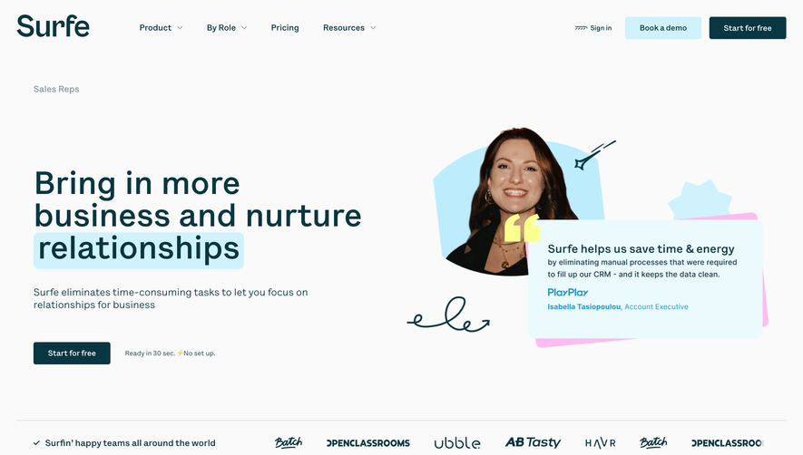


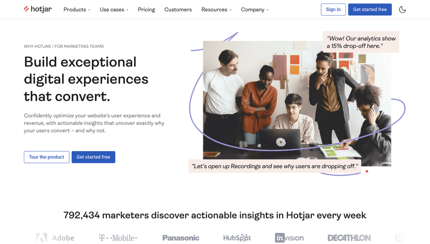

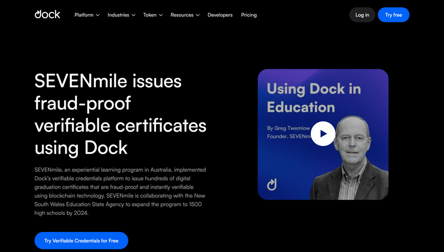

Upgrade to SaaSFrame Pro now to see similar examples.
Monthly
$18 /month
Billed $18 monthly
Browse all screens & flows
Filter and search screens & flows
Search text in screenshots
Access Figma files
Access mobile versions
Join now
Quarterly
$16 /month
Billed $48 quarterly
Browse all screens & flows
Filter and search screens & flows
Search text in screenshots
Access Figma files
Access mobile versions
Join now
Yearly
$15 /month
Billed $180 yearly
Browse all screens & flows
Filter and search screens & flows
Search text in screenshots
Access Figma files
Access mobile versions
Join now