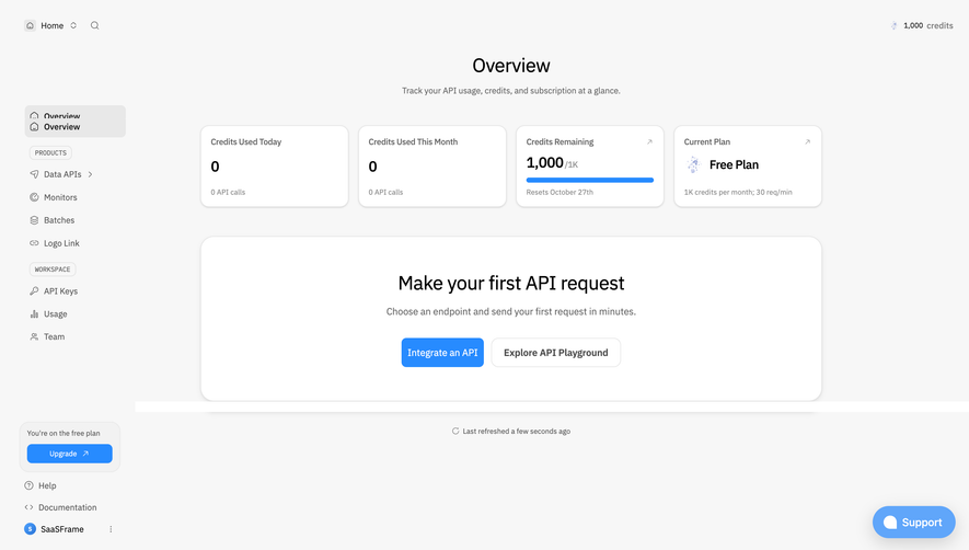
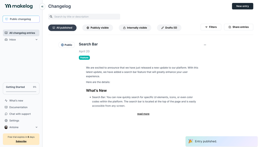
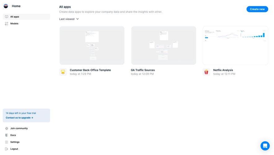
Design with AI
Generate a new design based on this screen using your own content.
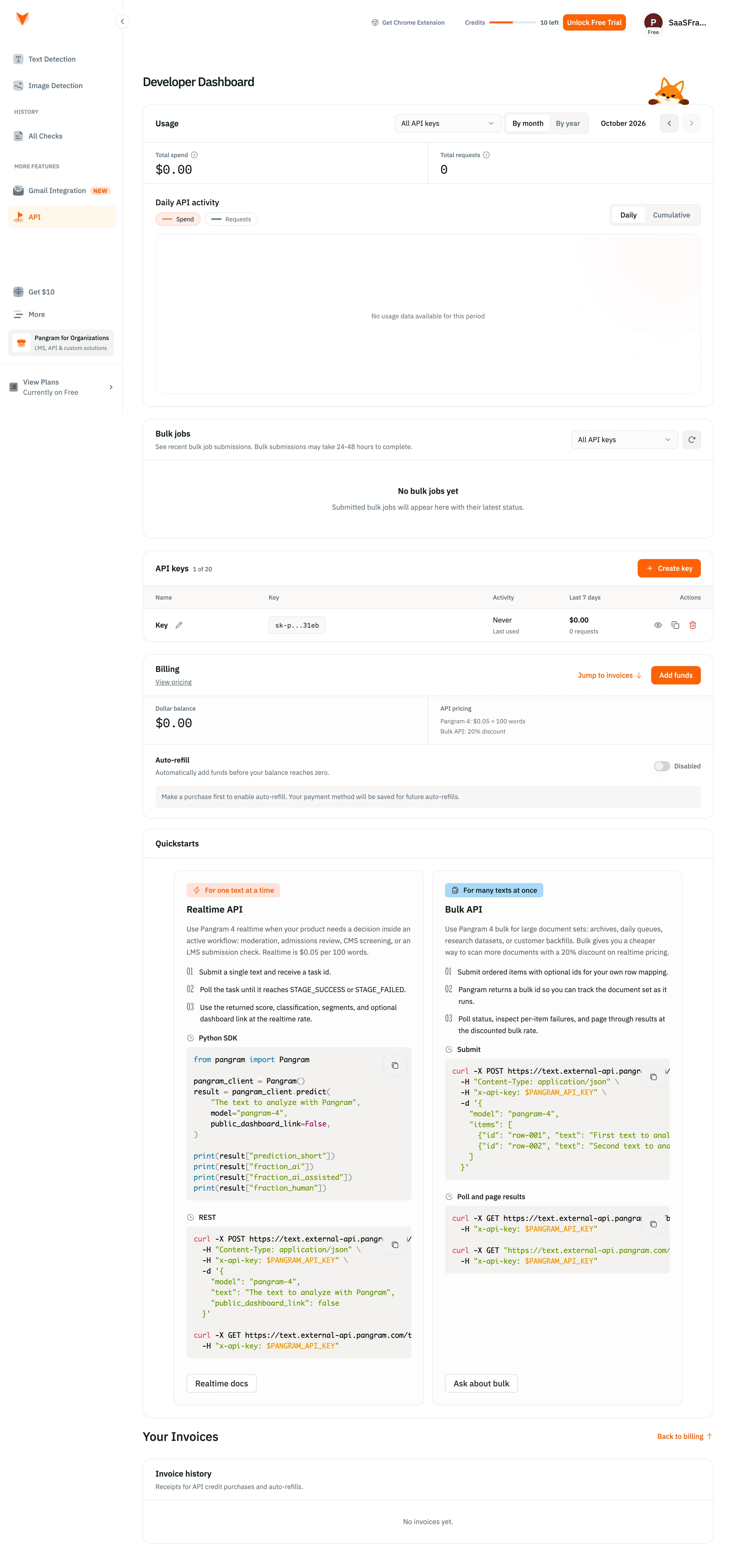
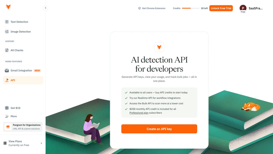
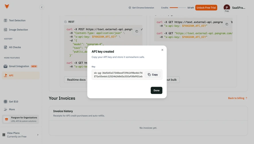
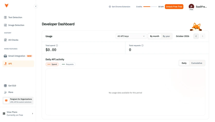
# Design from Reference: Pangram Developer dashboard
Create an original, high-fidelity visual design inspired by the reference. Prioritize composition, typography, colors, spacing, and component styling over technical implementation.
## Reference
- **Product:** Pangram
- **Category:** Dashboard
- **Screenshot:** https://cdn.prod.website-files.com/5e9dc792e1210c5325f7ebbc/6aca261aa3a034e38b3ee67a_6aca22ef73348a8d0746538b_cms-bfccbd5558f3eeb084400d0a.webp
Analyze the screenshot first. If inaccessible, request it rather than guessing.
## Content
{{content.instructions}}
{{content.data}}
Preserve essential messaging and factual accuracy. Adapt structure and copy length for visual balance; never invent product claims.
## Visual Design
### Overall aesthetic
- **Character:** Friendly developer dashboard combining white administrative panels, orange actions and approachable technical documentation.
### Page composition
- **Capture:** 2880 × 6156 screenshot pixels; estimated 2× CSS scale.
- **Structure:** Sidebar and utility bar frame Usage, Bulk jobs, API keys, Billing, paired Quickstarts and Invoice history panels.
### Information hierarchy
- **Priority:** Usage totals/chart lead, operational key and billing actions follow, then detailed realtime/bulk integration guidance and invoice empty state.
### Typography
- **Families:** Sans-serif interface and monospace code/financial figures; exact families unverified.
- **Estimated CSS sizes:** Page heading 24px, panel headings 16px, body 14px, metadata 12px and code 14px.
### Colors & surfaces
- **Measured palette:** White #FFFFFF, panel #FCFCFC, code warm gray #F4F2F0 and subtle variants #FDFDFC/#F8F7F5/#FAF9F8.
- **Accents:** Orange primary actions/links, dark green secondary chart legend and multicolor syntax.
### Components
- **Elements:** API-key dropdowns, month/year and daily/cumulative segments, large empty chart, key table with masked value/actions, refill toggle and numbered code quickstarts.
- **Estimated geometry:** Sidebar 240px, panels 16px radius, 24px padding, 36px controls and 24px vertical gaps.
### Visual rhythm
- **Spacing:** Large chart and empty-state panels contrast with dense paired documentation cards. Repeated panel headers unify a long functional page.
### Responsive
- **Suggested adaptation:** Collapse sidebar, stack quickstarts and billing columns, and allow code/table horizontal scrolling. Mobile behavior is not shown.
### Adaptation guidance
- **Transfer:** Preserve the usage/manage/integrate progression, masked credentials and consistent orange action hierarchy. Replace pricing and API examples with verified current content.
Use this context to reproduce the reference's visual language: layout, typography, colors, spacing, borders, radii, and distinctive elements. The screenshot takes priority if descriptions conflict.
## Direction
{{preferences.fidelityInstructions}}
## Output
{{output.instructions}}
Deliver a polished, cohesive design with precise alignment, hierarchy, and spacing. Produce the requested visual artifact, not just a description. If unsupported, explain the limitation.