Generate a new design based on this screen using your own content.
Thank you! Your submission has been received!
Oops! Something went wrong while submitting the form.
# Design from Reference: Paddle Podcast Pages
Create an original, high-fidelity visual design inspired by the reference. Prioritize composition, typography, colors, spacing, and component styling over technical implementation.
## Reference
- **Product:** Paddle
- **Category:** Podcast Pages
- **Screenshot:** https://cdn.prod.website-files.com/5e9dc792e1210c5325f7ebbc/6acad3b2c2028efdec71b100_6acad163053419932ab4b6a3_cms-913f3a06ff93b0099d5fc356.webp
Analyze the screenshot first. If inaccessible, request it rather than guessing.
## Content
{{content.instructions}}
{{content.data}}
Preserve essential messaging and factual accuracy. Adapt structure and copy length for visual balance; never invent product claims.
## Visual Design
Use this context to reproduce the reference's visual language: layout, typography, colors, spacing, borders, radii, and distinctive elements. The screenshot takes priority if descriptions conflict.
## Direction
{{preferences.fidelityInstructions}}
## Output
{{output.instructions}}
Deliver a polished, cohesive design with precise alignment, hierarchy, and spacing. Produce the requested visual artifact, not just a description. If unsupported, explain the limitation.
A Media Hub That Actually Feels Like Entertainment
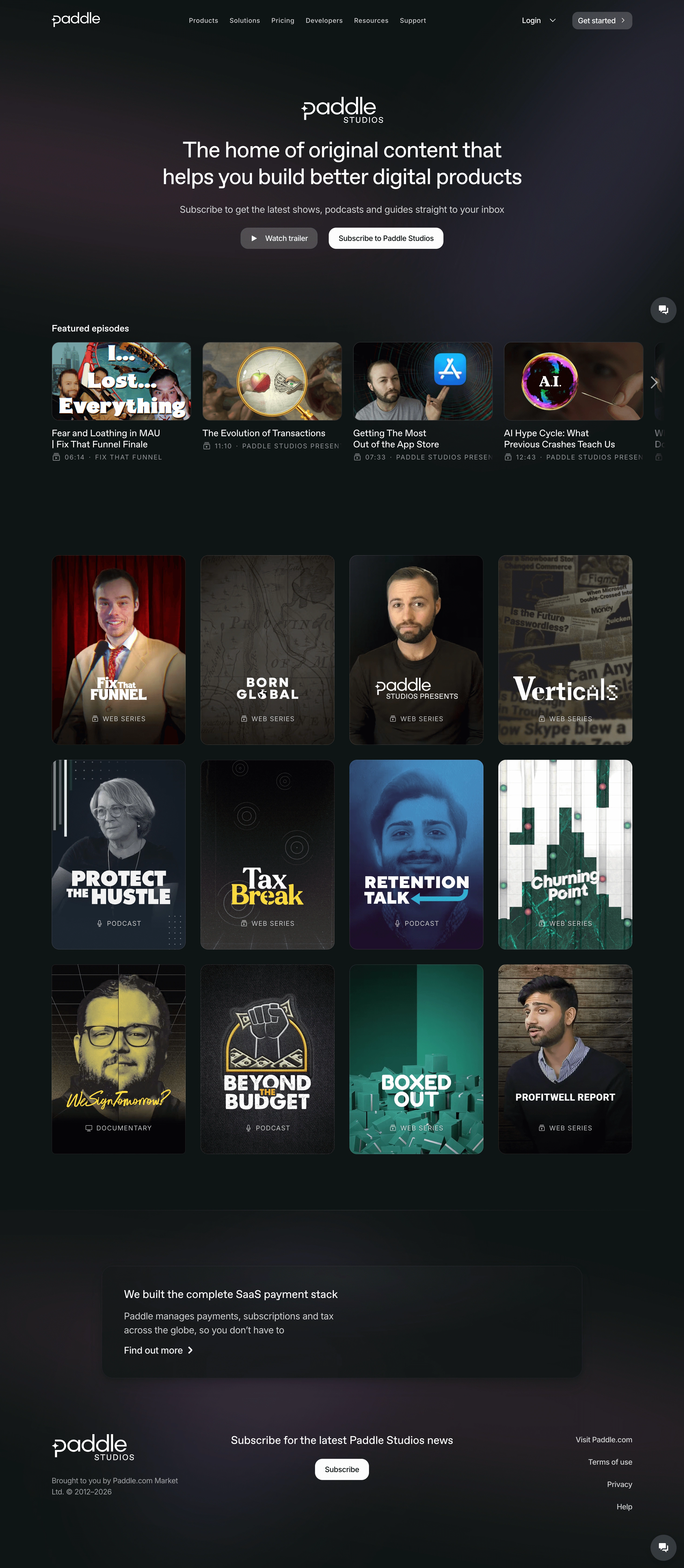
Paddle Studios goes full dark mode here and it works. The deep black background makes every thumbnail pop like a streaming platform. Netflix energy, but for SaaS content. That's a bold move for a payments company.
Grid That Does the Heavy Lifting
The layout is dead simple. Hero up top with a clear value prop, then featured episodes in a horizontal scroll, followed by a tight 4-column grid of show cards. Each card has its own personality through custom branding and color treatments. Shows like "Fix That Funnel," "Born Global," and "Churning Point" feel like real productions, not afterthought blog posts. The category labels (Web Series, Podcast, Documentary) sitting at the bottom of each card add just enough structure.
Typography and Tone
Clean sans-serif type keeps things readable against the dark canvas. The yellow script font on "We Sign Tomorrow?" breaks the pattern in a good way. What makes this distinct is the commitment to the bit. They didn't half-build a content page. They built a whole studio brand with a subscribe CTA and trailer button front and center.