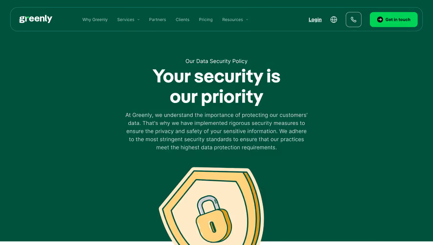
Generate a new design based on this screen using your own content.
Thank you! Your submission has been received!
Oops! Something went wrong while submitting the form.
# Design from Reference: OpenAI Security Page
Create an original, high-fidelity visual design inspired by the reference. Prioritize composition, typography, colors, spacing, and component styling over technical implementation.
## Reference
- **Product:** OpenAI
- **Category:** Security Page
- **Screenshot:** https://cdn.prod.website-files.com/5e9dc792e1210c5325f7ebbc/65646f9ef8974b3434d4687c_1cPEDEz3kJ1y6mOTGpkBwUPiulnJNC6vmlczTOm_qo0.webp
Analyze the screenshot first. If inaccessible, request it rather than guessing.
## Content
{{content.instructions}}
{{content.data}}
Preserve essential messaging and factual accuracy. Adapt structure and copy length for visual balance; never invent product claims.
## Visual Design
Use this context to reproduce the reference's visual language: layout, typography, colors, spacing, borders, radii, and distinctive elements. The screenshot takes priority if descriptions conflict.
## Direction
{{preferences.fidelityInstructions}}
## Output
{{output.instructions}}
Deliver a polished, cohesive design with precise alignment, hierarchy, and spacing. Produce the requested visual artifact, not just a description. If unsupported, explain the limitation.
The OpenAI Security page envelops users in a minimalist, ultra-modern visual language. Clean lines, open whitespace, and subtle geometric shapes exude a sense of precision and clarity, elevating trust and professionalism. The aesthetic avoids visual clutter, ensuring every element serves a clear purpose.
Layout and Structure
The page structure is deliberate and highly scannable. A succinct hero section with a no-nonsense headline and subtext immediately orients the visitor to core security principles. Content sections follow a predictable, comforting rhythm—stacked information blocks that mix short paragraphs with bulleted highlights. There’s no distraction from unnecessary sections like testimonials or pricing, maintaining focus on informational depth.
Visual Elements
Instead of elaborate illustrations or photography, the page relies on a sophisticated interplay of icons and understated animations to provide visual cues. Discreet animated accents highlight interactivity without overwhelming users—adding to the site’s responsive, future-forward aura.
Color Palette and Typography
A restrained palette dominates: deep blues convey security and reliability, punctuated by crisp white backgrounds and muted gray accents. Typography is crisp and modern, with a clear hierarchy; bold sans-serif headings anchor the eye while smaller, lighter body text ensures readability.
User Experience Patterns & Unique Touches
The page uses sticky navigation for easy section jumps and prominent CTAs crafted with clarity. Subtle hover effects and micro-interactions enhance engagement without visual noise. The tone is confident but approachable—projecting trust, innovation, and transparency, making it an outstanding reference for security-focused SaaS design.