Overall Style and Aesthetic
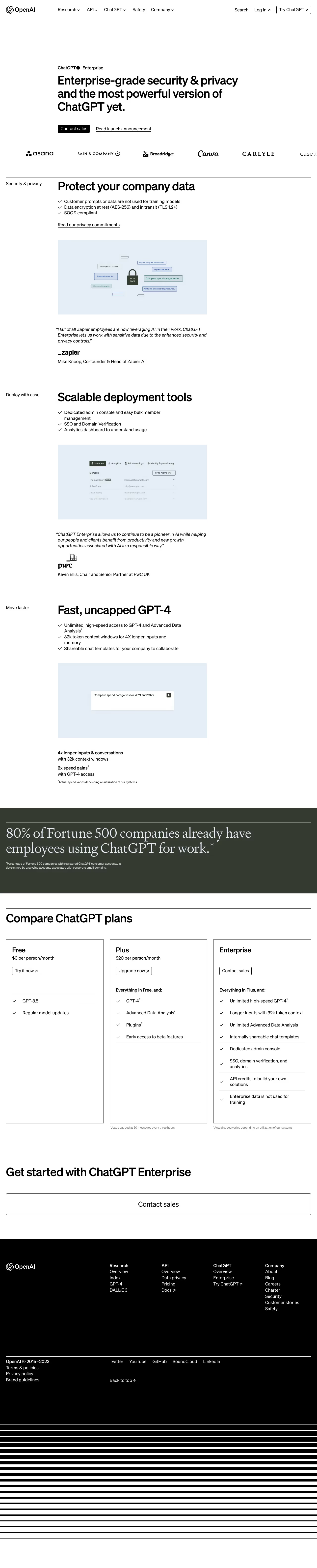
OpenAI Enterprise’s website epitomizes modern minimalism paired with an air of professionalism and quiet confidence. Every element feels thoughtfully placed, giving the page a spacious, uncluttered look. The restrained use of color and whitespace boosts scannability and draws the visitor’s focus to vital content. Layout and Structure
The structure follows a classic narrative: a compelling hero section featuring a bold headline and succinct subtext, offering immediate clarity. Beneath, purpose-driven sections outline features, security commitments, case studies, partner logos, and FAQs. Each section is clearly segmented for an intuitive, linear journey that builds trust and understanding as you scroll. Visual Elements
The page employs abstract, data-inspired illustrations and subtle micro-animations that inject energy while maintaining a professional tone. Strategic iconography clarifies features and benefits, and animated transitions between sections guide the user’s attention. The sparse use of photography emphasizes product over people, putting AI capabilities front and center. Color Palette and Typography
A calming palette of deep charcoal, crisp white, and muted accent blues defines the aesthetic, enhancing readability. Sans-serif typefaces convey modernity and reliability; varied font weights and generous sizing create a clear visual hierarchy, making headlines, sub-headlines, and CTAs pop. User Experience Patterns
Navigation is sticky and minimal, featuring anchor links for smooth section transitions. Prominent CTAs remain visible, using high-contrast buttons. There’s a frictionless contact form, and subtle scroll-triggered animations reward exploration without overwhelming the senses. Unique or Notable Design Choices
Distinctive touches include interactive data graphics and seamless page flows that evoke cutting-edge technology. The tone is quietly authoritative—innovative yet approachable, inspiring confidence in enterprise-grade AI without resorting to salesy hyperbole.