Design with AI
Generate a new design based on this screen using your own content.
# Design from Reference: Olvy Product Tour
Create an original, high-fidelity visual design inspired by the reference. Prioritize composition, typography, colors, spacing, and component styling over technical implementation.
## Reference
- **Product:** Olvy
- **Category:** Product Tour
- **Screenshot:** https://cdn.prod.website-files.com/5e9dc792e1210c5325f7ebbc/6acbbcfe3b6b24eada548720_6acbbc2e07a85b98c47c7388_cms-e7fc631ca01acb61f93f0d15.webp
Analyze the screenshot first. If inaccessible, request it rather than guessing.
## Content
{{content.instructions}}
{{content.data}}
Preserve essential messaging and factual accuracy. Adapt structure and copy length for visual balance; never invent product claims.
## Visual Design
### Overall aesthetic
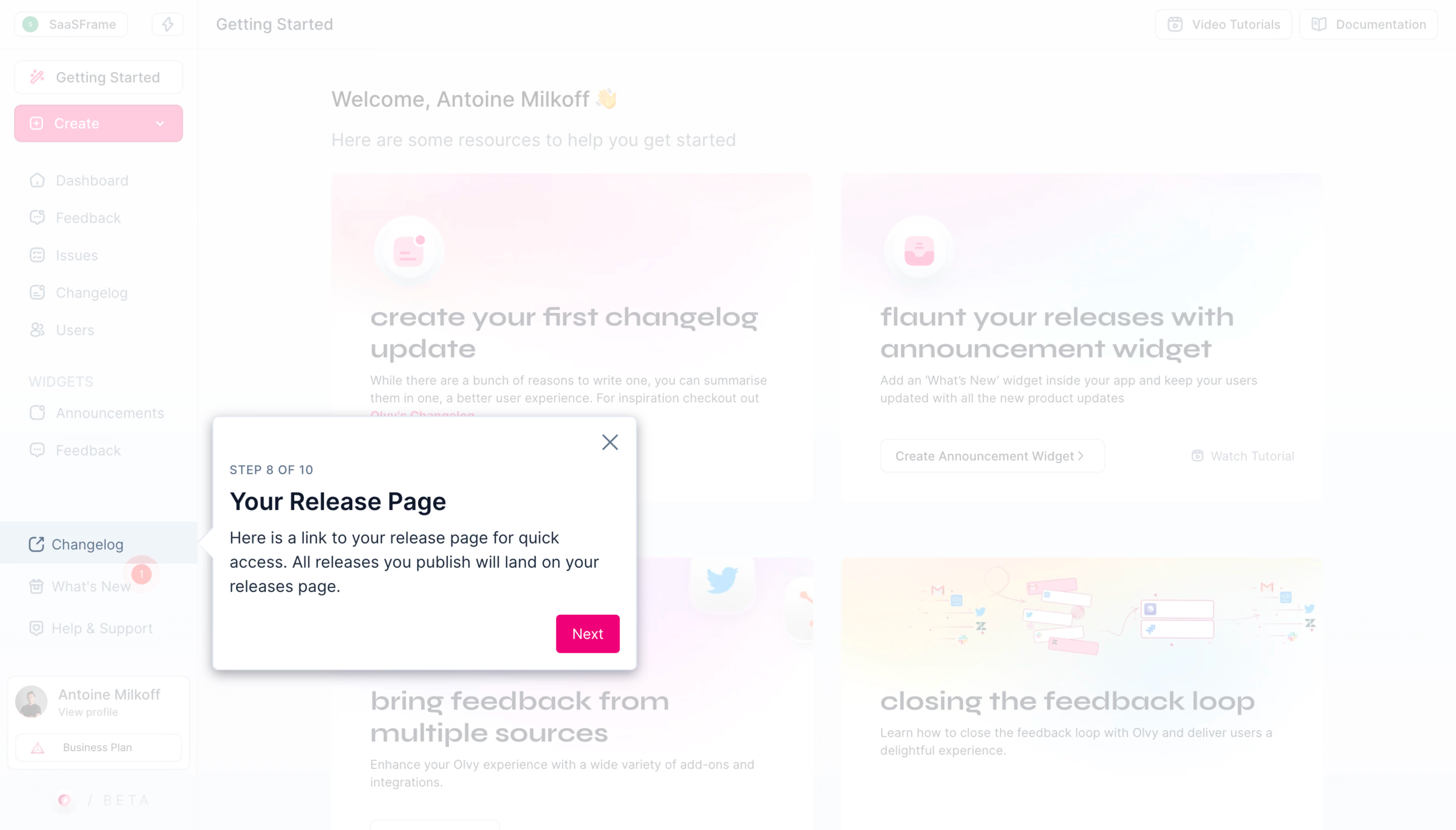
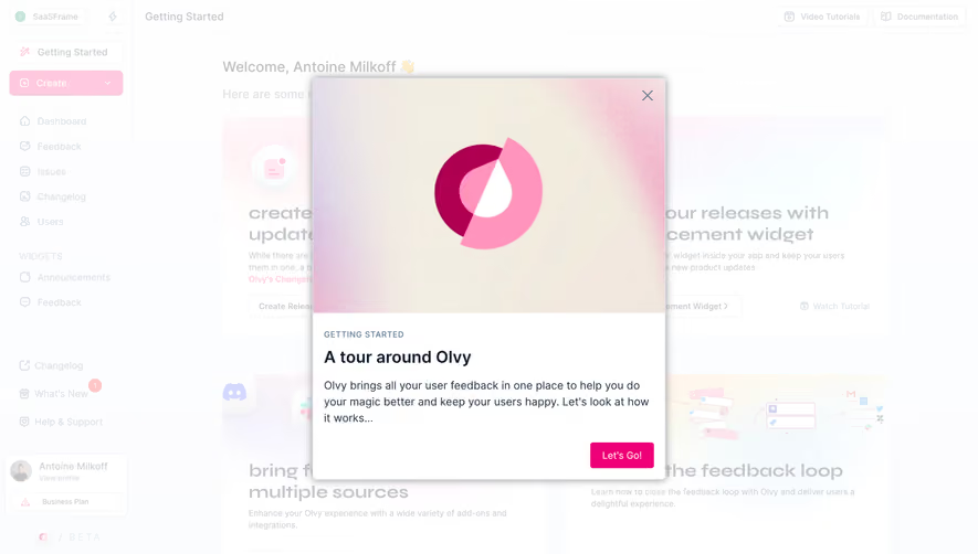
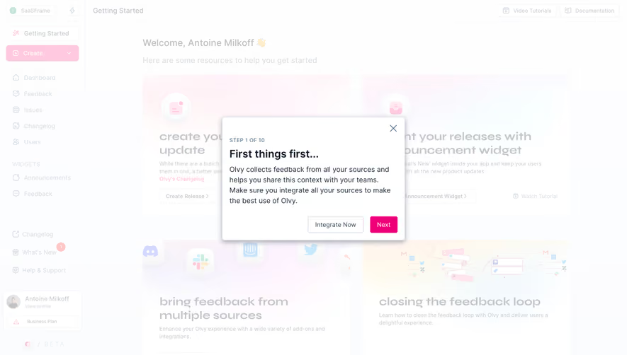
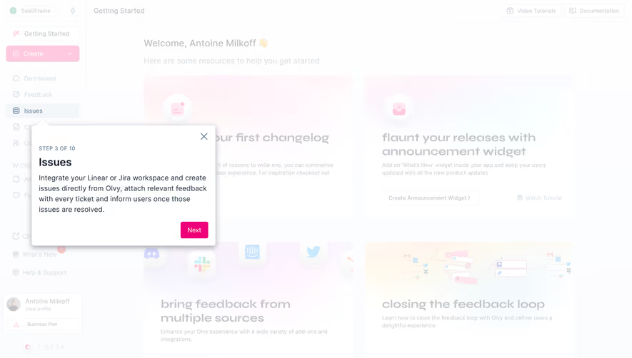
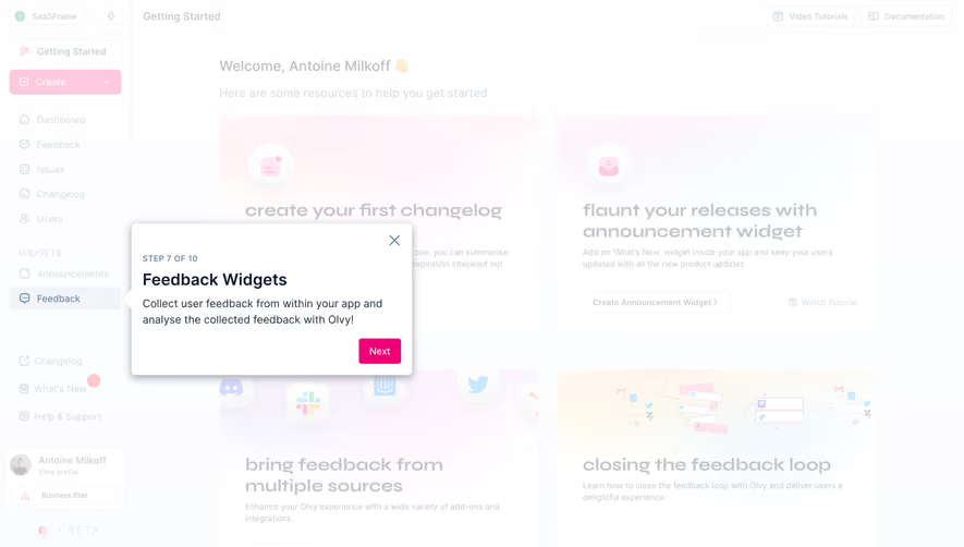
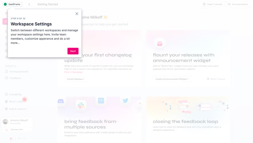
- **Character:** Light product dashboard under a white onboarding wash, with a crisp coachmark and pink next-step action.
### Page composition
- **Capture:** 5760 × 3284 screenshot pixels; estimated 4× CSS scale.
- **Structure:** Sidebar and Getting Started resource-card grid remain visible behind the tour. A coachmark sits beside the highlighted Changelog navigation link.
### Information hierarchy
- **Priority:** Step 8 of 10 label precedes Your Release Page title, short explanation and Next action. The pointer ties the instruction to the sidebar target.
### Typography
- **Families:** Sans-serif interface and coachmark; background resource cards use a wider rounded display style. Exact families unverified.
- **Estimated CSS sizes:** Coachmark heading 24px, body 16px, step label 12px with tracking and Next 14px.
### Colors & surfaces
- **Measured palette:** White #FFFFFF with near-white #FDFEFE, #FCFDFE, #FDFDFE and #FEFEFF from the washed-out capture.
- **Treatment:** Dark navy coachmark text, vivid pink action and faded pastel resource cards. Background samples reflect the white tour overlay, not verified underlying CSS colors.
### Components
- **Elements:** White tooltip with left pointer, close icon, step count, explanatory copy, pink Next button and highlighted external-link navigation row.
- **Estimated geometry:** Tooltip approximately 420px wide, 16px padding, 6px radius, soft gray shadow and 38px action height.
### Visual rhythm
- **Spacing:** Dense navigation and large background resource cards contrast with the compact tour instruction. White wash suppresses background competition.
### Responsive
- **Suggested adaptation:** Reposition coachmark above/below its target when space is limited and prevent viewport clipping. Mobile behavior is unverified.
### Adaptation guidance
- **Transfer:** Preserve target proximity, step progress and a single next action. Keep overlay opacity sufficient for focus while leaving navigation context recognizable.
Use this context to reproduce the reference's visual language: layout, typography, colors, spacing, borders, radii, and distinctive elements. The screenshot takes priority if descriptions conflict.
## Direction
{{preferences.fidelityInstructions}}
## Output
{{output.instructions}}
Deliver a polished, cohesive design with precise alignment, hierarchy, and spacing. Produce the requested visual artifact, not just a description. If unsupported, explain the limitation.