
Thank you! Your submission has been received!
Oops! Something went wrong while submitting the form.
Get SaaSFrame Pro
Monthly
$18
Quarterly
$48
Yearly
$180
Upgrade to access this feature
Browse all screens & flows
Filter and search screens & flows
Access Figma files
Access mobile versions
Bookmark screens & flows
Join now
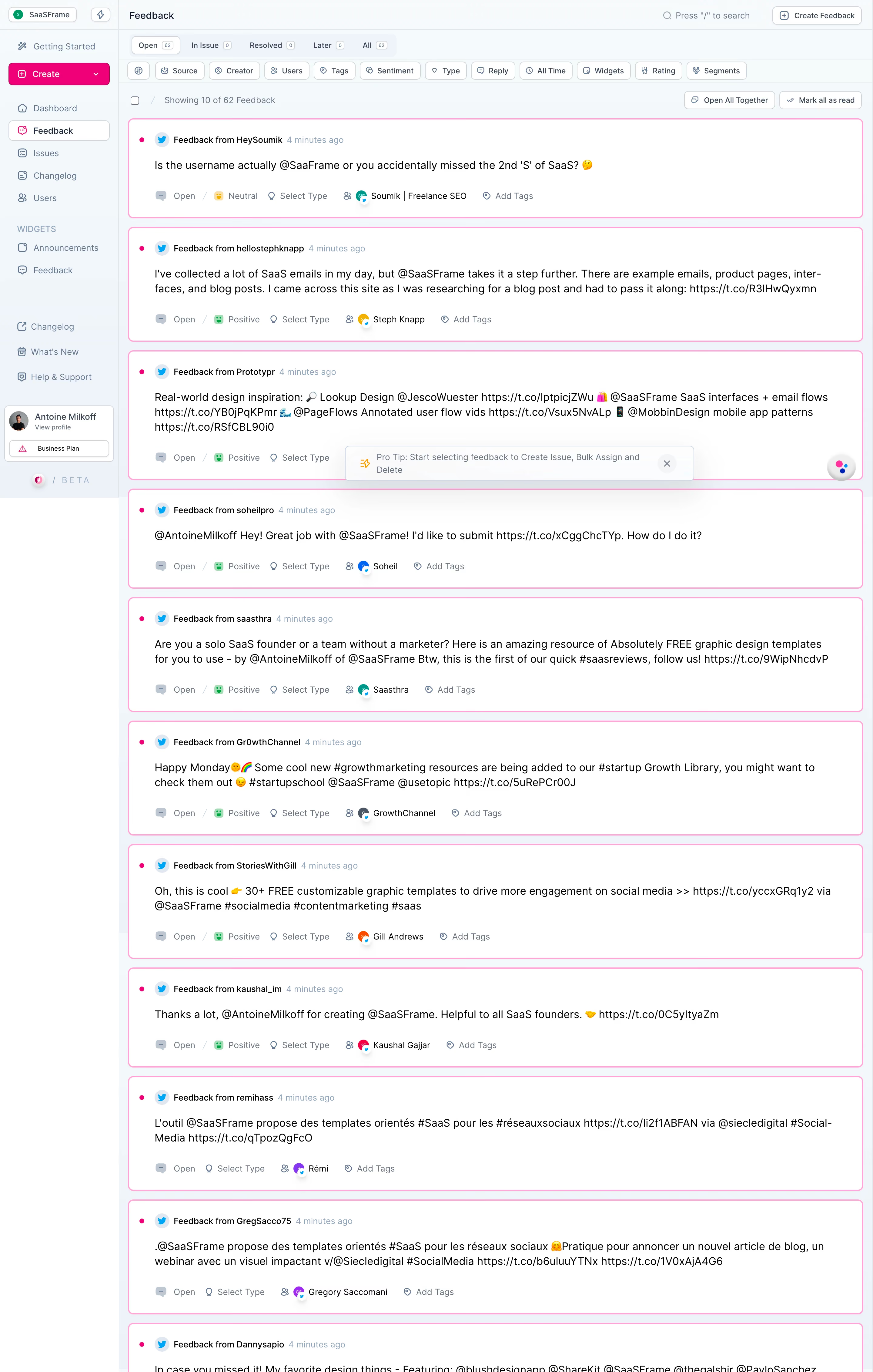
Olvy Feedback List

Olvy
Manage your user feedback like never before
Designed by
No items found.

Bookmark
Bookmark

Design with AI
Thank you! Your submission has been received!
Oops! Something went wrong while submitting the form.
# Design from Reference: Olvy Feedback List
Create an original, high-fidelity visual design inspired by the reference. Prioritize composition, typography, colors, spacing, and component styling over technical implementation.
## Reference
- **Product:** Olvy
- **Category:** Dashboard
- **Screenshot:** https://cdn.prod.website-files.com/5e9dc792e1210c5325f7ebbc/6acbbcfe3b6b24eada548732_6acbbc2cd1be8ecd2913be5a_cms-fe2fcbfd191c3ed55e6c9032.webp
Analyze the screenshot first. If inaccessible, request it rather than guessing.
## Content
{{content.instructions}}
{{content.data}}
Preserve essential messaging and factual accuracy. Adapt structure and copy length for visual balance; never invent product claims.
## Visual Design
### Overall aesthetic
- **Character:** A dense feedback-management workspace uses pale blue-gray chrome, white content cards, thin outlines, small line icons, and vivid pink accents. It prioritizes reading and classification over decoration.
- **Visual emphasis:** A saturated pink Create control and pink-outlined feedback cards stand out against the cool neutral application shell. Most secondary actions use quiet white outlined buttons.
- **Observed scale:** The image measures 2880 × 4524 pixels. The estimated CSS sizes below assume a 2× capture, giving a roughly 1440-pixel-wide workspace; the actual device pixel ratio is unverified.
- **Captured extent:** The long list continues to a partially visible final card at the bottom. No pagination footer or complete end-of-list state is shown.
### Page composition
- **Sidebar:** A roughly 196 CSS-pixel left rail contains a workspace selector, a small lightning control, Getting Started, a prominent Create dropdown, primary navigation, a Widgets group, and lower utility links. A profile/plan block and beta branding appear near the lower part of the initial sidebar region.
- **Header:** The main area starts with a compact Feedback title at left, a search hint near the right, and Create Feedback at the far right.
- **Status strip:** A second row contains Open, In Issue, Resolved, Later, and All tabs with small count badges. Open is visually selected.
- **Filter row:** A horizontal sequence of outlined filters includes Source, Creator, Users, Tags, Sentiment, Type, Reply, All Time, Widgets, Rating, and Segments, preceded by a small icon-only control.
- **List utilities:** A checkbox and visible-result count sit at left. Open All Together and Mark all as read align to the right.
- **Card stream:** Large full-width cards form one vertical column with narrow outer gutters. Each has a source/author/time row, a message body, and a classification row.
- **Overlay elements:** A floating Pro Tip toast overlays part of a card near the initial viewport’s lower edge. A small multicolor circular support launcher appears near the right edge.
### Information hierarchy
- **Workspace context:** The sidebar selection and Feedback title establish the active module. Status counts and filters provide the next level of control.
- **Reading priority:** The message body uses the largest text within each feedback card. The source label and timestamp form a smaller header; classification controls are muted below.
- **Unread emphasis:** A small saturated pink dot precedes each visible card header, and a pink perimeter outlines the cards. The screenshot does not independently establish the precise semantics of every border.
- **Classification sequence:** Metadata typically runs from Open status to sentiment, type, linked user, and tags. Later visible cards omit a sentiment label, showing that the row can vary.
- **Bulk-action guidance:** The toast explains that selecting feedback enables issue creation, assignment, and deletion. This is visible product guidance, not an instruction to perform those actions.
- **Content role:** Social posts are example feedback data. Their names, mentions, URLs, and claims are not necessary design tokens or verified facts.
### Typography
- **Typeface appearance:** A compact neutral sans-serif is used throughout; exact family is unverified.
- **Page and message roles:** The page title is around 16 CSS pixels with medium weight. Feedback bodies are approximately 16 pixels with 22–24-pixel line-height.
- **Header metadata:** Source/author labels are around 13–14 pixels and medium weight; timestamps are lighter blue-gray at a similar size.
- **Navigation and controls:** Sidebar items are around 14 pixels. Filter labels, status tabs, and compact buttons use roughly 12–13 pixels with medium weight.
- **Secondary labels:** Counts, group headings, profile subtitles, and plan labels are smaller, around 10–12 pixels. The Widgets heading uses uppercase letters and increased tracking.
- **Alignment:** All primary content is left aligned. Small icons sit on shared text baselines, and card metadata remains a single horizontal row where space permits.
### Colors & surfaces
- **Measured base:** #FFFFFF dominates card interiors. Sampled cool shell shades include #F5FAFD, #F3F8FB, #F2F7FA, and #F1F6F9.
- **Measured accent:** Sampled #FFA3D7 appears in the pink card-outline treatment. The Create control and unread dots use a visibly deeper saturated pink.
- **Text and icons:** Primary message text includes sampled #000000. Navigation, timestamps, and metadata use slate and muted blue-gray, producing a clear secondary tier.
- **Semantic cues:** Blue source icons identify the social channel; green face symbols indicate positive sentiment and a yellow face indicates neutral sentiment.
- **Boundaries:** Thin gray-blue rules divide toolbar rows. White controls have pale borders and small corner radii. The selected sidebar item has a white fill and subtle outline.
- **Depth:** Most surfaces are flat. The toast has a more noticeable soft shadow and pale outline, lifting it above the card stream.
### Components
- **Workspace switcher:** A compact bordered white pill combines a green circular workspace initial and workspace name; an adjacent outlined icon button is separate.
- **Create dropdown:** Approximately 167 × 36 CSS pixels, filled pink, with a leading plus icon and trailing chevron. It spans most of the sidebar width.
- **Navigation rows:** Small line icons precede labels; the active Feedback item is enclosed in a rounded white rectangle. Widgets and utility links form separate spaced groups.
- **Status tabs:** A pale grouped container holds five compact labels with tiny boxed counts. The selected tab appears raised on white.
- **Filter controls:** White outlined buttons around 30 pixels high combine a small icon and label. Their widths follow label length rather than using equal columns.
- **Feedback card:** At the assumed CSS scale, cards span about 1210 pixels and range from roughly 160–215 pixels high according to message length. Corners are approximately 8 pixels, with 24–42 pixels of inner horizontal space depending on the header marker column.
- **Card header:** A pink unread dot, pale circular source icon, bold source/author phrase, and lighter timestamp create a compact horizontal line.
- **Metadata row:** Small status, sentiment, type, person, and tag icons accompany text. A linked user has a colored circular avatar with a tiny source badge overlapping its edge.
- **Bulk controls:** The list-level checkbox is separate from the two right-aligned outlined actions. No selected checkbox state is visible.
- **Tip toast:** A centered floating white panel contains a small orange symbol, two-line muted guidance, and a circular close control at right.
- **Profile block:** A bordered card contains a small avatar, name, subtitle, and separate plan button. The exact personal details should be replaced in reusable demonstrations.
### Visual rhythm
- **Compact chrome:** Several short toolbar rows stack tightly, using thin rules and small padding. This contrasts with the generous reading area inside cards.
- **Card cadence:** Approximately 14–16 CSS pixels separate cards. Headers, messages, and metadata repeat at consistent vertical positions while card height expands with wrapping.
- **Left-edge system:** Sidebar icons, navigation labels, card source icons, message text, and metadata form distinct aligned columns.
- **Color restraint:** Pink repeats only in key controls and feedback emphasis; most information remains neutral, keeping a long stream readable.
- **Overlay interruption:** The tip toast temporarily crosses the list rhythm rather than becoming a permanent content row.
### Responsive
- **Evidence limit:** Only a desktop-width application is visible. The long capture does not verify a mobile layout or sticky behavior.
- **Recommended sidebar behavior:** Collapse navigation into a drawer or compact rail on narrow screens while preserving the active module and creation action.
- **Recommended filter handling:** Allow filters to wrap or move into a dedicated filter panel. Keep active-filter state visible rather than shrinking all labels.
- **Recommended cards:** Let metadata wrap into multiple lines, keep message text readable, and safely break long URLs. Preserve source, status, and sentiment labels alongside icons.
- **Recommended bulk actions:** Group less frequent actions in an accessible menu when the toolbar becomes crowded. Keep selection controls distinct from card navigation.
- **Recommended overlays:** Reposition or dismiss guidance so it does not obscure essential card text on small viewports.
### Adaptation guidance
- **Preserve the work model:** Separate navigation, status views, filters, bulk actions, and readable feedback cards. Maintain the repeated source-message-classification structure.
- **Use semantic tokens:** Define cool chrome, white cards, dark message text, muted metadata, and a small pink accent family from the measured appearance.
- **Support variable data:** Design for missing sentiment, long feedback, wrapped links, varied avatar colors, and different source channels without disrupting metadata alignment.
- **Make states explicit:** Implement selected, unread, resolved, hover, focus, and disabled states with text or shape cues as well as color. Only the states visible in this capture are established.
- **Protect readability:** Keep controls compact but provide usable hit areas. Check pale icon contrast and keyboard navigation in a working implementation.
- **Use safe sample content:** Replace personal names, posts, and links with approved demonstration data. Recreate their visual roles and lengths rather than copying identifiers.
Use this context to reproduce the reference's visual language: layout, typography, colors, spacing, borders, radii, and distinctive elements. The screenshot takes priority if descriptions conflict.
## Direction
{{preferences.fidelityInstructions}}
## Output
{{output.instructions}}
Deliver a polished, cohesive design with precise alignment, hierarchy, and spacing. Produce the requested visual artifact, not just a description. If unsupported, explain the limitation.


Category
Patterns
No items found.
Tech Stack


Added on
April 19, 2023
Similar screens





Upgrade to SaaSFrame Pro now to see similar examples.
Monthly
$18 /month
Billed $18 monthly
Browse all screens & flows
Filter and search screens & flows
Search text in screenshots
Access Figma files
Access mobile versions
Join now
Quarterly
$16 /month
Billed $48 quarterly
Browse all screens & flows
Filter and search screens & flows
Search text in screenshots
Access Figma files
Access mobile versions
Join now
Yearly
$15 /month
Billed $180 yearly
Browse all screens & flows
Filter and search screens & flows
Search text in screenshots
Access Figma files
Access mobile versions
Join now