Design with AI
Generate a new design based on this screen using your own content.
# Design from Reference: Oku People Profile
Create an original, high-fidelity visual design inspired by the reference. Prioritize composition, typography, colors, spacing, and component styling over technical implementation.
## Reference
- **Product:** Oku
- **Category:** Empty
- **Screenshot:** https://cdn.prod.website-files.com/5e9dc792e1210c5325f7ebbc/6acad62afef6904ce0090e6c_6acad5b0c910b3adf9e544d8_cms-4ae06231eccbd47cac0c38b9.webp
Analyze the screenshot first. If inaccessible, request it rather than guessing.
## Content
{{content.instructions}}
{{content.data}}
Preserve essential messaging and factual accuracy. Adapt structure and copy length for visual balance; never invent product claims.
## Visual Design
### Overall aesthetic
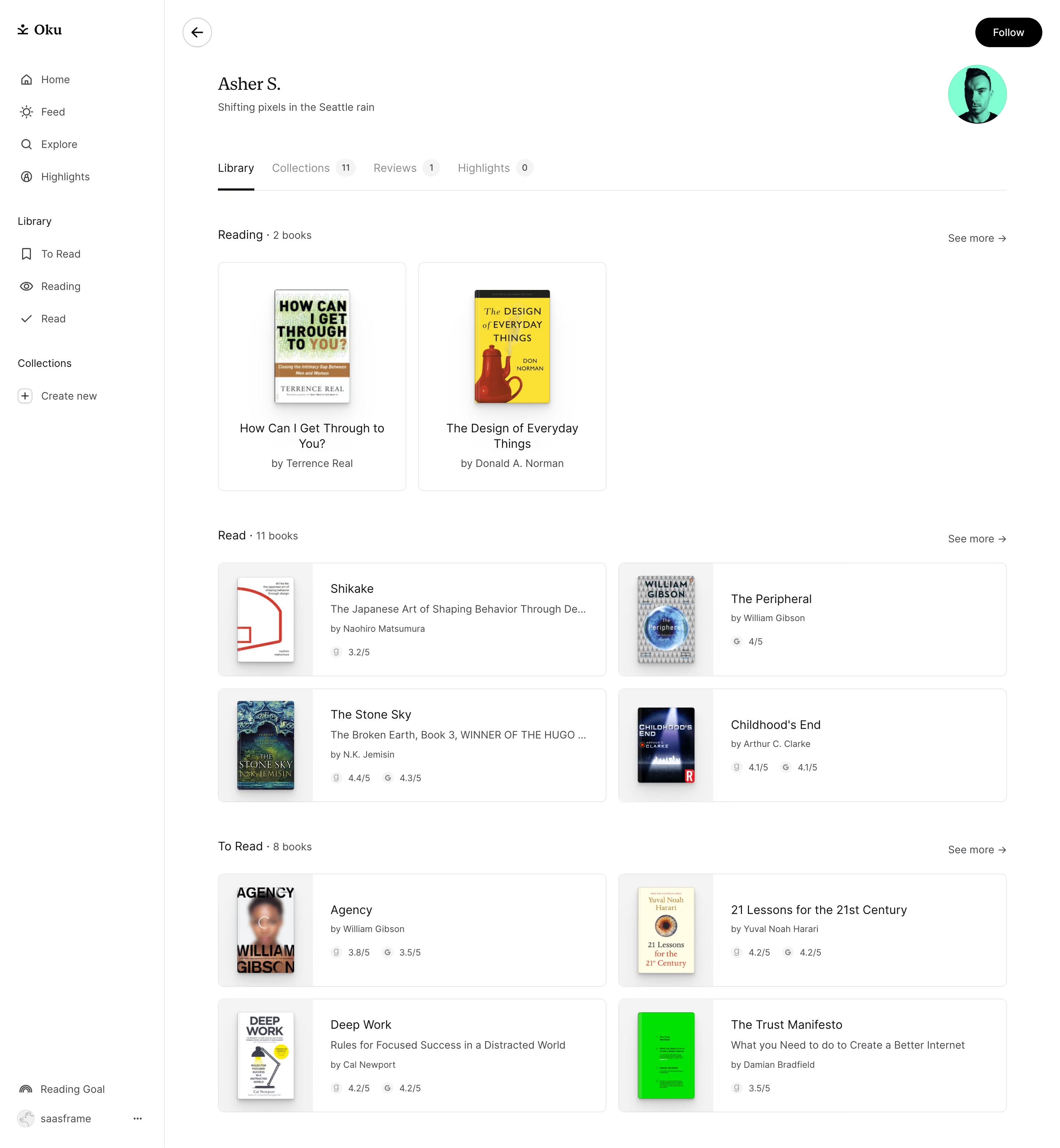
- **Character:** A quiet reading-profile page with white surfaces, serif identity text and book covers as the main color source.
- **Structure:** A narrow navigation sidebar and orderly library sections create a restrained personal-catalog experience.
### Page composition
- **Capture scale:** The source measures 2880 × 3120 pixels. A roughly 1440 × 1560 CSS-pixel page at 2× scale is plausible but unverified; both readable portions were inspected.
- **Sidebar:** A roughly 224-pixel estimated CSS rail contains brand, general navigation, reading-state links and collection creation, with lower goal/account utilities.
- **Profile header:** A back control sits above name/bio at left, while avatar and Follow action occupy the right.
- **Tabs:** Library, Collections, Reviews and Highlights run horizontally with count badges and a dark underline on Library.
- **Library:** Reading uses two tall cover cards; Read and To Read use two-column horizontal book cards, with section counts and See more links.
### Information hierarchy
- **Identity:** A serif name and short bio introduce the profile without a large banner.
- **Library status:** Reading, Read and To Read headings distinguish groups; total counts are shown even where only a subset of books is visible.
- **Book cards:** Cover, title, optional subtitle, author and small rating/source markers appear in descending prominence.
- **Actions:** Follow is the strongest filled control; See more links remain quiet at section edges.
### Typography
- **Families:** Profile identity and brand use a serif; navigation and book metadata use a sans serif. Exact identities are unverified.
- **Profile name:** Approximately 26 estimated CSS pixels, regular.
- **Book titles:** Around 16 pixels with 21-pixel line height; author/subtitle text is around 14 pixels.
- **Utility:** Rating metadata and badges are approximately 12 pixels, while section labels are around 16 pixels.
### Colors & surfaces
- **Measured palette:** ICC-aware sRGB sampling yields white #FFFFFF, pale gray #F3F4F4, border #E8E8E9 and near-white #F2F3F3/#F1F2F2.
- **Accents:** Black anchors Follow and the selected-tab underline; the profile portrait has a bright teal backdrop. Colorful book covers supply most remaining variation.
- **Captured cover color:** A vivid sampled green #00E600 belongs to one book cover, not the interface action system.
- **Treatment:** Thin gray borders and approximately 8-pixel estimated CSS corners contain cards, with soft shadows on cover images.
### Components
- **Tall reading cards:** Roughly 255 × 310 estimated CSS pixels, with centered cover, title and author.
- **Horizontal cards:** Two roughly 528-pixel-wide columns pair a pale cover well at left with text/rating details at right.
- **Tabs:** Small pale count badges accompany inactive destinations; a short black line marks the active Library tab.
- **Profile controls:** A circular outlined back arrow contrasts with the black rounded Follow pill.
- **Sidebar:** Simple line icons pair with labels; collection creation uses a small boxed plus.
### Visual rhythm
- **Spacing:** Approximately 48-pixel intervals separate library groups; card grids use roughly 16-pixel gaps.
- **Alignment:** Section headings and cards share a broad left edge, while See more links align far right.
- **Density:** Larger current-reading cards lead into denser horizontal catalog rows.
### Responsive
- **Recommendation:** Collapse the sidebar and reduce library cards to one column where titles become crowded.
- **Recommendation:** Wrap profile tabs horizontally or into a compact navigation pattern, keeping counts legible. No mobile state is shown.
### Adaptation guidance
- **Preserve:** Retain cover-led discovery, clear reading-state groups and restrained metadata.
- **Build:** Use shared book-card variants for tall/current-reading and compact catalog layouts.
- **Privacy:** Use generic profile details in reusable examples and avoid treating captured reading counts as current live data.
Use this context to reproduce the reference's visual language: layout, typography, colors, spacing, borders, radii, and distinctive elements. The screenshot takes priority if descriptions conflict.
## Direction
{{preferences.fidelityInstructions}}
## Output
{{output.instructions}}
Deliver a polished, cohesive design with precise alignment, hierarchy, and spacing. Produce the requested visual artifact, not just a description. If unsupported, explain the limitation.