
Thank you! Your submission has been received!
Oops! Something went wrong while submitting the form.
Get SaaSFrame Pro
Monthly
$18
Quarterly
$48
Yearly
$180
Upgrade to access this feature
Browse all screens & flows
Filter and search screens & flows
Access Figma files
Access mobile versions
Bookmark screens & flows
Join now
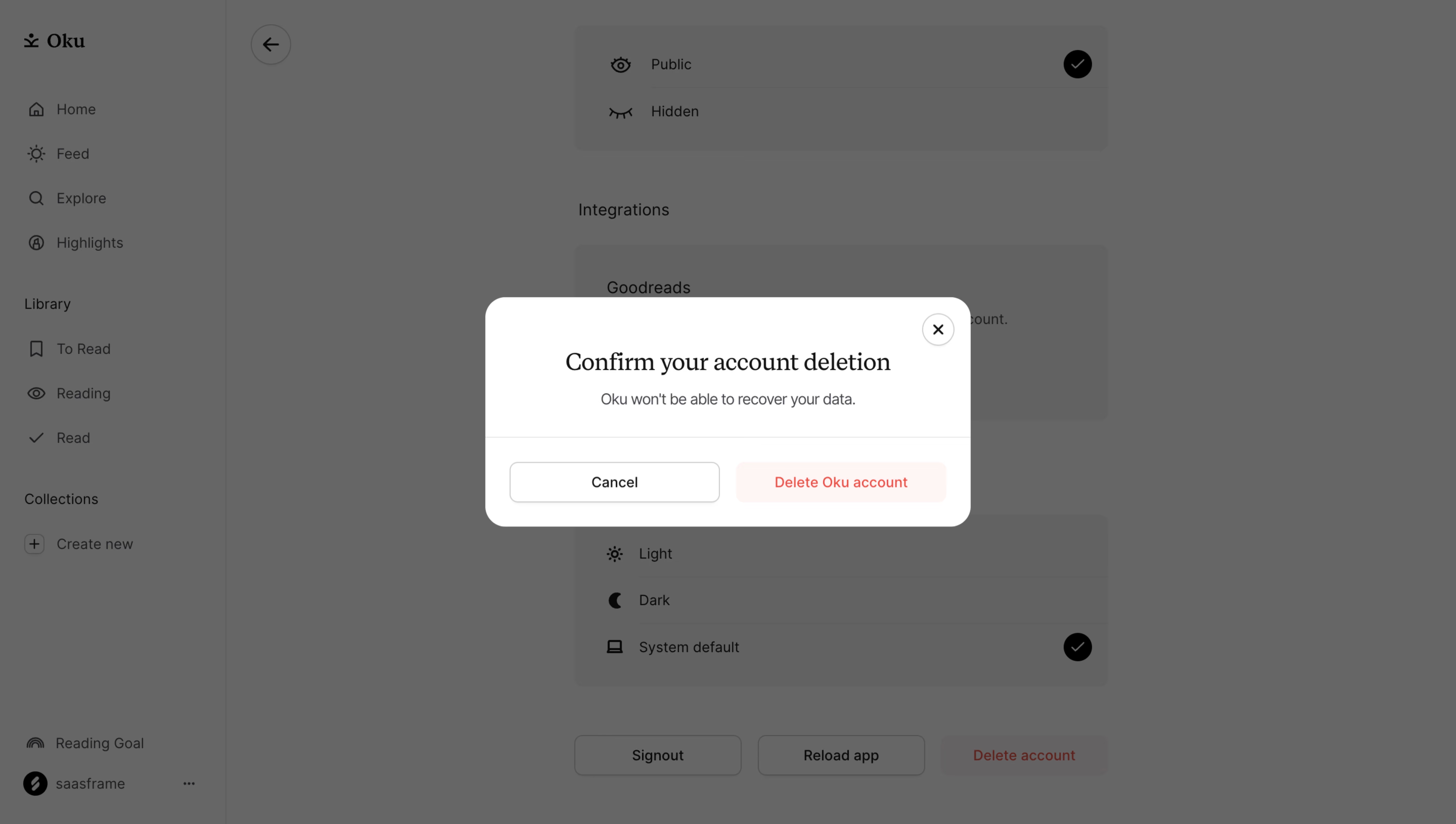
Oku Delete Account Confirmation

Oku
The companion app for every book.
Designed by
No items found.

Bookmark
Bookmark

Design with AI
Thank you! Your submission has been received!
Oops! Something went wrong while submitting the form.
# Design from Reference: Oku Delete Account Confirmation
Create an original, high-fidelity visual design inspired by the reference. Prioritize composition, typography, colors, spacing, and component styling over technical implementation.
## Reference
- **Product:** Oku
- **Category:** Confirmation
- **Screenshot:** https://cdn.prod.website-files.com/5e9dc792e1210c5325f7ebbc/6acad62afef6904ce0090e68_6acad5b0f29b80df5f1010c6_cms-0a308c76361ce2b08c14064d.webp
Analyze the screenshot first. If inaccessible, request it rather than guessing.
## Content
{{content.instructions}}
{{content.data}}
Preserve essential messaging and factual accuracy. Adapt structure and copy length for visual balance; never invent product claims.
## Visual Design
### Overall aesthetic
- **Style:** Calm reading-app interface with a centered white confirmation dialog over a gray-dimmed settings page.
- **Character:** A serif confirmation title and softly rounded controls give the destructive workflow a restrained, approachable presentation.
- **Capture:** The screenshot measures 5760 × 3260 pixels. CSS estimates assume a 4× capture, equivalent to approximately 1440 × 815 CSS pixels; actual scale and font identities are unverified.
### Page composition
- **Underlying shell:** A roughly 224-CSS-pixel left rail contains reading navigation, library groups, collections and lower account controls.
- **Settings context:** The dimmed main area shows visibility choices, integration information, theme options and account actions in a narrow central column.
- **Dialog placement:** A roughly 480 × 227-pixel white modal is centered near x480, y294.
- **Dialog structure:** A small close control sits upper right; a centered title and short warning occupy the upper body.
- **Action area:** A thin divider separates two equal-width horizontal buttons from the message.
### Information hierarchy
- **Primary message:** The serif heading explicitly requests account-deletion confirmation.
- **Consequence:** A smaller gray line warns that data cannot be recovered.
- **Action distinction:** Cancel is neutral and outlined; the deletion action uses red text on a pale-red surface.
- **Dismissal:** A circular X offers an additional way to leave the dialog.
- **Background suppression:** A uniform scrim reduces the settings page's prominence without removing context.
- **State scope:** This is a pending decision, with no completed deletion or subsequent feedback shown.
### Typography
- **Title family:** A serif is visible in the dialog heading; exact identity is unverified.
- **Title scale:** Approximately 26-pixel CSS size, regular weight, with around 34-pixel line height.
- **Body family:** Warning and controls use sans-serif; exact identity is unverified.
- **Warning:** Approximately 14–15 pixels with 22-pixel line height.
- **Buttons:** Approximately 14 pixels, medium weight, centered.
- **Background labels:** Compact sans-serif navigation and settings labels remain readable through the overlay but subordinate.
### Colors & surfaces
- **Measured modal:** White #FFFFFF fills the dialog.
- **Measured overlay appearance:** Gray #666666 and #616262 dominate the dimmed screenshot; these are composited visible colors, not verified underlying CSS surface tokens.
- **Measured destructive surface:** Pale red #FFF6F5 supports the deletion action.
- **Measured text:** Black #000000 appears in principal title/control pixels.
- **Accent role:** Red text identifies the destructive choice, while warning copy is neutral gray.
- **Depth:** The modal has large rounded corners and a clean white surface; the scrim provides most separation.
### Components
- **Modal:** Approximately 480 pixels wide with 20-pixel corners.
- **Close control:** A roughly 32-pixel circular outlined button sits about 16 pixels from the upper/right edges.
- **Message body:** Centered heading and warning use generous horizontal padding and roughly 44-pixel top spacing.
- **Divider:** A fine gray rule spans the modal above the action row.
- **Cancel:** Approximately 208 × 40 pixels, white with a thin gray outline, subtle shadow and 8-pixel corners.
- **Destructive action:** Approximately 208 × 40 pixels, pale red with red label and matching corner radius.
- **Underlying settings:** Visibility and theme choices use icon-label rows with circular selected checks; account actions sit beneath them.
- **Interaction scope:** The screenshot evidences the confirmation presentation only; no button activation is performed or implied.
### Visual rhythm
- **Centering:** Dialog title, warning and modal align to the viewport center.
- **Message spacing:** A small gap connects title and consequence, followed by a larger break before actions.
- **Action symmetry:** Equal button widths and a 16-pixel gap balance the neutral and destructive choices.
- **Context retention:** The narrow settings column remains recognizable behind the uniform overlay.
- **Whitespace:** Large dimmed margins isolate the decision without additional decoration.
### Responsive
- **Recommendation — modal width:** Use fluid width with at least 16-pixel viewport gutters.
- **Recommendation — buttons:** Stack actions when two labels cannot fit comfortably side by side.
- **Recommendation — message:** Allow the title and warning to wrap while retaining clear hierarchy.
- **Recommendation — accessibility:** Trap focus, label the dialog and restore focus after dismissal.
- **Recommendation — short screens:** Permit scrolling without hiding either action. No mobile state is evidenced.
### Adaptation guidance
- **Keep consequences explicit:** Retain a concise irreversible-data warning near the decision.
- **Maintain action differentiation:** Use neutral cancellation and clear destructive wording alongside red styling.
- **Reuse restrained styling:** Keep white surface, large corners, fine divider and limited color emphasis.
- **Separate context from interaction:** Dim the underlying settings and prevent accidental background interaction while the dialog is open.
- **Define result feedback separately:** Completion, failure and progress states are not shown.
- **Preserve safe dismissal:** Provide a clear cancel route and accessible close control.
Use this context to reproduce the reference's visual language: layout, typography, colors, spacing, borders, radii, and distinctive elements. The screenshot takes priority if descriptions conflict.
## Direction
{{preferences.fidelityInstructions}}
## Output
{{output.instructions}}
Deliver a polished, cohesive design with precise alignment, hierarchy, and spacing. Produce the requested visual artifact, not just a description. If unsupported, explain the limitation.


Category
Patterns
Tech Stack

Added on
November 14, 2023
Similar screens
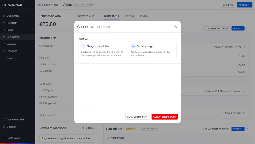





Upgrade to SaaSFrame Pro now to see similar examples.
Monthly
$18 /month
Billed $18 monthly
Browse all screens & flows
Filter and search screens & flows
Search text in screenshots
Access Figma files
Access mobile versions
Join now
Quarterly
$16 /month
Billed $48 quarterly
Browse all screens & flows
Filter and search screens & flows
Search text in screenshots
Access Figma files
Access mobile versions
Join now
Yearly
$15 /month
Billed $180 yearly
Browse all screens & flows
Filter and search screens & flows
Search text in screenshots
Access Figma files
Access mobile versions
Join now