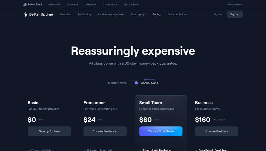
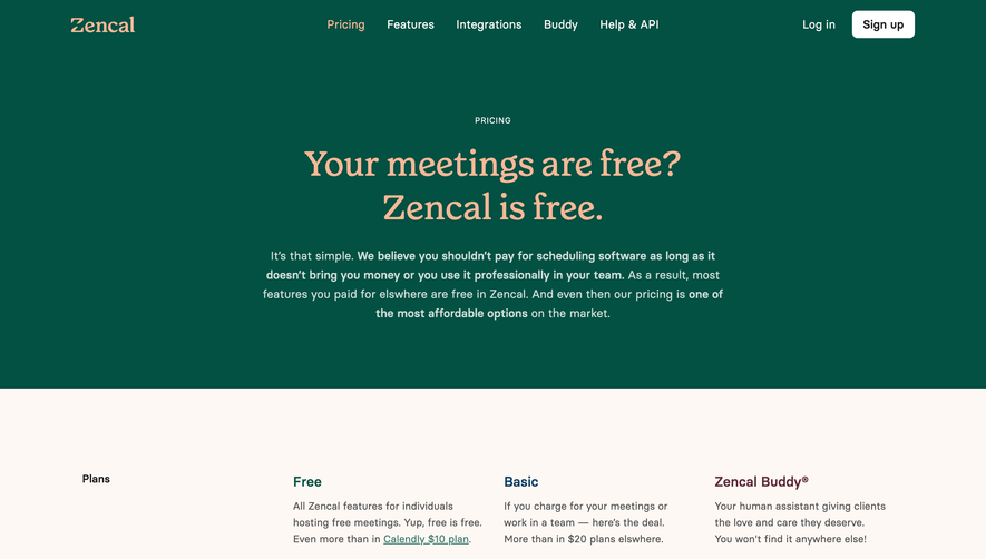
Overall Style and Aesthetic
Officevibe’s pricing page exudes a fresh, approachable professionalism with its clean, modern aesthetic. The design strikes a balance between playfulness and credibility, leveraging softly rounded shapes, ample whitespace, and gentle color transitions for a welcoming, uncluttered look. The style radiates a sense of trust and transparency, inviting users to explore further without overwhelming them. Layout and Structure
The structure is expertly segmented: a concise hero section clearly states "Simple pricing to get started," followed by interactive pricing tables. Supplementary sections highlight key features, supplemented by subtle, human-centric illustrations. Importantly, the entire flow is linear and intuitive—no section overshadows the main focus on pricing, keeping visitors engaged and informed. Visual Elements
Delicate, friendly illustrations reinforce the platform’s people-first attitude. Custom icons distill complex features into instantly recognizable visuals, while strategic use of micro-animations (like hover states on buttons) subtly enhance interactivity. The imagery remains consistently on-brand, utilizing abstract, non-distracting motifs that complement content without competing for attention. Color Palette and Typography
A harmonious palette leads with teal and mint green, accented by navy and gentle lavender. This fresh color scheme is both calming and distinctive, aiding navigation. Font choices are modern sans-serifs, with headings set bold for clarity and body text remaining highly legible. Hierarchy is established through thoughtful sizing and color contrast, ensuring key information always stands out. User Experience Patterns
Navigation is minimized and pinned for ease, with persistent CTAs ("Get started," "Contact sales") that guide users toward conversion. Pricing toggles and plan breakdowns use clear, interactive controls. Tooltips and accessible forms reduce friction, while deep scrolls are punctuated by footer links and support resources—making the whole experience smooth, informative, and reassuring. Unique or Notable Design Choices
Noteworthy is the transparent, jargon-free communication style, supported by empathetic illustrations that personify the brand. The subtle animation and iconography serve the content, never distracting from decision-making. The overall tone is warm and confidence-inspiring—perfect inspiration for SaaS designers wishing to combine clarity, brand personality, and seamless usability.