Overall Style and Aesthetic
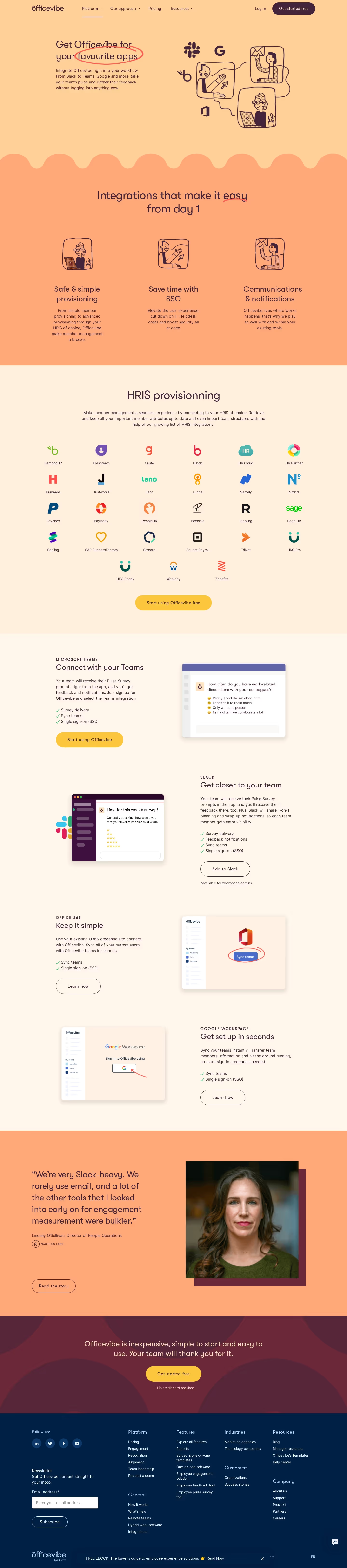
Officevibe’s Integrations page radiates a modern, approachable, and slightly playful professionalism. The aesthetic is clean and uncluttered, championing white space and soft, rounded elements that evoke a sense of friendliness while retaining corporate credibility. Colorful accent illustrations and icons give the page energy without overwhelming the core content—a perfect balance for audiences seeking both function and warmth. Layout and Structure
The structure unfolds logically: a prominent hero section introduces integrations with concise text and a sweeping, vibrant illustration to set the tone. Below, integrations are grouped visually and categorized, each accompanied by branded icons for immediate recognition. Instead of overwhelming visitors, information density is managed with collapsible sections, gentle reveals, and smart use of microinteractions. The page closes with compelling CTAs and a concise, well-designed footer, maintaining flow and clarity throughout. Visual Elements
Custom vector illustrations and branded icons are woven throughout, creating visual coherence with Officevibe’s friendly brand personality. Animated interactions—such as icon hovers and slide-ins—add dynamism without distracting the user. No stock photography clutters the design; instead, graphics tell the story, making complex integration partners feel approachable and easy to grasp. Color Palette and Typography
The palette is light and inviting: crisp whites, soft grays, and strategic splashes of Officevibe’s signature blues, greens, and purples. Typography is modern and functional, employing clean sans-serif fonts with thoughtful hierarchy. Headlines are bold but not aggressive, while body copy remains readable and approachable. User Experience Patterns and Unique Choices
Navigation is frictionless, with a sticky header and smooth-scrolling anchor links. Strategic CTAs—like “Get Started” and “Contact Us”—are prominent yet tastefully subdued, ensuring user intent guides action. Notably, the page shines with its restrained, consistent use of brand illustration, micro-interactions, and intuitive categorical organization—qualities that elevate both usability and visual delight. The overall tone is inviting, reliable, and quietly innovative, making complex SaaS integrations feel simple and accessible.