
Thank you! Your submission has been received!
Oops! Something went wrong while submitting the form.
Get SaaSFrame Pro
Monthly
$18
Quarterly
$48
Yearly
$180
Upgrade to access this feature
Browse all screens & flows
Filter and search screens & flows
Access Figma files
Access mobile versions
Bookmark screens & flows
Join now

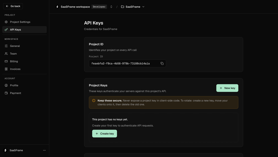
Moss Project API keys empty state

Moss
The retrieval layer for production AI
Designed by
No items found.

Bookmark
Bookmark

Design with AI
Thank you! Your submission has been received!
Oops! Something went wrong while submitting the form.
# Design from Reference: Moss Project API keys empty state
Create an original, high-fidelity visual design inspired by the reference. Prioritize composition, typography, colors, spacing, and component styling over technical implementation.
## Reference
- **Product:** Moss
- **Category:** Empty State
- **Screenshot:** https://cdn.prod.website-files.com/5e9dc792e1210c5325f7ebbc/6acf5250052e3ba5eb2c837a_TtKggq-eHcRw8AcPzdrJ_nezQx_WZ0lDLKuLOjGQxmo.png
Analyze the screenshot first. If inaccessible, request it rather than guessing.
## Content
{{content.instructions}}
{{content.data}}
Preserve essential messaging and factual accuracy. Adapt structure and copy length for visual balance; never invent product claims.
## Visual Design
### Overall aesthetic
- **Style:** Dark developer-settings screen with nearly black canvas, charcoal panels and mint-green creation actions.
- **Character:** Monospace labels, restrained borders and an amber guidance callout emphasize a technical credential-management workflow.
- **Capture:** The screenshot measures 2880 × 2034 pixels. CSS estimates assume a 2× capture, equivalent to approximately 1440 × 1017 CSS pixels; actual scale and font identities are unverified.
### Page composition
- **Sidebar:** An approximately 254-CSS-pixel rail groups project, workspace and account settings, with a back control above and workspace identity below.
- **Top context bar:** Workspace identity, a Developer badge and project selector span the header of the main region.
- **Main column:** An approximately 824-pixel-wide column begins around x435, with page title and short credential subtitle.
- **Project identity:** The first panel contains a project-ID heading, explanation, small monospace label and copyable identifier.
- **Project keys:** The larger middle panel contains a heading/description, top-right New key action, amber guidance block and dashed empty-state region with a second creation action.
- **CLI tokens:** A lower panel explains token origin and shows a dashed empty state with a monospace command fragment.
### Information hierarchy
- **Location:** API Keys is highlighted within the Project sidebar group.
- **Page heading:** The main title is the strongest text above the three credential categories.
- **Category separation:** Project ID, project keys and CLI tokens have distinct panels and explanations.
- **Empty state:** The project-key region explicitly communicates that no keys exist and offers creation.
- **Guidance:** An amber icon and bold opening distinguish cautionary guidance from neutral descriptions.
- **Action emphasis:** Mint buttons are the brightest controls; copy and selection utilities remain secondary.
- **Captured state:** The project identifier is visible, while key and CLI-token lists are empty.
### Typography
- **Family:** A neutral UI sans-serif is visible, with monospace used for developer labels and command/value text; exact identities are unverified.
- **Page title:** Approximately 24-pixel CSS size, semibold, with around 30-pixel line height.
- **Panel headings:** Approximately 16 pixels and semibold.
- **Body and controls:** Approximately 14 pixels with 20–22-pixel line height.
- **Monospace labels:** Approximately 12–14 pixels; sidebar group labels are uppercase and widely tracked.
- **Secondary text:** Muted gray descriptions remain the same scale as primary body text, using color to reduce prominence.
### Colors & surfaces
- **Measured canvas:** Near-black #0A0A0A fills the main background and rail.
- **Measured panels:** Charcoal #111111 supports the three main containers.
- **Measured boundaries:** #242424 and #181818 occur among borders and selected surfaces.
- **Measured action:** Mint #ABE6C7 fills the creation buttons.
- **Measured guidance surface:** Dark amber-brown #282013 supports the caution block.
- **Measured text:** Near-white #FAFAFA and gray #A3A3A3 distinguish primary and secondary copy.
- **Depth:** The interface is flat; fine outlines and subtle fill shifts provide separation without shadows.
### Components
- **Sidebar selection:** A rounded dark-gray row pairs a mint key icon with the selected label.
- **Context selectors:** Workspace and project names have small dropdown chevrons; the Developer badge uses a compact dark monospace treatment.
- **Identity panel:** Approximately 824 × 182 CSS pixels, with 12-pixel corners and 24-pixel padding.
- **Copy field:** A roughly 400 × 40-pixel outlined dark box contains a monospace identifier and a right-aligned copy icon; the literal value is not a design token.
- **Key panel:** Approximately 824 × 358 pixels, with the same border/radius system.
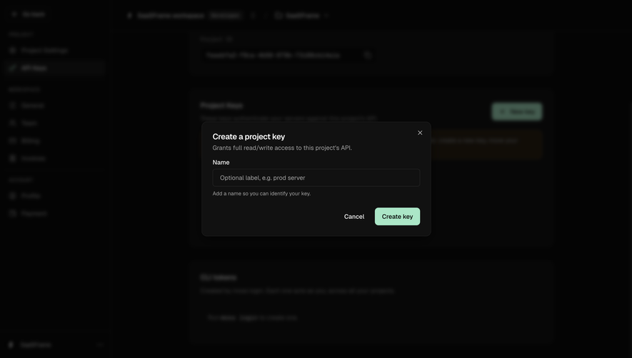
- **Creation buttons:** Mint rounded rectangles about 40 pixels high combine a plus icon with dark text. New key and Create key appear in different panel positions.
- **Guidance callout:** A full-width amber-outlined block contains a small alert icon and two-line explanatory copy.
- **Empty region:** A dashed rounded rectangle contains a short state message, muted supporting sentence and creation action.
- **CLI panel:** A shorter rounded panel includes another dashed inset and a command-style phrase within the empty-state sentence.
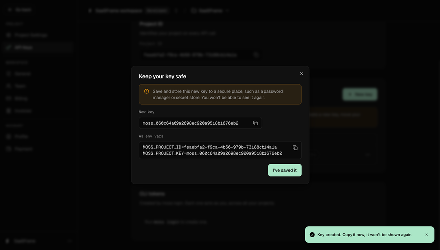
- **State scope:** No key-creation dialog, secret value, token list or copy confirmation is visible.
### Visual rhythm
- **Main spacing:** Approximately 32-pixel vertical gaps separate the three panels.
- **Internal rhythm:** Shared 24-pixel padding aligns headings, descriptions and inset regions.
- **Sidebar grouping:** Rules and widely tracked group labels divide related settings links.
- **Action placement:** Top-right creation and lower-left empty-state action provide equivalent routes within the same module.
- **Contrast economy:** Mint controls and amber guidance interrupt an otherwise monochrome layout sparingly.
### Responsive
- **Recommendation — shell:** Collapse the sidebar and context selectors on narrow screens while retaining project identity.
- **Recommendation — panels:** Use fluid widths and preserve readable internal padding.
- **Recommendation — identifiers:** Allow long values to truncate or scroll with copy access retained.
- **Recommendation — actions:** Stack panel headings and creation buttons when they no longer fit one row.
- **Recommendation — guidance:** Wrap alert copy without squeezing the icon or overflowing the panel. No mobile layout is evidenced.
### Adaptation guidance
- **Keep credential types separate:** Preserve independent project identity, server-key and CLI-token modules.
- **Use explicit empty states:** Explain absence and provide a clear creation route rather than leaving a blank table.
- **Reuse dark tokens:** Maintain near-black canvas, charcoal panels, fine outlines and mint actions.
- **Keep technical values readable:** Use monospace selectively for identifiers and command fragments.
- **Define unseen feedback:** Creation, copy, revocation and secret-reveal states require separate design; none is shown.
- **Avoid copying account data:** Treat the visible project identifier as example content rather than reusable interface copy.
Use this context to reproduce the reference's visual language: layout, typography, colors, spacing, borders, radii, and distinctive elements. The screenshot takes priority if descriptions conflict.
## Direction
{{preferences.fidelityInstructions}}
## Output
{{output.instructions}}
Deliver a polished, cohesive design with precise alignment, hierarchy, and spacing. Produce the requested visual artifact, not just a description. If unsupported, explain the limitation.


Category
Tech Stack
No items found.
Added on
October 14, 2026
Similar screens


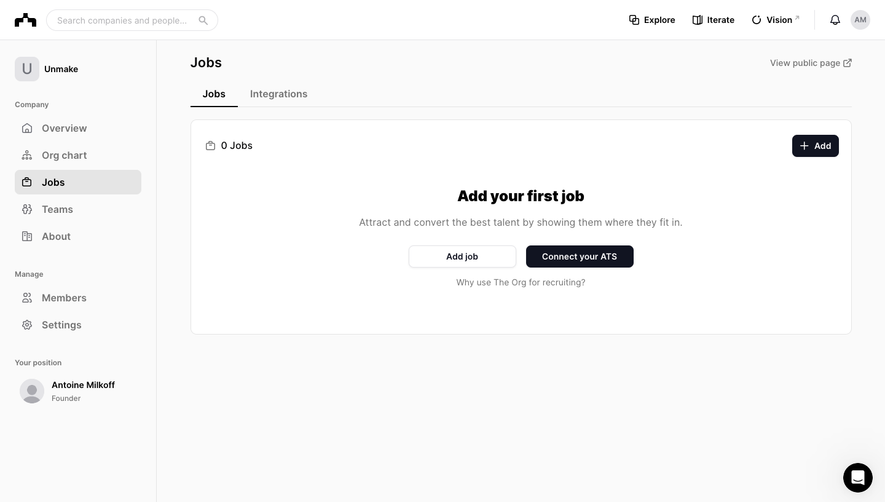

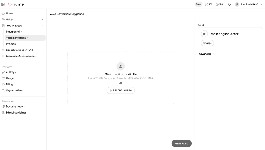
Upgrade to SaaSFrame Pro now to see similar examples.
Monthly
$18 /month
Billed $18 monthly
Browse all screens & flows
Filter and search screens & flows
Search text in screenshots
Access Figma files
Access mobile versions
Join now
Quarterly
$16 /month
Billed $48 quarterly
Browse all screens & flows
Filter and search screens & flows
Search text in screenshots
Access Figma files
Access mobile versions
Join now
Yearly
$15 /month
Billed $180 yearly
Browse all screens & flows
Filter and search screens & flows
Search text in screenshots
Access Figma files
Access mobile versions
Join now