
Thank you! Your submission has been received!
Oops! Something went wrong while submitting the form.
Get SaaSFrame Pro
Monthly
$18
Quarterly
$48
Yearly
$180
Upgrade to access this feature
Browse all screens & flows
Filter and search screens & flows
Access Figma files
Access mobile versions
Bookmark screens & flows
Join now
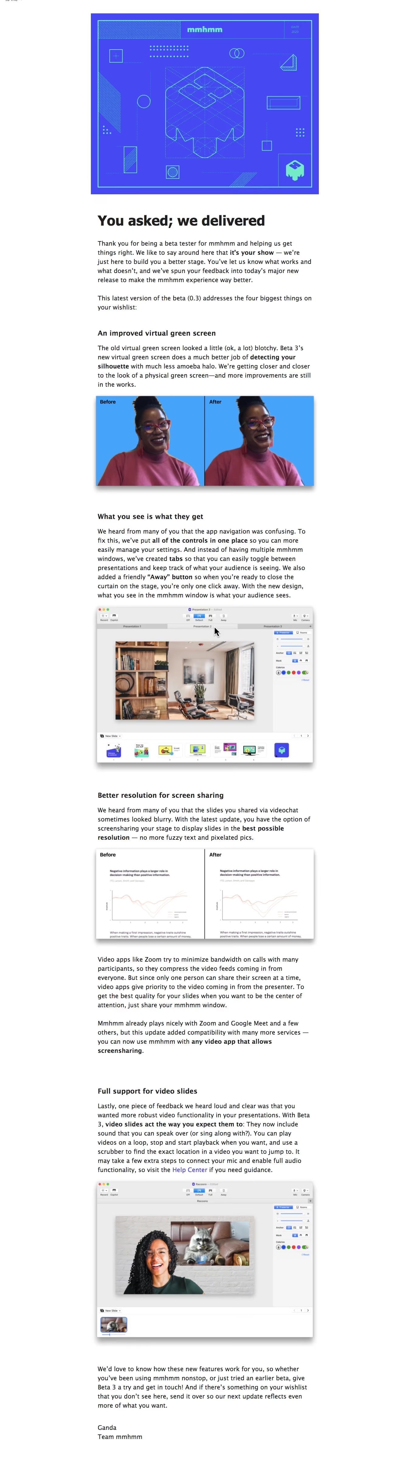
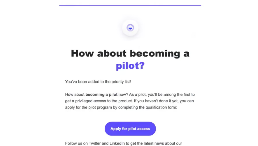
Mmhmm Early Access Emails

Mmhmm
It’s your show.
Designed by
No items found.

Bookmark
Bookmark

Design with AI
Thank you! Your submission has been received!
Oops! Something went wrong while submitting the form.
# Design from Reference: Mmhmm Early Access Emails
Create an original, high-fidelity visual design inspired by the reference. Prioritize composition, typography, colors, spacing, and component styling over technical implementation.
## Reference
- **Product:** Mmhmm
- **Category:** Early Access Emails
- **Screenshot:** https://cdn.prod.website-files.com/5e9dc792e1210c5325f7ebbc/6acbc143b7ca13cf70095bc5_6acbc03e39e7f22db402ee18_cms-9d05d339b5aa2084aa743fe0.webp
Analyze the screenshot first. If inaccessible, request it rather than guessing.
## Content
{{content.instructions}}
{{content.data}}
Preserve essential messaging and factual accuracy. Adapt structure and copy length for visual balance; never invent product claims.
## Visual Design
### Overall aesthetic
- **Character:** A long product-update email uses a white canvas, narrow centered reading column and large supporting screenshots.
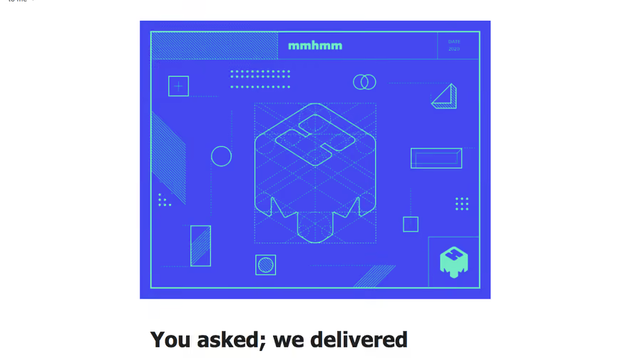
- **Brand expression:** A vivid blue-violet blueprint-style hero graphic introduces a practical, text-led release explanation. Bold phrases and section headings provide emphasis without card-based decoration.
### Page composition
- **Capture:** The source measures 1349 × 4812 image pixels. CSS scale and device-pixel ratio are unverified; dimensions below describe observed image pixels.
- **Email column:** The principal content is approximately 730 px wide, centered with broad white side gutters. The hero artwork is slightly wider than the prose.
- **Opening:** A large rectangular brand illustration precedes a bold release headline and two introductory paragraphs.
- **Feature sequence:** Four sections cover a virtual green-screen comparison, reorganized controls, screen-sharing resolution and video-slide support. Text alternates with before/after panels and desktop-app screenshots.
- **Closing:** A feedback invitation and short two-line personal/team sign-off end the message. No large action button or decorative footer is visible.
### Information hierarchy
- **Opening headline:** The bold release announcement is the largest text element below the hero artwork.
- **Feature headings:** Each update begins with a compact bold heading, followed by explanatory copy and relevant visual evidence.
- **Inline emphasis:** Selected phrases within paragraphs use heavier weight to highlight the main change.
- **Support route:** A blue-violet Help Center link appears within the final feature explanation rather than as a separate primary button.
### Typography
- **Family:** Body and headings use a humanist-looking sans serif; exact font identity is unverified.
- **Main heading:** Approximately 46–48 px in the source, heavy, with tight line spacing.
- **Body:** Approximately 21–22 px with around 30 px line height, producing a comfortable reading measure across the long column.
- **Section headings:** Approximately 24 px and bold, with generous space above and a smaller gap before the paragraph.
- **Visual annotations:** Before/After labels within comparison images use compact bold sans-serif text; app-interface labels are substantially smaller.
### Colors & surfaces
- **Measured foundation:** ICC-aware sRGB sampling yields #FFFFFF for the email canvas, with #ECECEC and #F6F6F6 in embedded application surfaces.
- **Measured hero accent:** Blue-violet #4648F2 dominates the blueprint illustration, paired with mint/cyan linework.
- **Measured screenshot accent:** Bright blue #45A4FA appears in the green-screen comparison background.
- **Text and links:** Near-black body text contrasts strongly with white. The support link uses a violet-blue related to the hero palette.
- **Depth:** Embedded comparison panels and app screenshots have visible gray drop shadows; the email itself has no enclosing bordered card.
### Components
- **Hero graphic:** A roughly 750 × 595 px blueprint panel contains the mmhmm wordmark, geometric construction lines, dotted grids and an isometric central brand form.
- **Before/after panels:** Two equal image halves are divided by a vertical rule and labeled at the top. One compares a person against blue; another compares slide-image sharpness.
- **Application screenshots:** Desktop windows show title bars, presentation tabs, a large stage, right-side controls and a bottom thumbnail strip.
- **Feature blocks:** Each combines a bold heading, one or more paragraphs and a full-column image, with no separate background container.
- **Sign-off:** A short name/team signature remains plain text and left aligned with the body.
### Visual rhythm
- **Long-form cadence:** Large gaps distinguish feature sections, while paragraphs within a section use smaller consistent spacing.
- **Text/image alternation:** Broad screenshots interrupt dense prose and create visual checkpoints throughout the email.
- **Alignment:** Headings, paragraphs and sign-off share the same left edge; image shadows extend slightly beyond that text boundary.
- **Whitespace:** Wide outer gutters and generous vertical spacing keep the long message readable despite substantial copy.
### Responsive
- **Evidence boundary:** Only one email capture is shown; responsive behavior is a recommendation.
- **Fluid column:** Constrain the email to a readable maximum width and reduce side gutters on narrow clients.
- **Media scaling:** Scale comparison panels and screenshots proportionally, with useful alternative text because embedded interface labels may become small on phones.
- **Reading comfort:** Preserve body line height and section spacing; avoid fixed-width content that forces horizontal scrolling.
### Adaptation guidance
- **Release narrative:** Reuse the sequence of user-feedback acknowledgement, four concrete changes, visual comparisons and a feedback invitation.
- **Evidence pairing:** Place each screenshot directly after the explanation it supports, using consistent widths and restrained shadows.
- **Email resilience:** Use robust email-compatible layout and linked images with descriptive alternatives; keep the help route available as real text.
- **Content boundaries:** The capture shows a beta-release update, despite the broader record label. Describe its visible content rather than inferring an access-invitation flow.
- **Measurement use:** Validate the observed image dimensions against the intended email CSS width before implementation.
Use this context to reproduce the reference's visual language: layout, typography, colors, spacing, borders, radii, and distinctive elements. The screenshot takes priority if descriptions conflict.
## Direction
{{preferences.fidelityInstructions}}
## Output
{{output.instructions}}
Deliver a polished, cohesive design with precise alignment, hierarchy, and spacing. Produce the requested visual artifact, not just a description. If unsupported, explain the limitation.


Category
Patterns
No items found.
Tech Stack
No items found.
Added on
February 4, 2023


Similar screens


Upgrade to SaaSFrame Pro now to see similar examples.
Monthly
$18 /month
Billed $18 monthly
Browse all screens & flows
Filter and search screens & flows
Search text in screenshots
Access Figma files
Access mobile versions
Join now
Quarterly
$16 /month
Billed $48 quarterly
Browse all screens & flows
Filter and search screens & flows
Search text in screenshots
Access Figma files
Access mobile versions
Join now
Yearly
$15 /month
Billed $180 yearly
Browse all screens & flows
Filter and search screens & flows
Search text in screenshots
Access Figma files
Access mobile versions
Join now