Design with AI
Generate a new design based on this screen using your own content.
# Design from Reference: Miro Newsletters
Create an original, high-fidelity visual design inspired by the reference. Prioritize composition, typography, colors, spacing, and component styling over technical implementation.
## Reference
- **Product:** Miro
- **Category:** Newsletters
- **Screenshot:** https://cdn.prod.website-files.com/5e9dc792e1210c5325f7ebbc/62ecad83eb86d361d684f458_1659676950013-5ef61962b3424a097a9e15cc_screencapture-mail-google-mail-u-1-2020-06-26-17_49_58.webp
Analyze the screenshot first. If inaccessible, request it rather than guessing.
## Content
{{content.instructions}}
{{content.data}}
Preserve essential messaging and factual accuracy. Adapt structure and copy length for visual balance; never invent product claims.
## Visual Design
### Overall aesthetic
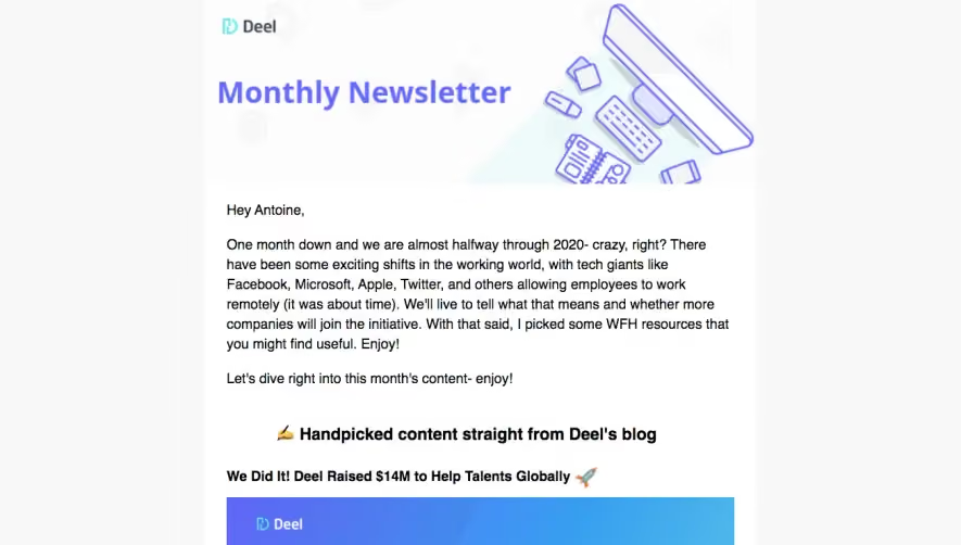
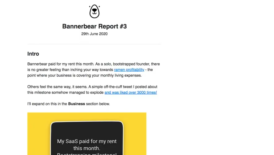
- **Character:** Text-rich community newsletter with dark navy typography, playful editorial art and understated outlined actions.
### Page composition
- **Canvas:** 1300 × 3195 screenshot px.
- **Structure:** Narrow white email column on a pale-gray surround; logo and personal introduction; illustrated guide; template bullet list; conference banner; workshop image and RSVP. Three centered buttons punctuate the left-aligned editorial content.
### Information hierarchy
- **Priority:** Bold section headings introduce each resource. Underlined links distinguish templates; large images anchor guide and event sections.
### Typography
- **Family:** Familiar sans serif, exact font unverified.
- **Scale:** Estimated screenshot body 20 px with approximately 29 px leading, section headings 26–28 px bold and buttons 18 px.
### Colors & surfaces
- **Sampled palette:** Surround #F3F5F9, white #FFFFFF, lavender image background #DADDF5, navy text #080938, light UI #F2F2F2 and blue #3F52D9.
### Components
- **Artwork:** Pink brain with oversized eyes and blue raindrops; geometric navy/pink/yellow conference banner; product-board workshop screenshot with participant video tiles.
- **Actions:** White rectangular buttons with blue outlines and minimal rounding; centered below supporting copy.
- **Content:** Bulleted resource links and paragraphs share a consistent narrow reading width; no separate card around each section.
### Visual rhythm
- **Spacing:** Approximately 48–64 screenshot px between resource sections and 20–28 px paragraph gaps. Full-width imagery provides visual rests within dense copy.
### Responsive
- **Observed:** Email screenshot only.
- **Adaptation:** Use fluid images, 20–24 CSS px mobile padding and readable list indentation; keep each action beside its relevant resource.
### Adaptation guidance
- **Preserve:** Newsletter letter opening, navy/blue restraint and playful resource artwork.
- **Replace:** Use current resources, actual event dates and authorized workshop images.
Use this context to reproduce the reference's visual language: layout, typography, colors, spacing, borders, radii, and distinctive elements. The screenshot takes priority if descriptions conflict.
## Direction
{{preferences.fidelityInstructions}}
## Output
{{output.instructions}}
Deliver a polished, cohesive design with precise alignment, hierarchy, and spacing. Produce the requested visual artifact, not just a description. If unsupported, explain the limitation.