Design with AI
Generate a new design based on this screen using your own content.
# Design from Reference: Miro ira Account Verification Email
Create an original, high-fidelity visual design inspired by the reference. Prioritize composition, typography, colors, spacing, and component styling over technical implementation.
## Reference
- **Product:** Miro
- **Category:** Verification Email
- **Screenshot:** https://cdn.prod.website-files.com/5e9dc792e1210c5325f7ebbc/62ecad76c8eb83ca168e3218_1659676932666-5f0b1cc63ebbae3d97b658f8_screencapture-mail-google-mail-u-1-2020-07-12-16_21_56.webp
Analyze the screenshot first. If inaccessible, request it rather than guessing.
## Content
{{content.instructions}}
{{content.data}}
Preserve essential messaging and factual accuracy. Adapt structure and copy length for visual balance; never invent product claims.
## Visual Design
### Overall aesthetic
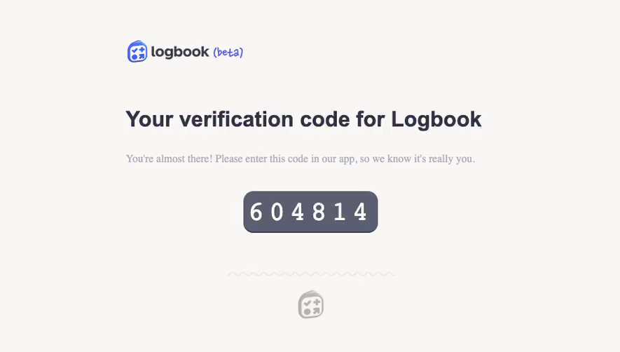
- **Character:** Direct transactional verification email with a prominent code and clear alternate action.
### Page composition
- **Canvas:** 1299 × 1092 screenshot px. Centered white email panel on a pale gray-blue background; brand and outlined destination button occupy the top row, notification footer sits outside.
### Information hierarchy
- **Priority:** Registration heading leads to instructions, oversized six-digit code, mobile guidance, blue confirmation action, and an ignore-if-unrequested note.
### Typography
- **Scale:** Approximately 52 screenshot px heading, 60 px code, 26 px body, and 22 px footer. Sans serif family and CSS scale unverified.
### Colors & surfaces
- **Palette:** Sampled sRGB background #F3F5F9, panel #FFFFFF, blue #2B78FB, and navy #080938. Muted lavender-gray supports explanatory text.
### Components
- **Details:** Large pale code rectangle with subtle 4 px corners; solid blue rectangular confirmation button and thin navy outlined Go to Miro button.
### Visual rhythm
- **Spacing:** Approximately 50 screenshot px inner padding and 36–44 px vertical gaps; single-column content with strong left alignment.
### Responsive
- **Adaptation:** Mobile is not shown. Use fluid email width and maintain large selectable code and thumb-friendly confirmation action.
### Adaptation guidance
- **Transfer:** Retain code-first verification and fallback action. Generate real one-time tokens and destinations; never reuse the screenshot's code.
Use this context to reproduce the reference's visual language: layout, typography, colors, spacing, borders, radii, and distinctive elements. The screenshot takes priority if descriptions conflict.
## Direction
{{preferences.fidelityInstructions}}
## Output
{{output.instructions}}
Deliver a polished, cohesive design with precise alignment, hierarchy, and spacing. Produce the requested visual artifact, not just a description. If unsupported, explain the limitation.