
Thank you! Your submission has been received!
Oops! Something went wrong while submitting the form.
Get SaaSFrame Pro
Monthly
$18
Quarterly
$48
Yearly
$180
Upgrade to access this feature
Browse all screens & flows
Filter and search screens & flows
Access Figma files
Access mobile versions
Bookmark screens & flows
Join now
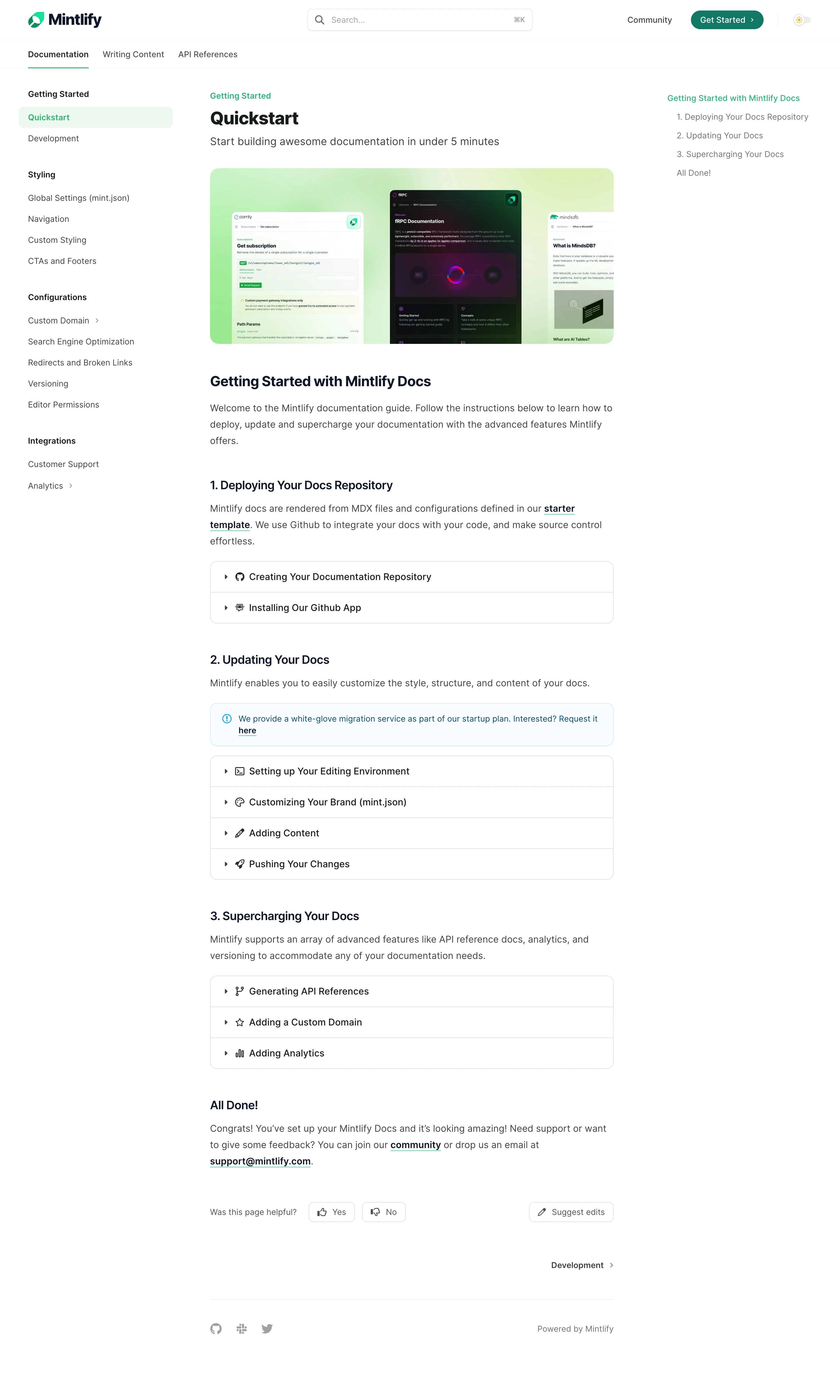

Mintlify Documentation

Mintlify
Beautiful documentation that converts users
Designed by
No items found.

Bookmark
Bookmark

Design with AI
Thank you! Your submission has been received!
Oops! Something went wrong while submitting the form.
# Design from Reference: Mintlify Documentation
Create an original, high-fidelity visual design inspired by the reference. Prioritize composition, typography, colors, spacing, and component styling over technical implementation.
## Reference
- **Product:** Mintlify
- **Category:** Documentation
- **Screenshot:** https://cdn.prod.website-files.com/5e9dc792e1210c5325f7ebbc/6acad5cbd05a3f53c0a6e478_6acad54481d0b61fedf5c9df_cms-711e2c11db0b50704dd78327.webp
Analyze the screenshot first. If inaccessible, request it rather than guessing.
## Content
{{content.instructions}}
{{content.data}}
Preserve essential messaging and factual accuracy. Adapt structure and copy length for visual balance; never invent product claims.
## Visual Design
### Overall aesthetic
- **Character:** A light documentation guide uses a white canvas, restrained green accents, three-column navigation/reading structure, and rounded outlined accordions.
- **Tone:** The page feels calm and instructional, with clear headings and sparse visual decoration apart from a product-example banner.
- **Observed scale:** The source measures 2880 × 4796 pixels. CSS estimates assume a 2× capture, equivalent to a 1440-pixel-wide page; actual pixel ratio and sticky behavior are unverified.
### Page composition
- **Global header:** Mintlify branding sits left, a centered search field includes a keyboard shortcut hint, and Community, Get Started, and a light-theme control sit right.
- **Top tabs:** Documentation, Writing Content, and API References form a secondary row. Documentation has a thin green underline.
- **Left sidebar:** Grouped links cover Getting Started, Styling, Configurations, and Integrations. Quickstart is highlighted in pale green.
- **Reading column:** A roughly 690 CSS-pixel central column contains a green category label, Quickstart title, subtitle, wide example banner, and the guide.
- **Right contents:** A slim table of contents lists the guide introduction, three numbered sections, and final completion section.
- **Guide sequence:** Introductory copy leads to deployment, updating, and advanced-feature sections, each followed by closed accordion rows. A pale blue informational callout appears in the updating section.
- **Ending:** A completion paragraph precedes helpfulness controls, Suggest edits, a next-page link, and a small social/powered-by footer.
### Information hierarchy
- **Page identity:** Category label, large title, and subtitle introduce the guide before the banner.
- **Instruction sequence:** Three numbered section headings establish an ordered learning path.
- **Collapsed detail:** Accordion titles expose topics without showing their contents. No hidden instructions should be inferred.
- **Navigation hierarchy:** Active top tab and active sidebar item provide separate context levels; the right contents mirror article sections.
- **Callout:** A blue outlined information box separates service-related copy from ordinary guide paragraphs.
- **Completion wording:** The final “All Done” section is article content, not proof that the viewer has completed setup.
- **Historical scope:** Product capabilities, setup timing, and service offers are captured documentation copy, not independently verified current specifications.
### Typography
- **Typeface appearance:** A neutral sans-serif is used throughout. Exact family is unverified.
- **Page title:** Approximately 30–32 CSS pixels, bold, with line-height around 38 pixels.
- **Subtitle/body:** Subtitle is around 18 pixels; body copy around 16 pixels with 26-pixel line-height.
- **Section headings:** The main introduction heading is approximately 24–26 pixels, bold; numbered subsection headings are around 20–22 pixels.
- **Navigation:** Sidebar and top tabs are roughly 14 pixels. Group labels and selected items are semibold.
- **Accordion labels:** Around 16 pixels, regular/medium, aligned beside small icons.
- **Links:** Dark text with green underline treatment distinguishes inline links without turning whole paragraphs green.
### Colors & surfaces
- **Measured base:** #FFFFFF dominates the page. #F6FCFF supplies the pale blue callout family.
- **Measured text:** #3E4442 appears in body/secondary text, #171C1A in darker text, and #0F1828 in heading detail.
- **Measured borders:** #DEE4E2 supplies light gray-green boundaries.
- **Measured selection:** #E9F7F0 appears in the pale green selected-sidebar family.
- **Accent:** Bright green marks category labels, active tab underline, selected navigation text, and link underlines; a darker green fills Get Started.
- **Banner palette:** A mint-to-yellow-green gradient sits behind three overlapping documentation examples, including a dark central screen.
- **Depth:** Most UI is flat. Fine outlines and small corner radii organize controls; the banner supplies the main visual richness.
### Components
- **Search:** A broad rounded outlined field contains a magnifying glass, muted prompt, and shortcut hint.
- **Get Started:** A dark green pill includes a small right chevron.
- **Theme control:** A tiny sun-like symbol appears inside a pale toggle-shaped area.
- **Sidebar groups:** Bold group labels precede plain links. Selected Quickstart uses a pale green rounded rectangle; selected subgroups elsewhere show small chevrons.
- **Hero banner:** A rounded rectangular image roughly 690 × 300 pixels displays three documentation-page examples over a green gradient.
- **Deployment accordion:** Two closed rows share a rounded outlined container, with chevrons and repository/app icons.
- **Updating accordion:** Four closed rows cover editing environment, branding, content, and publishing, each with a small distinct icon.
- **Advanced accordion:** Three closed rows cover API references, custom domain, and analytics.
- **Information callout:** A pale blue rounded outlined box contains a blue info symbol, small text, and underlined link.
- **Helpfulness row:** Yes and No outlined controls use thumbs icons beside labels. Suggest edits aligns to the right.
- **Next-page link:** A right-aligned Development label and chevron sit above the footer rule.
- **Footer:** Small social icons align left; a muted powered-by label aligns right.
- **Unshown states:** Search results, expanded accordions, theme change, feedback confirmation, and next-page content are not visible.
### Visual rhythm
- **Three-column balance:** Sidebar and contents remain visually lighter than the central reading column.
- **Clear section gaps:** Large vertical intervals separate numbered sections, while paragraphs and accordion groups remain tightly associated.
- **Accordion regularity:** Equal row heights, repeated chevrons, and thin separators create a predictable scan pattern.
- **Minimal color:** Green is used for context and links; blue is reserved for the informational callout.
- **Quiet ending:** Feedback, next-page navigation, and footer appear with ample whitespace after the article.
### Responsive
- **Evidence limit:** Only a desktop documentation view is captured. Mobile and sticky navigation behavior are unverified.
- **Recommended navigation:** Move the left sidebar into a drawer and collapse the right contents above the article on narrow screens.
- **Recommended reading width:** Use fluid content with 20–24-pixel gutters and preserve comfortable body line-height.
- **Recommended accordions:** Allow long titles to wrap and keep chevrons/icons aligned to their labels.
- **Recommended banner:** Scale the example image proportionally and provide an enlarged view or useful alternative text if details become unreadable.
- **Recommended controls:** Keep search, helpfulness, edit, theme, and navigation actions keyboard accessible with clear focus.
### Adaptation guidance
- **Preserve the learning path:** Introduce the page, then organize deployment, updating, and advanced topics into numbered sections.
- **Do not invent collapsed content:** Define accordion bodies from real documentation requirements rather than titles alone.
- **Use semantic structure:** Implement heading levels, navigation landmarks, accessible disclosures, and clear current-page states.
- **Keep completion contextual:** Article completion language should not imply actual account setup success without product state.
- **Validate current technical content:** Confirm configuration names, supported features, and service wording before reuse.
- **Build from measured tokens:** White, dark green-gray text, pale green selection, fine borders, and selective green/blue accents provide the core system.
Use this context to reproduce the reference's visual language: layout, typography, colors, spacing, borders, radii, and distinctive elements. The screenshot takes priority if descriptions conflict.
## Direction
{{preferences.fidelityInstructions}}
## Output
{{output.instructions}}
Deliver a polished, cohesive design with precise alignment, hierarchy, and spacing. Produce the requested visual artifact, not just a description. If unsupported, explain the limitation.


Category
Patterns
No items found.
Tech Stack

Added on
November 22, 2023
Similar screens
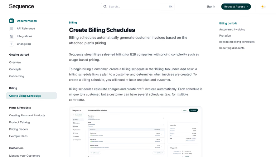






Upgrade to SaaSFrame Pro now to see similar examples.
Monthly
$18 /month
Billed $18 monthly
Browse all screens & flows
Filter and search screens & flows
Search text in screenshots
Access Figma files
Access mobile versions
Join now
Quarterly
$16 /month
Billed $48 quarterly
Browse all screens & flows
Filter and search screens & flows
Search text in screenshots
Access Figma files
Access mobile versions
Join now
Yearly
$15 /month
Billed $180 yearly
Browse all screens & flows
Filter and search screens & flows
Search text in screenshots
Access Figma files
Access mobile versions
Join now