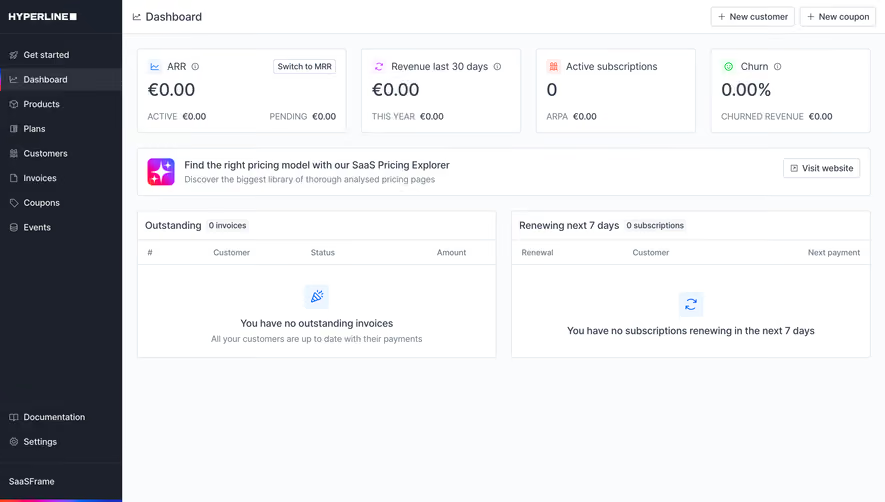
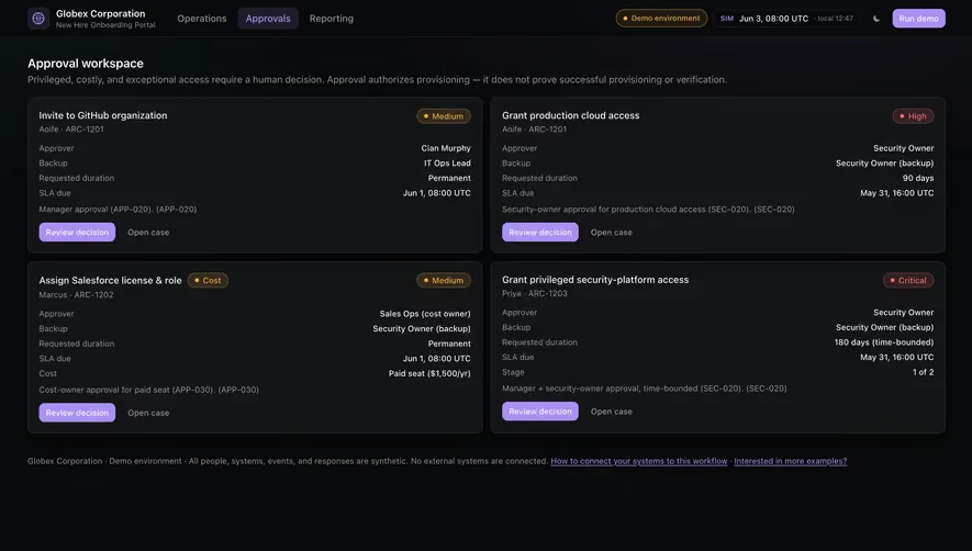
Generate a new design based on this screen using your own content.
Thank you! Your submission has been received!
Oops! Something went wrong while submitting the form.
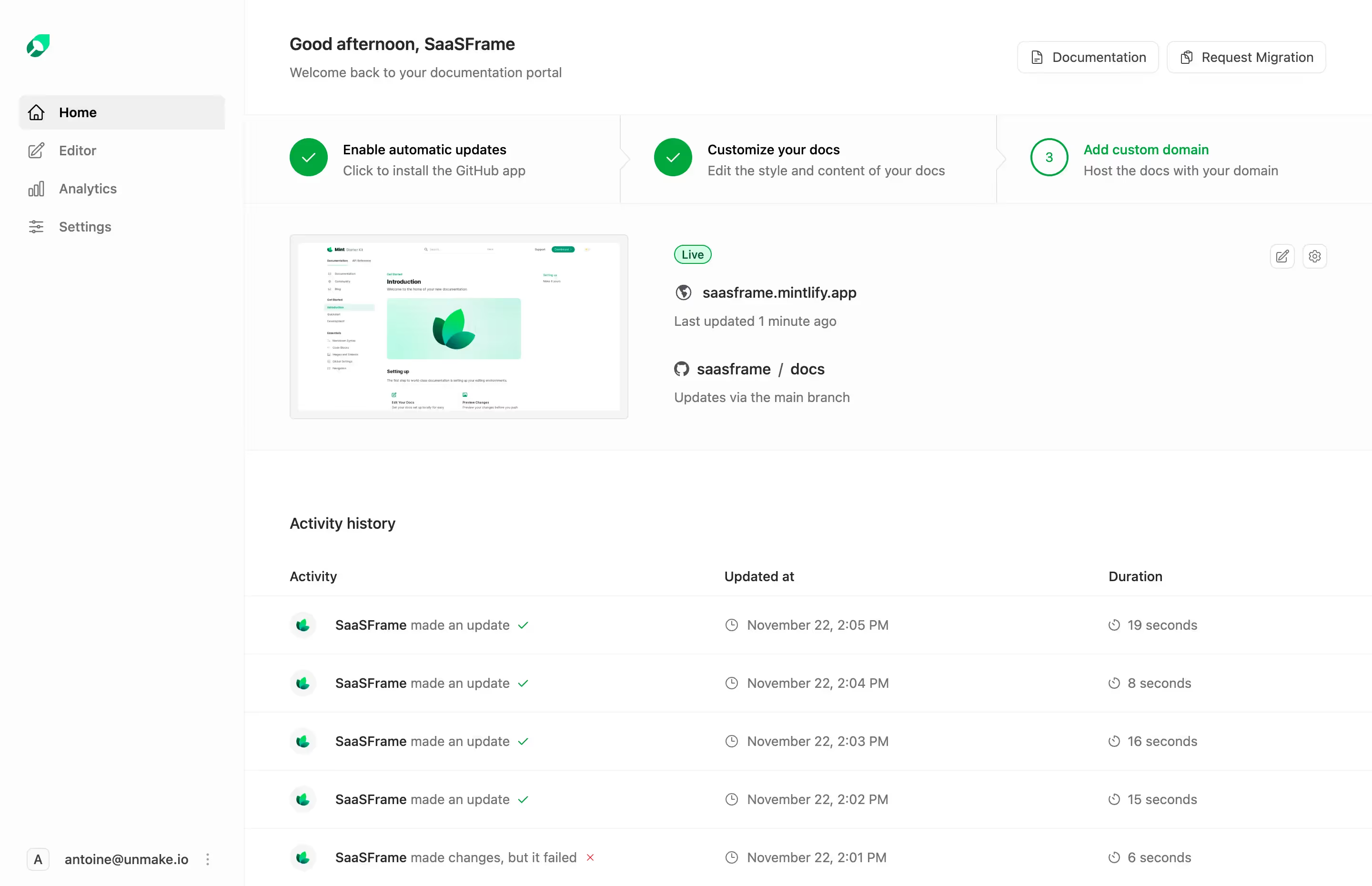
# Design from Reference: Mintlify Dashboard
Create an original, high-fidelity visual design inspired by the reference. Prioritize composition, typography, colors, spacing, and component styling over technical implementation.
## Reference
- **Product:** Mintlify
- **Category:** Dashboard
- **Screenshot:** https://cdn.prod.website-files.com/5e9dc792e1210c5325f7ebbc/655e008f9a34e51168129a10_C6zf8vtrDVrx89mcBtXHuIZpuoZt06uJfwh8YyDL0KU.avif
Analyze the screenshot first. If inaccessible, request it rather than guessing.
## Content
{{content.instructions}}
{{content.data}}
Preserve essential messaging and factual accuracy. Adapt structure and copy length for visual balance; never invent product claims.
## Visual Design
Use this context to reproduce the reference's visual language: layout, typography, colors, spacing, borders, radii, and distinctive elements. The screenshot takes priority if descriptions conflict.
## Direction
{{preferences.fidelityInstructions}}
## Output
{{output.instructions}}
Deliver a polished, cohesive design with precise alignment, hierarchy, and spacing. Produce the requested visual artifact, not just a description. If unsupported, explain the limitation.
Mintlify’s dashboard epitomizes minimalist, modern SaaS design. Crisp lines and generous white space create a breathable interface that feels both focused and inviting. The visual hierarchy is clear and understated, balancing professionalism with approachable visual warmth, resulting in a product that feels trustworthy and innovative.
Layout & Structure
The page prioritizes usability through a clear and familiar SaaS dashboard structure. A compact sidebar offers streamlined navigation, while content areas are organized with modular cards and sections. Core workflows and insights are accessible upfront—no clutter, just actionable information. The layout avoids extraneous content, achieving both clarity and efficiency.
Visual Elements
Iconography throughout is sharp and purposeful, using simple illustrations and line-based icons that support functionality without demanding attention. Subtle animation cues—like hover states—add polish and assist with discoverability. Visual balance is maintained by avoiding heavy imagery or distracting backgrounds.
Color Palette & Typography
A restrained palette anchors the design: soft whites, subtle grays, and infrequent pops of mint green for UI highlights and calls to action. Typographic choices lean toward geometric sans-serifs, lending the experience a clean, technological edge. Font hierarchy is assertive but elegant, guiding users clearly from navigation to action.
User Experience Patterns & Unique Choices
Navigation is frictionless, with sticky elements and clear CTAs ensuring users are never lost. Microinteractions—like loading spinners or dropdown reveals—add responsiveness. Notably, the absence of visual overload makes the complexity of the software accessible for both newcomers and power users, setting a benchmark for SaaS dashboard clarity.
Tone & Feel
Overall, Mintlify’s dashboard instills confidence through coherence and restraint, blending innovation with quiet authority—perfect for product builders seeking both style and substance in SaaS design inspiration.