Design with AI
Generate a new design based on this screen using your own content.
# Design from Reference: Mine User Onboarding
Create an original, high-fidelity visual design inspired by the reference. Prioritize composition, typography, colors, spacing, and component styling over technical implementation.
## Reference
- **Product:** Mine
- **Category:** User Onboarding
- **Screenshot:** https://cdn.prod.website-files.com/5e9dc792e1210c5325f7ebbc/6acbca3c8313d4c6c0cc412e_6acbc83cd6be908889c7210a_cms-49ce842cc7a22cba17dd9dca.webp
Analyze the screenshot first. If inaccessible, request it rather than guessing.
## Content
{{content.instructions}}
{{content.data}}
Preserve essential messaging and factual accuracy. Adapt structure and copy length for visual balance; never invent product claims.
## Visual Design
### Overall aesthetic
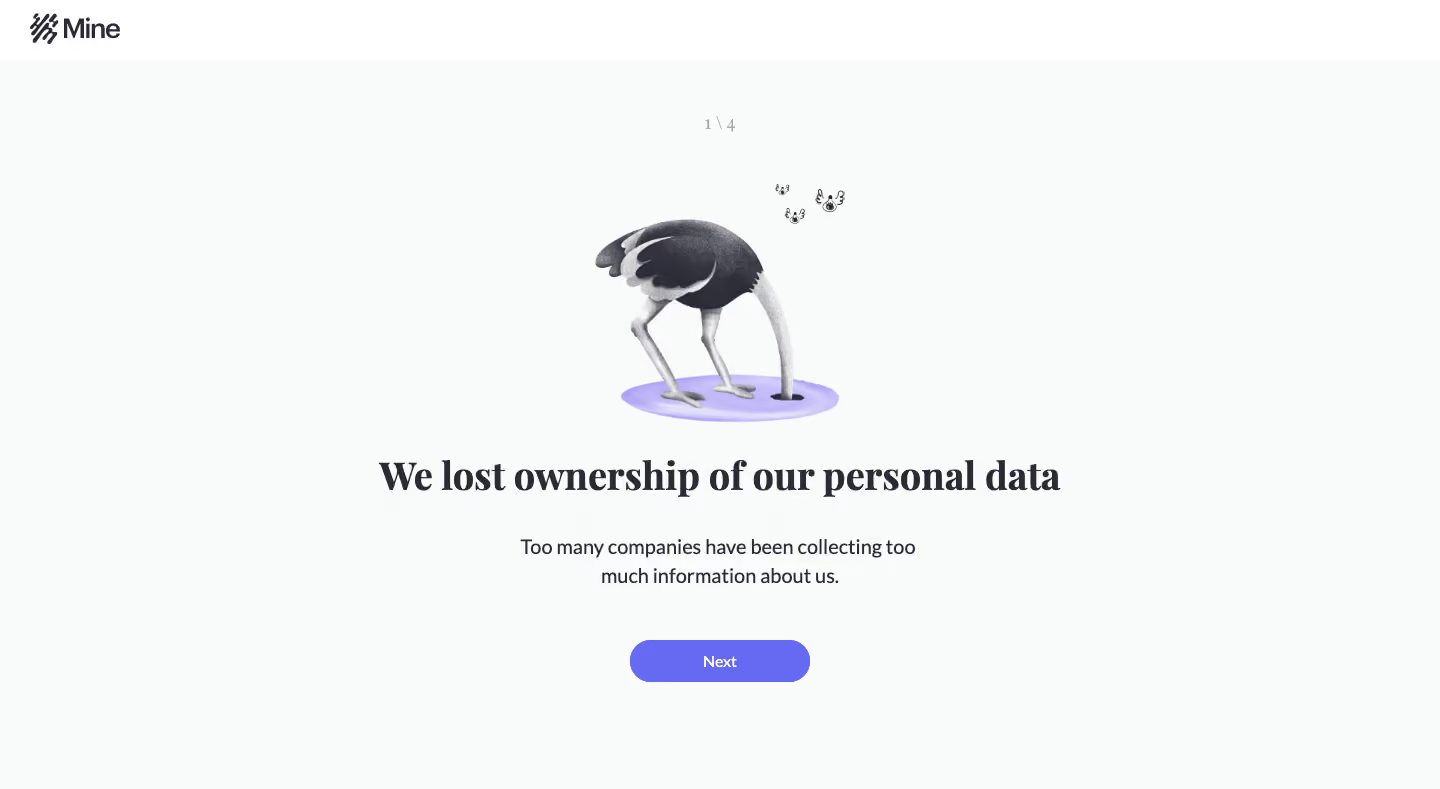
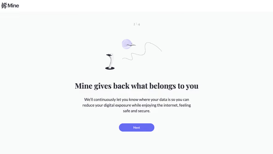
- **Character:** Minimal educational onboarding slide with a whimsical monochrome ostrich illustration, bold serif statement and violet progression action.
- **Evidence and scale:** Screenshot is 1440 × 789 image pixels. Sizes describe captured pixels with plausible 1× CSS scale; DPR and font identities remain unverified.
### Page composition
- **Header:** White horizontal brand strip around 60px high contains the dark logo at upper-left.
- **Main canvas:** Very pale cool ground fills the remaining viewport. A centered progress indicator sits above the illustration.
- **Content stack:** Ostrich artwork, one-line serif headline, centered two-line explanation and pill-shaped Next button form one vertical sequence.
- **Whitespace:** No enclosing card, sidebar or footer appears; wide margins isolate the narrative.
### Information hierarchy
- **Illustration:** The bird with its head down supplies the first visual metaphor, with a pale purple ground and small floating line details.
- **Statement:** Large bold serif text carries the slide's main message.
- **Support:** Smaller sans-serif explanation expands the statement, followed by the only visible action.
- **Progress:** Small 1/4 indicator quietly establishes a sequence; later screens are not shown.
### Typography
- **Headline:** Approximately 40px captured size, bold serif with compact leading.
- **Explanation:** Approximately 20px neutral sans-serif with 28px leading.
- **Utilities:** Next label around 14px medium; progress around 14px in muted gray.
- **Family:** Exact serif and sans-serif identities, computed weight and tracking are unverified.
### Colors & surfaces
- **Measured ground:** Pale #F9FBFB dominates, with white #FFFFFF in the top brand strip.
- **Measured foreground:** Dark #2A2B35 supports headline/brand and explanatory text.
- **Measured action:** Violet #666AF3 fills the Next pill; related purple tones appear in the illustration's small ground ellipse.
- **Artwork:** Grayscale texture and shading add character without introducing a broad secondary palette.
### Components
- **Brand strip:** Simple logo mark/wordmark around 90px wide, inset roughly 30px from the left.
- **Illustration:** Approximately 250 × 240px captured footprint, centered, combining textured black/gray bird and purple base.
- **Next:** Approximately 180 × 42px, violet fill, white centered label and fully rounded ends.
- **Progress label:** Small centered fraction, no visible progress bar or separate navigation dots.
### Visual rhythm
- **Stack spacing:** Progress and illustration have generous separation; illustration-to-headline gap is around 36px.
- **Text rhythm:** Headline and explanation are separated by about 32px; button follows around 50px below the copy.
- **Balance:** Central alignment and broad white space keep the single-message slide calm and focused.
### Responsive
- **Observed limit:** Only one desktop onboarding slide is shown; transitions and mobile layouts are unobserved.
- **Recommended layout:** Keep the single-column stack, reduce headline size fluidly and allow it to wrap naturally.
- **Recommended illustration:** Cap artwork width and height to prevent it pushing the action below a short viewport.
- **Recommended controls:** Preserve a comfortably tappable Next button and accessible progress text.
### Adaptation guidance
- **Preserve focus:** Use one memorable illustration, one clear statement and one concise explanation per educational step.
- **Keep contrast:** Pair editorial serif emphasis with practical sans-serif support and one violet action color.
- **Implementation:** Provide meaningful illustration alternatives or decorative handling as appropriate, visible focus and announced step changes. The slide's privacy statement is captured messaging rather than independently verified factual guidance.
Use this context to reproduce the reference's visual language: layout, typography, colors, spacing, borders, radii, and distinctive elements. The screenshot takes priority if descriptions conflict.
## Direction
{{preferences.fidelityInstructions}}
## Output
{{output.instructions}}
Deliver a polished, cohesive design with precise alignment, hierarchy, and spacing. Produce the requested visual artifact, not just a description. If unsupported, explain the limitation.