Design with AI
Generate a new design based on this screen using your own content.
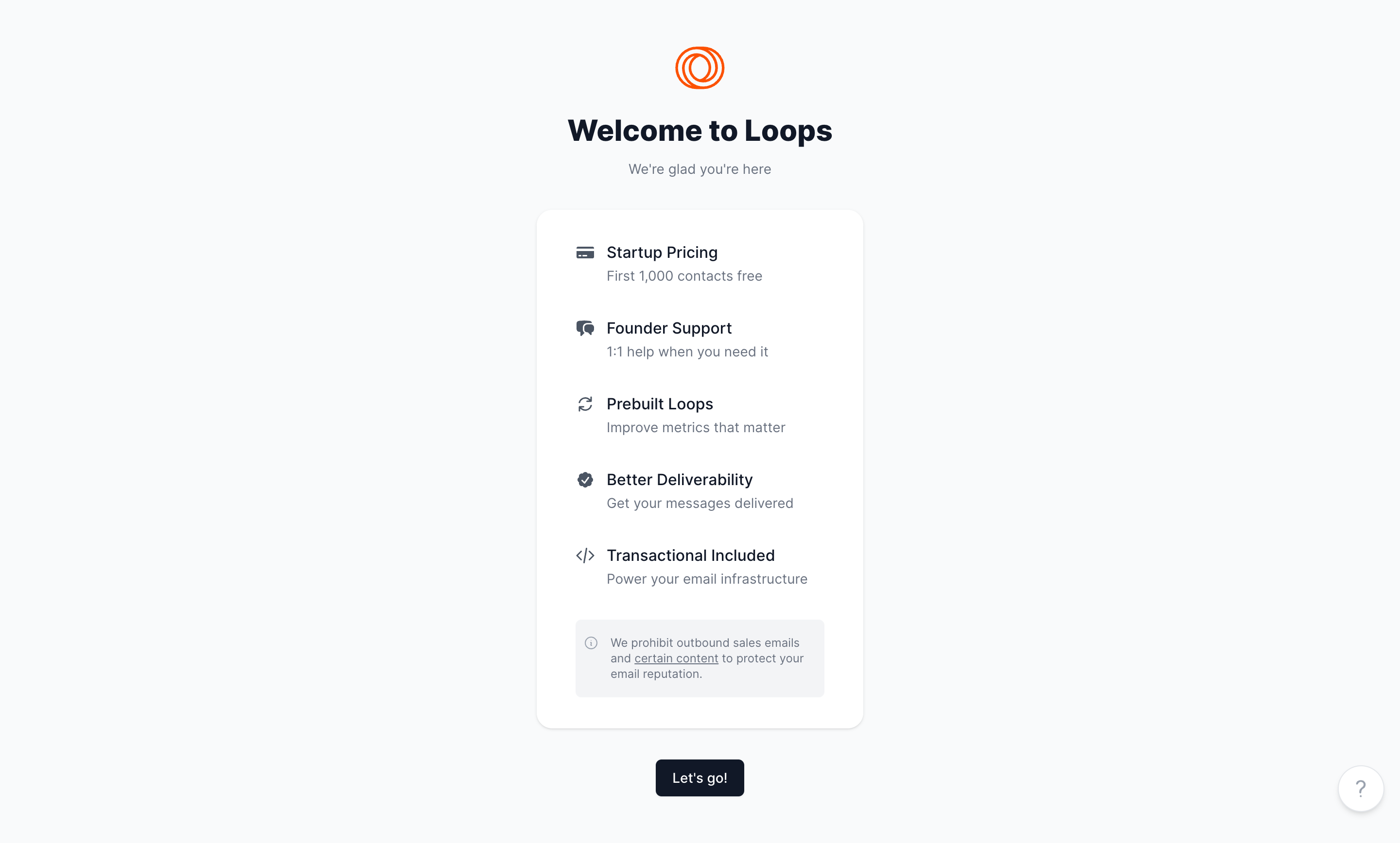
# Design from Reference: Loops Welcome Screen
Create an original, high-fidelity visual design inspired by the reference. Prioritize composition, typography, colors, spacing, and component styling over technical implementation.
## Reference
- **Product:** Loops
- **Category:** Welcome Screen
- **Screenshot:** https://cdn.prod.website-files.com/5e9dc792e1210c5325f7ebbc/6acadbf0d05a3f53c0a863ca_6acadb488abe3f93125d7f4f_cms-11b2d24bcd1789b6aa93b6c3.webp
Analyze the screenshot first. If inaccessible, request it rather than guessing.
## Content
{{content.instructions}}
{{content.data}}
Preserve essential messaging and factual accuracy. Adapt structure and copy length for visual balance; never invent product claims.
## Visual Design
### Overall aesthetic
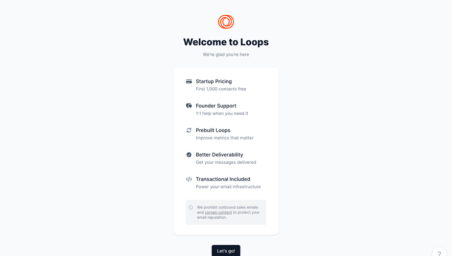
- **Style:** Minimal welcome screen with a cool near-white background, centered white benefit card and dark action.
- **Character:** Small orange loop artwork supplies a restrained brand accent above the friendly heading.
### Page composition
- **Canvas:** Source 2880 × 1736 pixels; geometry uses the 1400 × 844 inspection rendering. Approximate 2× CSS capture is plausible but unverified.
- **Opening:** Centered brand mark near y47, heading near y119 and short muted subtitle below.
- **Card:** Approximately 328 × 520px, positioned near x536, y210.
- **Flow:** Five icon/title/description groups precede a small inset information notice.
- **Action/support:** Let’s go button is centered below the card; circular help control sits lower right.
### Information hierarchy
- **Welcome:** Bold heading is the dominant text.
- **Benefits:** Five equally treated entries describe pricing, support, prebuilt flows, deliverability and transactional capability.
- **Notice:** Small muted policy text inside a pale inset panel sits below the benefits, with one underlined phrase.
- **Progression:** One dark button follows the card without competing secondary actions.
### Typography
- **Heading:** Approximately 32px bold sans serif, around 38px line height.
- **Benefit titles:** Approximately 16px medium, around 22px line height.
- **Descriptions:** Around 14px regular, 20px line height, muted slate.
- **Notice/action:** Notice around 12px/16px; action around 14px medium. Exact font family is unverified.
### Colors & surfaces
- **Measured base:** #F9FAFB canvas, #FFFFFF card and #F3F4F6 notice fill.
- **Measured foreground:** #0F1828 dark heading/action and #687281 secondary text.
- **Pale variations:** #F8F9FA, #F6F7F8 and #F7F8F9 occur in surface transitions.
- **Brand:** Orange outlined loop symbol contrasts with the otherwise cool neutral palette.
- **Depth:** Fine pale card boundary and small soft downward shadow.
### Components
- **Main card:** Approximately 16px radius and about 39px horizontal padding.
- **Benefit rows:** Small slate icons at left; title and one-line description align in a consistent text column.
- **Notice:** Approximately 249 × 78px, 6px radius, small information icon and multiline text.
- **Primary action:** Approximately 89 × 37px, dark navy fill, white label and 6px radius.
- **Help:** Approximately 46px white circular control with gray question mark and soft shadow.
- **States:** Static welcome state only; next screen, hover and help behavior are not shown.
### Visual rhythm
- **Opening:** Roughly 28px separates brand and heading, with a compact subtitle gap.
- **Card gap:** About 30px separates subtitle and card.
- **Benefit cadence:** Entries follow an approximately 76px vertical pitch.
- **Action gap:** Around 30px separates card bottom and primary button.
- **Alignment:** All central elements share one vertical axis.
### Responsive
- **Observed scope:** Desktop only; mobile behavior is unverified.
- **Recommended card:** Use a fluid maximum width with 20px viewport gutters.
- **Recommended height:** Let content determine height and allow descriptions to wrap.
- **Recommended support:** Keep help clear of the primary action at narrow widths.
### Adaptation guidance
- **Preserve:** One-column welcome, consistent benefit rows and separate low-emphasis notice.
- **Content:** Use supplied benefits and policy language; screenshot pricing claims should not be assumed current.
- **Interaction:** Define progression and help states explicitly.
- **Accessibility:** Label icon controls and keep notice text readable.
Use this context to reproduce the reference's visual language: layout, typography, colors, spacing, borders, radii, and distinctive elements. The screenshot takes priority if descriptions conflict.
## Direction
{{preferences.fidelityInstructions}}
## Output
{{output.instructions}}
Deliver a polished, cohesive design with precise alignment, hierarchy, and spacing. Produce the requested visual artifact, not just a description. If unsupported, explain the limitation.