Overall Style and Aesthetic
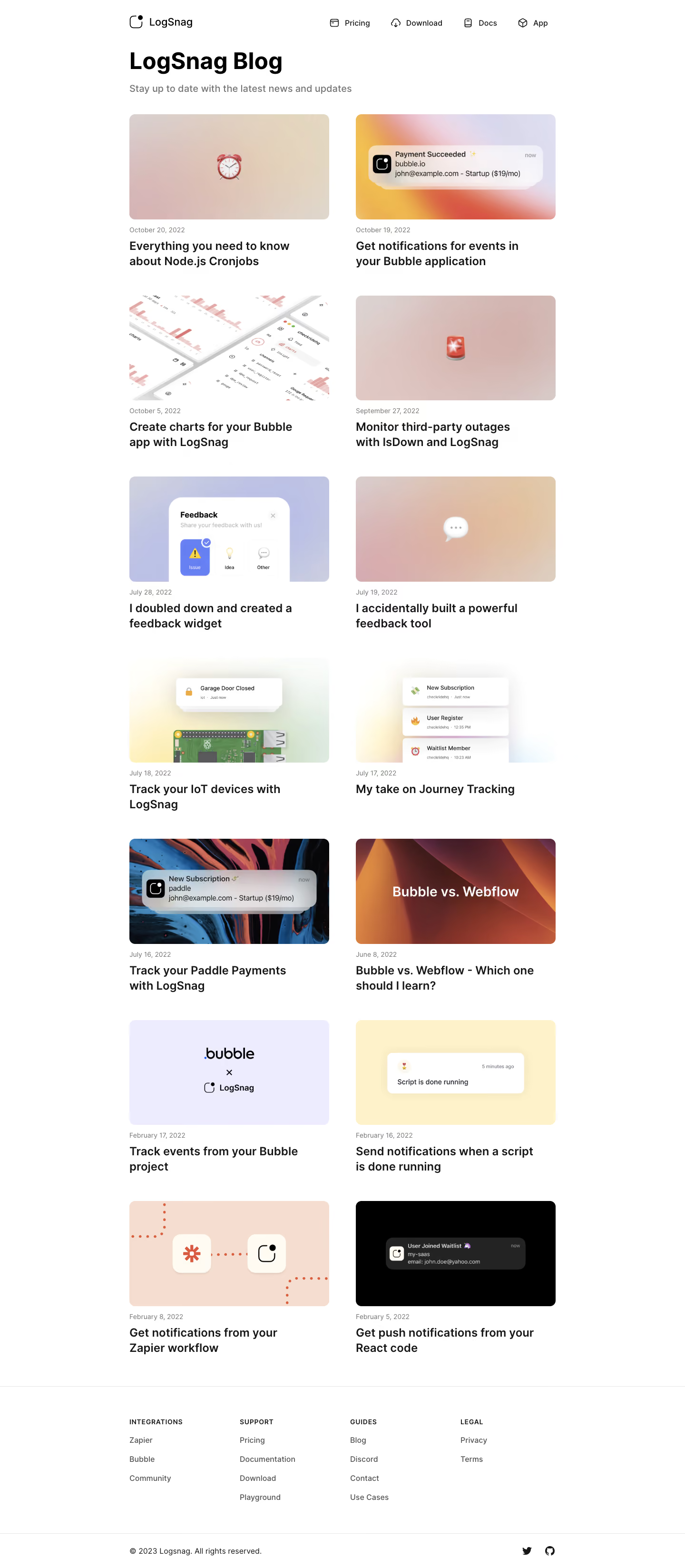
LogSnag's blog page exemplifies a clean, ultra-modern aesthetic, leaning heavily into minimalism that champions whitespace and clarity. The look feels polished and professional, yet friendly—striking a balance through subtle color pops and inviting microinteractions that enhance accessibility and approachability. Layout and Structure
The structure is intuitive and grid-based, removing distractions and letting content take center stage. A prominent, centered "Blog" heading anchors the hero area, followed by neatly arranged post previews in uniform cards. Each card features ample padding, cover illustrations, concise headlines, and metadata, ensuring effortless scannability. The header remains slim for maximum content focus, while a minimal footer rounds off the page, containing only essential links for a sleek finish. Visual Elements
Custom vector illustrations lend visual interest and brand recognition, replacing generic stock photography with unique, playful artwork. Each blog card’s cover is vibrant and smartly differentiated, bringing energy to the overall tone. Iconography is sparse but purposeful, and gentle hover animations inject interactivity without disruption. Color Palette and Typography
A refined palette of deep indigo, crisp whites, and muted lavender defines the brand identity, with bright accent hues on illustrations and CTAs for visual hierarchy. Typography is elegant and geometric, relying on clear sans-serif headings paired with lighter body text, promoting easy reading and distinct separation between elements. User Experience Patterns
Navigation is streamlined: a fixed, uncluttered top bar maintains orientation, while blog cards maximize discoverability through large click targets. Calls-to-action appear as subtle, outlined buttons, matching the gentle tone. The horizontal scroll for blog cards on smaller screens is a thoughtful touch, making browsing seamless on mobile. Unique or Notable Design Choices
LogSnag’s use of expansive negative space, branded illustrations, and consistent card formats gives the page its disciplined yet engaging feel. The minimalist approach to visual chaos—eschewing extraneous effects or noise—prioritizes clarity, while still feeling distinctly lively and innovative. It’s a master class in how playful personality and high trustworthiness can coexist in SaaS design.