Design with AI
Generate a new design based on this screen using your own content.
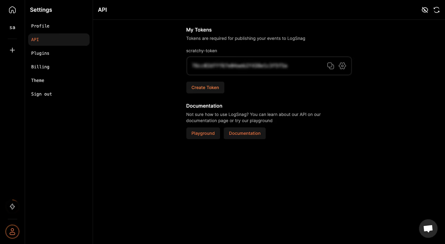
# Design from Reference: Logsnag API settings
Create an original, high-fidelity visual design inspired by the reference. Prioritize composition, typography, colors, spacing, and component styling over technical implementation.
## Reference
- **Product:** Logsnag
- **Category:** Settings
- **Screenshot:** https://cdn.prod.website-files.com/5e9dc792e1210c5325f7ebbc/6acbbe43476aea3982e3fb9b_6acbbd77d01e364847667ad4_cms-f9c69e2c80ed661f6281bf06.webp
Analyze the screenshot first. If inaccessible, request it rather than guessing.
## Content
{{content.instructions}}
{{content.data}}
Preserve essential messaging and factual accuracy. Adapt structure and copy length for visual balance; never invent product claims.
## Visual Design
### Overall aesthetic
- **Character:** Extremely dark API settings interface with black ground, subtle charcoal controls and small orange accents.
- **Evidence and scale:** Screenshot is 1440 × 789 image pixels. Sizes describe captured pixels with plausible 1× CSS scale; DPR and font identities are unverified.
### Page composition
- **Navigation layers:** Narrow icon rail around 80px wide sits beside a settings menu around 220px wide.
- **Main header:** API title occupies a slim bordered top bar, with two small utility icons at the far right.
- **Content column:** A roughly 535px-wide token/documentation stack sits near the upper-middle of the main region.
- **Token area:** Heading and explanation precede a named token field with obscured content and copy/settings icons, then Create Token.
- **Help area:** Documentation heading, short explanation and two small actions follow. A chat circle anchors the lower-right.
### Information hierarchy
- **Selected setting:** API uses an orange label on a rounded charcoal menu row.
- **Content levels:** White section headings, gray descriptions and compact orange-label actions establish hierarchy.
- **Sensitive value:** Token content is blurred in the image; its value is not legible or necessary to the visual description.
- **Next routes:** Token creation and documentation/playground actions remain separate compact controls.
### Typography
- **Page/menu title:** Around 18px captured size semibold sans-serif.
- **Section headings:** Around 16px medium-to-semibold; body around 14px with 20px leading.
- **Settings menu:** Monospaced-looking labels around 14px, with moderate tracking.
- **Family:** Exact sans-serif/monospace identities and computed weights remain unverified.
### Colors & surfaces
- **Measured ground:** Black #000000 dominates almost the entire image.
- **Measured controls:** #171717 forms selected rows/buttons; #1F1F1F/#2A2A2A support borders and raised details.
- **Measured secondary:** Gray #A3A3A3 appears in muted copy.
- **Measured accent:** Orange/coral #D66B44 and #DE7945 occur in small active/action pixels.
### Components
- **Token field:** Approximately 535 × 62px, thick low-contrast charcoal outline and radius near 12px, with two right-aligned line icons.
- **Actions:** Small charcoal rectangles around 38px high, orange labels and 6px radii.
- **Settings row:** Wide rounded charcoal selected rectangle, inset from menu edges.
- **Rail utilities:** Outline home/add icons and bottom lightning/profile controls; selected profile uses an orange circular outline.
- **Chat:** Dark-gray circular support control around 60px with white conversation glyph.
### Visual rhythm
- **Content spacing:** Roughly 24–32px gaps separate token field, action and documentation group.
- **Whitespace:** Large black empty regions beneath and to the sides emphasize the compact settings task.
- **Boundaries:** Thin dark vertical/horizontal rules define shell regions without introducing bright borders.
### Responsive
- **Observed limit:** Desktop only; token reveal/copy/settings, creation and theme behavior are unobserved.
- **Recommended navigation:** Collapse the settings menu/rail into a drawer on narrow screens.
- **Recommended fields:** Make token controls fluid, keep icons reachable and avoid overflowing long values.
- **Recommended contrast:** Preserve readable helper text and visible keyboard focus against black.
### Adaptation guidance
- **Preserve restraint:** Use near-black layering and one warm action accent for a focused developer-settings screen.
- **Separate tasks:** Keep token management distinct from learning/documentation routes.
- **Implementation:** Provide accessible icon names, safe obscured-value presentation and explicit creation/reveal states. The screenshot does not authorize token use, reveal or creation.
Use this context to reproduce the reference's visual language: layout, typography, colors, spacing, borders, radii, and distinctive elements. The screenshot takes priority if descriptions conflict.
## Direction
{{preferences.fidelityInstructions}}
## Output
{{output.instructions}}
Deliver a polished, cohesive design with precise alignment, hierarchy, and spacing. Produce the requested visual artifact, not just a description. If unsupported, explain the limitation.