
Thank you! Your submission has been received!
Oops! Something went wrong while submitting the form.
Get SaaSFrame Pro
Monthly
$18
Quarterly
$48
Yearly
$180
Upgrade to access this feature
Browse all screens & flows
Filter and search screens & flows
Access Figma files
Access mobile versions
Bookmark screens & flows
Join now
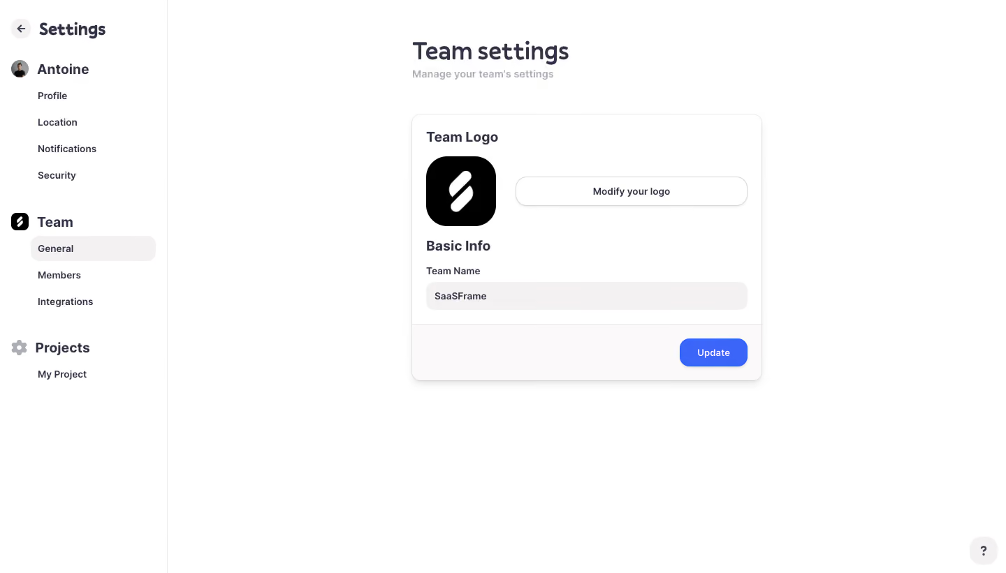
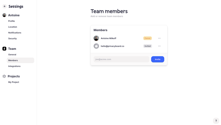
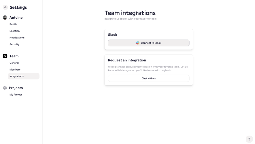
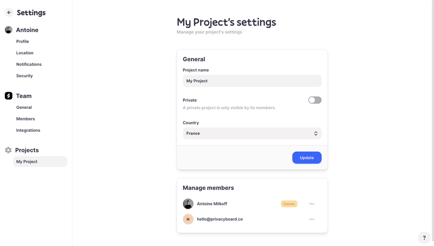
Logbook Team Settings

Logbook
Meet Logbook. Beat deadlines.
Designed by
No items found.

Bookmark
Bookmark

Design with AI
Thank you! Your submission has been received!
Oops! Something went wrong while submitting the form.
# Design from Reference: Logbook Team Settings
Create an original, high-fidelity visual design inspired by the reference. Prioritize composition, typography, colors, spacing, and component styling over technical implementation.
## Reference
- **Product:** Logbook
- **Category:** Settings
- **Screenshot:** https://cdn.prod.website-files.com/5e9dc792e1210c5325f7ebbc/6acb6ead2837b9f3168fb75a_6acb6cbf5a8f98ddabbf488a_cms-07630c83ea5f56d017a2442c.webp
Analyze the screenshot first. If inaccessible, request it rather than guessing.
## Content
{{content.instructions}}
{{content.data}}
Preserve essential messaging and factual accuracy. Adapt structure and copy length for visual balance; never invent product claims.
## Visual Design
### Overall aesthetic
- **Style:** Quiet team-settings page with a white sidebar and compact raised form card.
- **Character:** Rounded dark-slate typography, soft warm-gray fields, bright-blue save action, and generous unused canvas.
- **Surface treatment:** Thin sidebar rule, subtle card outline/shadow, and a pale footer strip inside the card.
### Page composition
- **Capture and scale:** 1440 × 821 image px. CSS estimates assume approximately 1× capture; scale is unverified.
- **Sidebar:** Approximately 240px wide, with back/settings heading, account destinations, team destinations, and project group.
- **Selection:** General is highlighted beneath Team.
- **Main area:** Approximately 500px-wide form column centered in the remaining pane, beginning around x=590px.
- **Intro:** Team settings title and muted subtitle above the card.
- **Card:** Team Logo section with large square logo left and wide modify action right; Basic Info heading, team-name label/input, and bottom-right Update action.
- **Help:** Small pale rounded question-mark control at the lower-right corner.
### Information hierarchy
- **Page identity:** Large Team settings heading, followed by a compact explanatory subtitle.
- **Card groups:** Team Logo and Basic Info headings divide visual identity from team data.
- **Primary action:** Blue Update is the strongest filled control.
- **Secondary action:** White outlined Modify your logo button spans the remaining logo-row width.
- **Navigation grouping:** Bold account/team/project labels precede smaller indented destinations.
### Typography
- **Family:** Rounded humanist sans serif; exact identity is unverified.
- **Page heading:** Approximately 36px semibold with 44px line-height.
- **Subtitle:** Approximately 16px medium in light gray.
- **Card/group headings:** Approximately 20px semibold.
- **Labels / navigation:** Approximately 14px medium, with larger 20px sidebar group labels.
- **Buttons / input:** Approximately 14px semibold.
- **Precision:** CSS sizes and weights are visual estimates.
### Colors & surfaces
- **Canvas / card:** Sampled #FFFFFF.
- **Card action strip:** Sampled #FBFAFA.
- **Input / selection:** Sampled #F3F1F1.
- **Dark text:** Sampled #323245.
- **Logo fill:** Sampled #000000.
- **Primary blue:** Sampled #3B65F9.
- **Secondary roles:** Light-gray subtitle and thin pale outlines.
- **Depth:** Small soft gray shadow below the card and secondary button.
### Components
- **Sidebar selection:** Broad pale warm-gray rounded pill around General, about 180 × 36px.
- **Settings card:** Approximately 500 × 382px, thin light outline, 12px radius, and subtle shadow.
- **Logo tile:** Approximately 100px square, black with white mark, around 28px radius.
- **Modify action:** Approximately 332 × 42px, white outlined pill with small shadow and dark centered label.
- **Team-name field:** Approximately 460 × 40px, soft warm-gray fill, no heavy outline, and 12px radius.
- **Action strip:** Pale footer band with top divider and roughly 20px padding.
- **Update button:** Approximately 96 × 40px, bright blue, white label, 14px radius, and subtle shadow.
- **Help control:** Pale rounded square with dark question mark.
- **State limits:** Existing team name is shown; no upload dialog, editing caret, validation, or saved confirmation is visible.
### Visual rhythm
- **Alignment:** Title/subtitle align with the card’s left edge; card content shares a 20px inset.
- **Logo row:** Large logo balances the long horizontal modify control.
- **Grouping:** Compact label/input spacing contrasts with larger breaks between logo and basic-information sections.
- **Whitespace:** Broad open right/lower canvas keeps the settings task focused.
### Responsive
- **Observed state:** Desktop only; mobile behavior is unverified.
- **Sidebar recommendation:** Collapse settings navigation into a drawer or separate list.
- **Card recommendation:** Use fluid width within 20–24px gutters.
- **Logo-row recommendation:** Stack logo and modify control on narrow screens.
- **Action recommendation:** Preserve a clear save location and comfortable touch target.
### Adaptation guidance
- **Preserve:** Simple team-identity card, warm-gray filled input, strong blue save action, and grouped settings navigation.
- **Starting geometry:** Approximately 240px sidebar, 500px form card, 20px inset, 100px logo, and 40px controls under the unverified 1× assumption.
- **Content fidelity:** Populate team identity from supplied data and use an actual uploaded logo.
- **Interaction recommendation:** Provide accessible upload, explicit validation, visible focus, and saved-state feedback.
- **State fidelity:** Do not infer that displayed values were changed or successfully saved.
Use this context to reproduce the reference's visual language: layout, typography, colors, spacing, borders, radii, and distinctive elements. The screenshot takes priority if descriptions conflict.
## Direction
{{preferences.fidelityInstructions}}
## Output
{{output.instructions}}
Deliver a polished, cohesive design with precise alignment, hierarchy, and spacing. Produce the requested visual artifact, not just a description. If unsupported, explain the limitation.


Category
Patterns
Tech Stack
No items found.
Added on
March 13, 2023
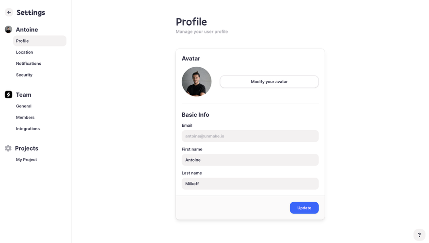
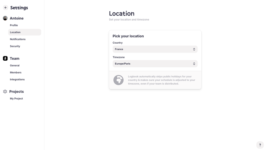
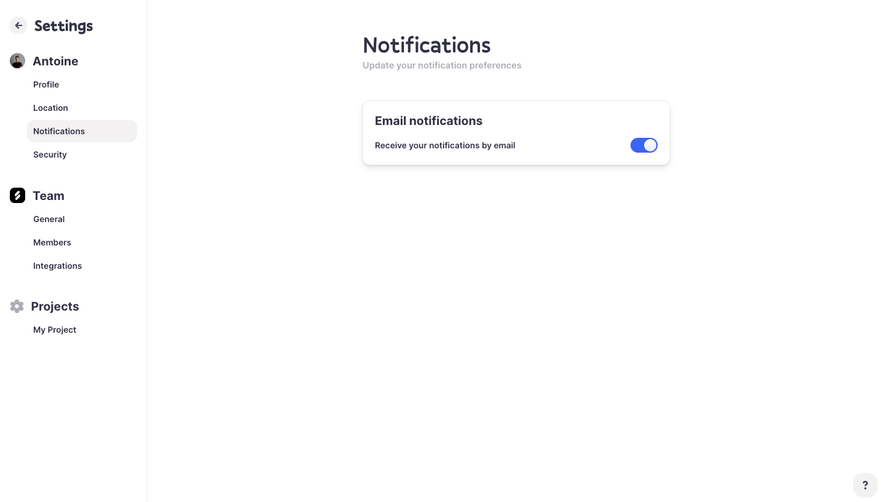


Similar screens
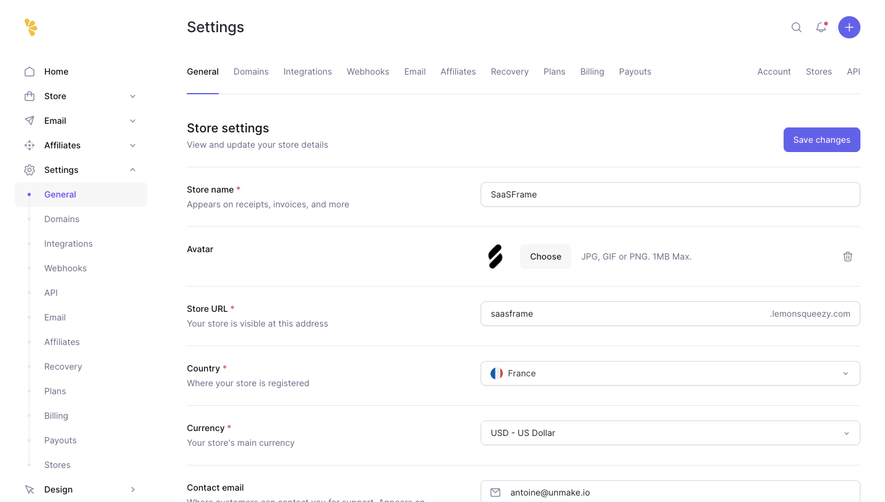





Upgrade to SaaSFrame Pro now to see similar examples.
Monthly
$18 /month
Billed $18 monthly
Browse all screens & flows
Filter and search screens & flows
Search text in screenshots
Access Figma files
Access mobile versions
Join now
Quarterly
$16 /month
Billed $48 quarterly
Browse all screens & flows
Filter and search screens & flows
Search text in screenshots
Access Figma files
Access mobile versions
Join now
Yearly
$15 /month
Billed $180 yearly
Browse all screens & flows
Filter and search screens & flows
Search text in screenshots
Access Figma files
Access mobile versions
Join now