Design with AI
Generate a new design based on this screen using your own content.
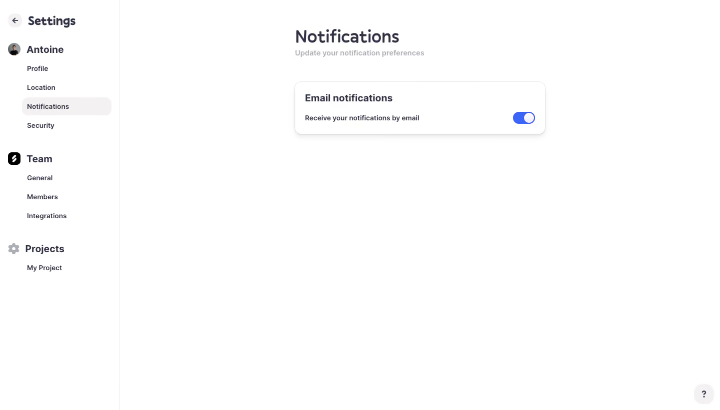
# Design from Reference: Logbook Notifications Settings
Create an original, high-fidelity visual design inspired by the reference. Prioritize composition, typography, colors, spacing, and component styling over technical implementation.
## Reference
- **Product:** Logbook
- **Category:** Settings
- **Screenshot:** https://cdn.prod.website-files.com/5e9dc792e1210c5325f7ebbc/6acb6eab2837b9f3168fb711_6acb6cb02837b9f3168f0f0a_cms-8e5058e4d1f82bef72df1de1.webp
Analyze the screenshot first. If inaccessible, request it rather than guessing.
## Content
{{content.instructions}}
{{content.data}}
Preserve essential messaging and factual accuracy. Adapt structure and copy length for visual balance; never invent product claims.
## Visual Design
### Overall aesthetic
- **Character:** Very sparse settings interface with dark indigo typography, soft neutral selection and a single blue notification switch.
### Page composition
- **Canvas:** 1440 × 821 screenshot pixels; CSS estimates are near screenshot scale, with capture scale unverified.
- **Structure:** Approximately 240px left settings sidebar, fine vertical separator and a narrow main content column centered in the remaining workspace.
### Information hierarchy
- **Priority:** Notifications heading and helper line lead to one Email notifications card with an enabled switch.
### Typography
- **Family:** Rounded friendly sans-serif; exact font is unverified.
- **Scale:** Estimated CSS page title 34px, sidebar group titles 22px, card heading 20px and helper/navigation text 14px.
### Colors & surfaces
- **Sampled palette:** White #FFFFFF; selected navigation #F3F1F1; dark ink #323245; light border #EBEBEB.
- **Accent:** Bright blue enabled toggle contrasts with muted gray helper text.
### Components
- **Settings card:** White outlined rectangle approximately 500px CSS wide, 104px tall, 12px radius and soft lower shadow.
- **Navigation:** Personal, team and project groups use bold labels/icons and smaller child links. Circular back/help controls sit at opposite corners.
### Visual rhythm
- **Spacing:** Approximately 48px from title/helper to card; broad unused white space surrounds the single preference.
### Responsive
- **Guidance:** Mobile is not shown. Use compact settings navigation and keep the entire labeled switch row touch-friendly.
### Adaptation guidance
- **Transfer:** Preserve the simple preference hierarchy and visible enabled state. Adapt notification categories without adding unnecessary controls.
Use this context to reproduce the reference's visual language: layout, typography, colors, spacing, borders, radii, and distinctive elements. The screenshot takes priority if descriptions conflict.
## Direction
{{preferences.fidelityInstructions}}
## Output
{{output.instructions}}
Deliver a polished, cohesive design with precise alignment, hierarchy, and spacing. Produce the requested visual artifact, not just a description. If unsupported, explain the limitation.