Design with AI
Generate a new design based on this screen using your own content.
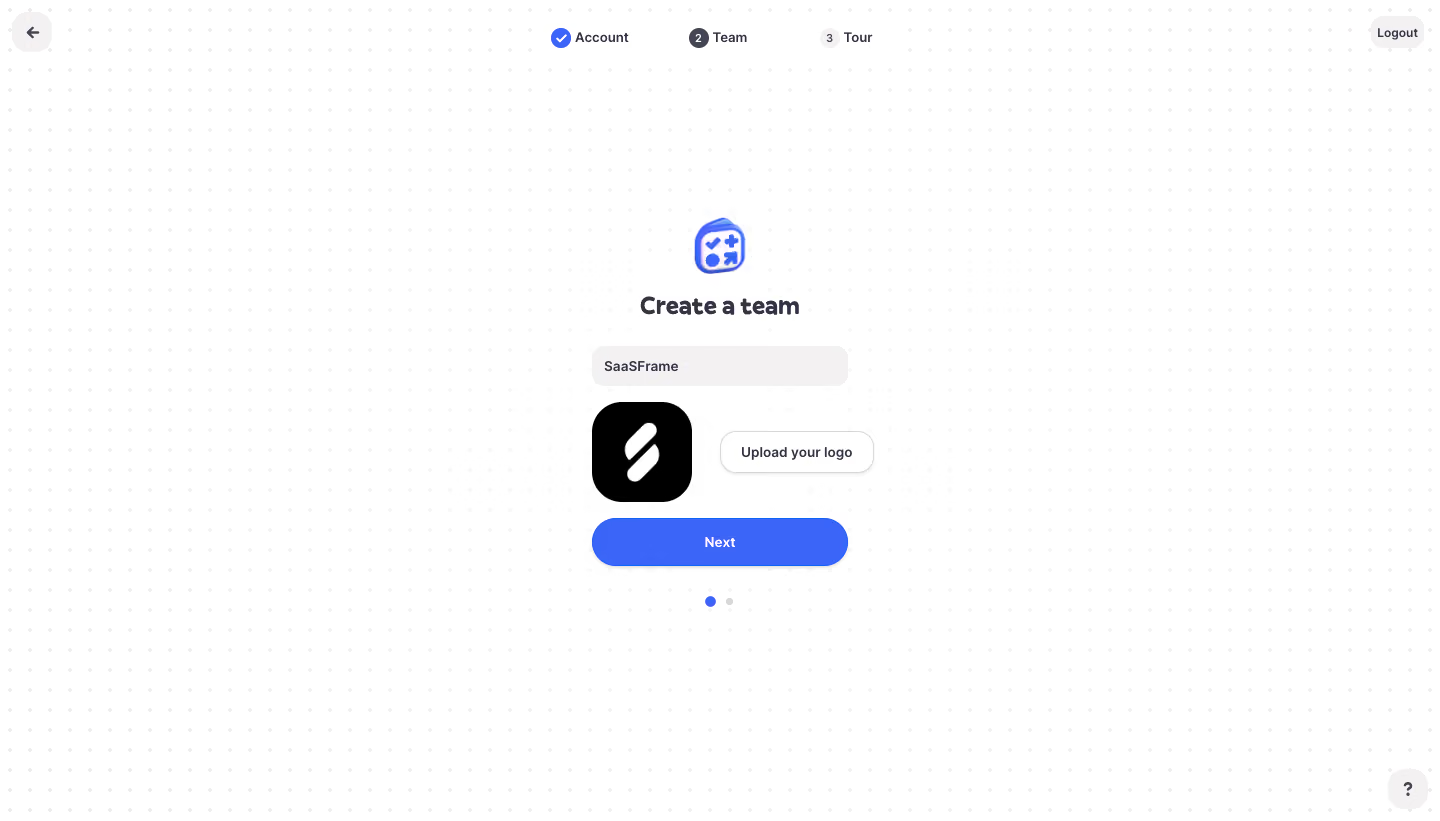
# Design from Reference: Logbook Create A Team
Create an original, high-fidelity visual design inspired by the reference. Prioritize composition, typography, colors, spacing, and component styling over technical implementation.
## Reference
- **Product:** Logbook
- **Category:** Account Setup
- **Screenshot:** https://cdn.prod.website-files.com/5e9dc792e1210c5325f7ebbc/6acb6f523156cd8dbc47135b_6acb6e6e82df6283972b4783_cms-ac544492131720ba5ba27d39.webp
Analyze the screenshot first. If inaccessible, request it rather than guessing.
## Content
{{content.instructions}}
{{content.data}}
Preserve essential messaging and factual accuracy. Adapt structure and copy length for visual balance; never invent product claims.
## Visual Design
### Overall aesthetic
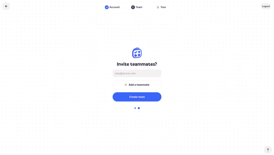
- **Character:** Friendly team-creation onboarding with a faint dotted canvas, small central form and vivid blue continuation action.
### Page composition
- **Canvas:** 1440 × 821 screenshot pixels; CSS estimates are near screenshot scale, with capture scale unverified.
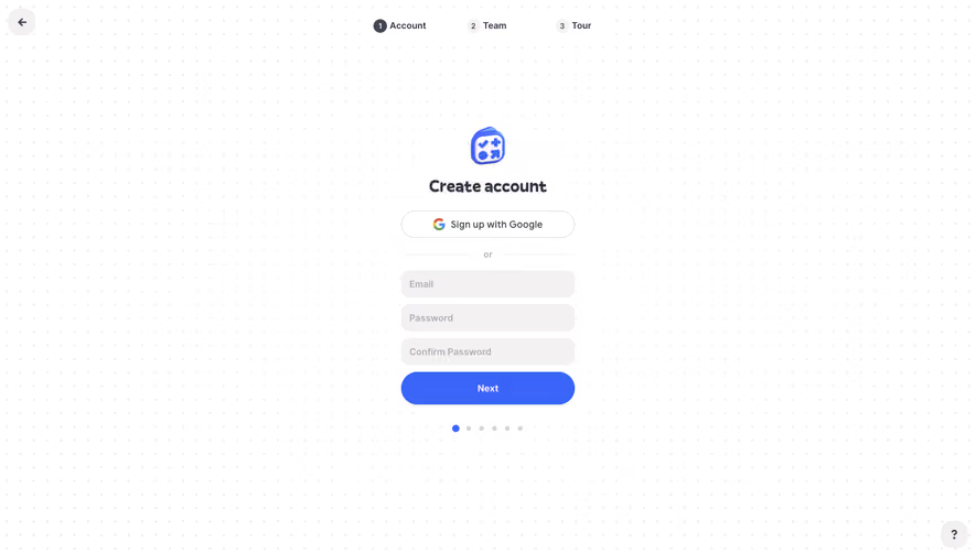
- **Structure:** Three-step progress indicator at the top; compact centered creation stack; back/logout utilities in top corners and help at lower right.
### Information hierarchy
- **Priority:** Team icon and Create a team title precede name input, logo/upload row and Next. Two small dots indicate a substep below.
### Typography
- **Family:** Rounded sans-serif; exact font is unverified.
- **Scale:** Estimated CSS title 24px bold, labels/buttons 14px and progress text 12–13px.
### Colors & surfaces
- **Sampled palette:** White #FFFFFF; pale input #F3F1F1; blue #3B65F9; black #000000.
- **Treatment:** Extremely faint neutral dots create texture without an enclosing card; dark indigo text and gray secondary states remain restrained.
### Components
- **Controls:** Soft-filled rounded name field about 256px CSS wide, large black rounded-square logo preview and outlined Upload your logo button.
- **Action:** Full-width blue pill approximately 48px high with subtle shadow. Completed/current/future progress states use checkmark and numbered circles.
### Visual rhythm
- **Spacing:** Large open margins frame the stack; roughly 16–24px gaps separate name, logo row and action.
### Responsive
- **Guidance:** Mobile is not shown. Keep a fluid narrow form and ensure progress labels and upload controls fit without crowding.
### Adaptation guidance
- **Transfer:** Preserve the simple team-identity flow and visible logo preview. Use the target brand's upload behavior and relevant onboarding steps.
Use this context to reproduce the reference's visual language: layout, typography, colors, spacing, borders, radii, and distinctive elements. The screenshot takes priority if descriptions conflict.
## Direction
{{preferences.fidelityInstructions}}
## Output
{{output.instructions}}
Deliver a polished, cohesive design with precise alignment, hierarchy, and spacing. Produce the requested visual artifact, not just a description. If unsupported, explain the limitation.