Design with AI
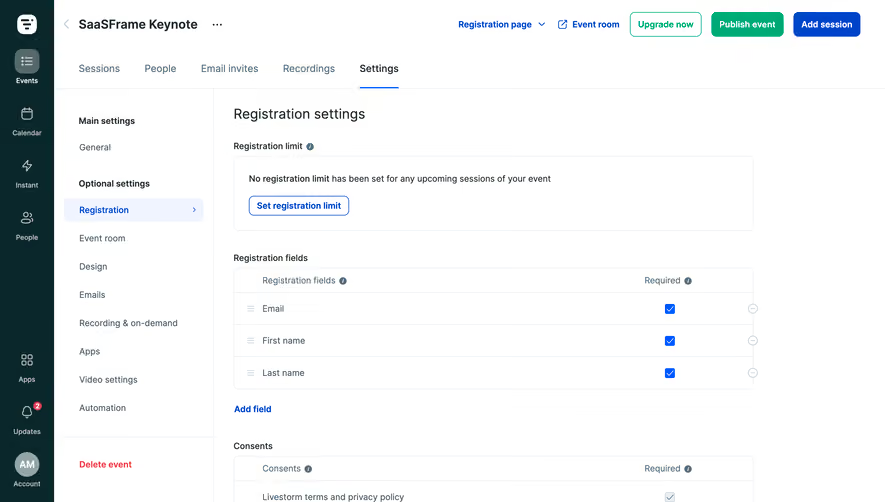
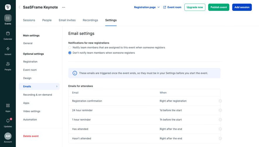
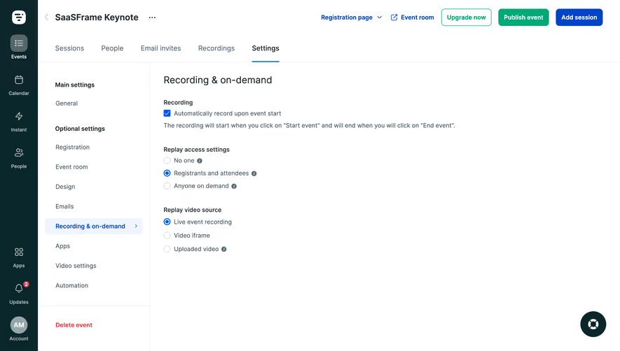
Generate a new design based on this screen using your own content.
# Design from Reference: Livestorm Event Room Settings
Create an original, high-fidelity visual design inspired by the reference. Prioritize composition, typography, colors, spacing, and component styling over technical implementation.
## Reference
- **Product:** Livestorm
- **Category:** Settings
- **Screenshot:** https://cdn.prod.website-files.com/5e9dc792e1210c5325f7ebbc/6acb61e6a2ab34f172933164_6acadc80b2f1b924c5f3e709_cms-3af0a01e543fe571e629e2ed.webp
Analyze the screenshot first. If inaccessible, request it rather than guessing.
## Content
{{content.instructions}}
{{content.data}}
Preserve essential messaging and factual accuracy. Adapt structure and copy length for visual balance; never invent product claims.
## Visual Design
### Overall aesthetic
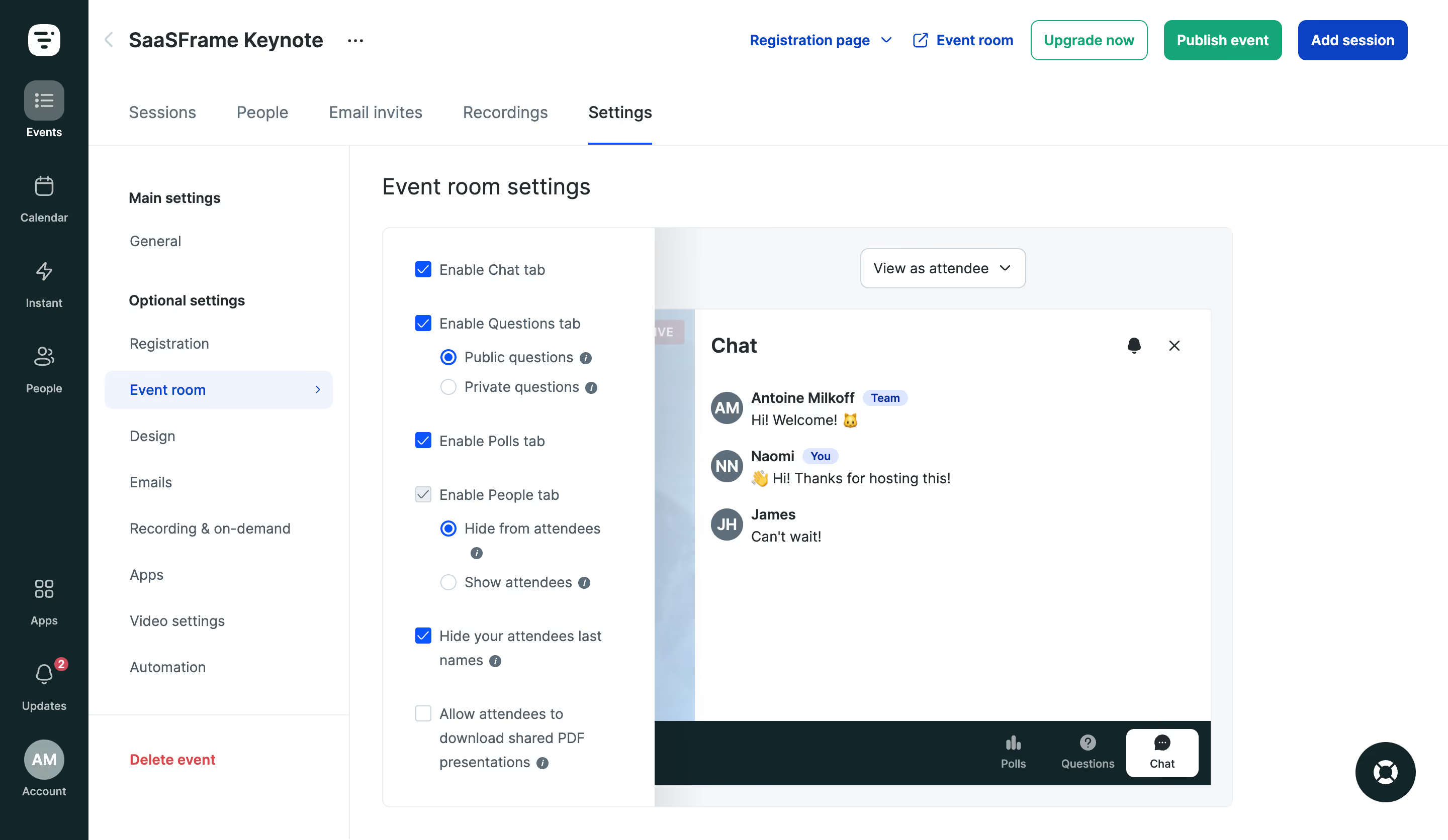
- **Character:** Practical event-administration interface with blue selections, dark teal app navigation and an immediate room preview.
### Page composition
- **Capture:** 2880 × 1672 screenshot pixels; estimated 2× CSS scale.
- **Structure:** Dark icon rail, event header/actions, horizontal event tabs, settings subnavigation and a split configuration/preview panel.
### Information hierarchy
- **Priority:** Event room settings title introduces checkbox/radio options on the left; the attendee preview on the right demonstrates chat and bottom room tabs.
### Typography
- **Family:** Sans serif; exact family unverified.
- **Estimated CSS sizes:** Page title 24px, event heading 20px, navigation 16px and form labels 14px.
### Colors & surfaces
- **Measured palette:** White #FFFFFF, dark teal #0A272B, preview gray #F6F7F9, selected blue-white #EFF4FF, borders #E9EEF1 and ink #212B30.
- **Accents:** Blue checked controls and Add session, green Publish/Upgrade actions, red Delete event.
### Components
- **Elements:** Main settings navigation, checkbox tab toggles, nested public/private and visibility radio choices, info icons, View as attendee dropdown and chat preview with avatar initials.
- **Estimated geometry:** Rail 88px, secondary navigation 260px, preview panel radius 8px, 40px toolbar buttons and 24–32px content padding.
### Visual rhythm
- **Spacing:** Compact top navigation contrasts with evenly spaced form options; a continuous preview frame groups the configuration and its outcome.
### Responsive
- **Suggested adaptation:** Collapse navigation and place preview below controls, retaining a clear configuration-to-preview relationship. Mobile behavior is unverified.
### Adaptation guidance
- **Transfer:** Preserve visible feedback between settings and preview; group subordinate radio options beneath their parent checkbox.
Use this context to reproduce the reference's visual language: layout, typography, colors, spacing, borders, radii, and distinctive elements. The screenshot takes priority if descriptions conflict.
## Direction
{{preferences.fidelityInstructions}}
## Output
{{output.instructions}}
Deliver a polished, cohesive design with precise alignment, hierarchy, and spacing. Produce the requested visual artifact, not just a description. If unsupported, explain the limitation.