
Thank you! Your submission has been received!
Oops! Something went wrong while submitting the form.
Get SaaSFrame Pro
Monthly
$18
Quarterly
$48
Yearly
$180
Upgrade to access this feature
Browse all screens & flows
Filter and search screens & flows
Access Figma files
Access mobile versions
Bookmark screens & flows
Join now
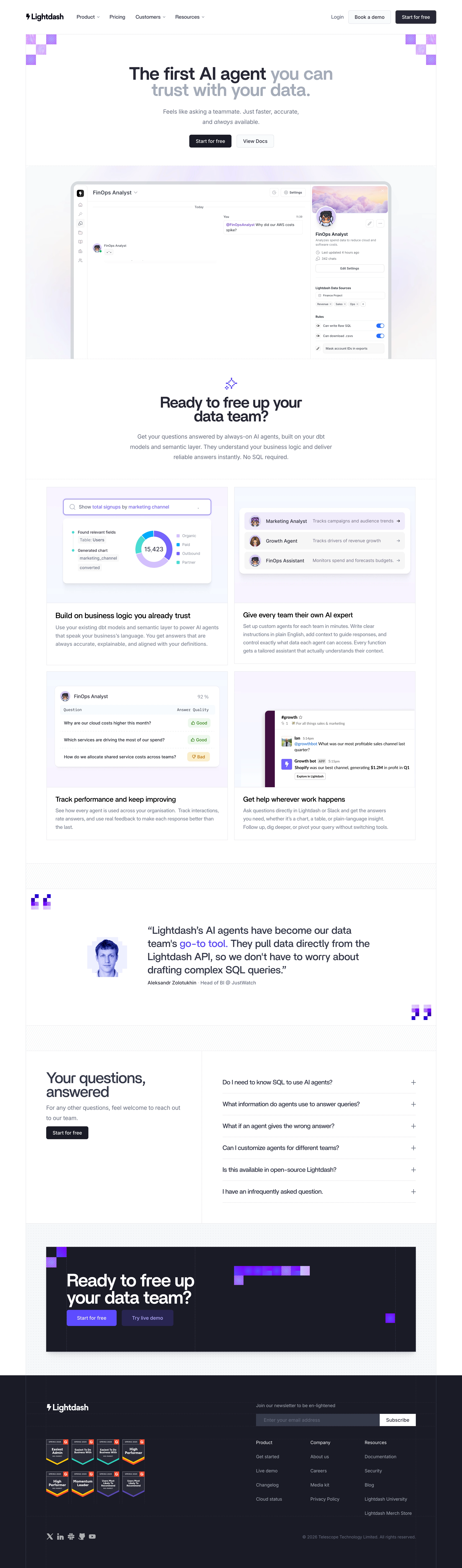

Lightdash Features Page

Lightdash
The open-source AI native BI platform
Designed by


Bookmark
Bookmark

Design with AI
Thank you! Your submission has been received!
Oops! Something went wrong while submitting the form.
# Design from Reference: Lightdash Features Page
Create an original, high-fidelity visual design inspired by the reference. Prioritize composition, typography, colors, spacing, and component styling over technical implementation.
## Reference
- **Product:** Lightdash
- **Category:** Features Page
- **Screenshot:** https://cdn.prod.website-files.com/5e9dc792e1210c5325f7ebbc/6acad338d5603a17eba5b5e9_6acad0c251f927271bf829d5_cms-bd05727961e3be4c31aa3366.webp
Analyze the screenshot first. If inaccessible, request it rather than guessing.
## Content
{{content.instructions}}
{{content.data}}
Preserve essential messaging and factual accuracy. Adapt structure and copy length for visual balance; never invent product claims.
## Visual Design
### Overall aesthetic
- **Character:** A light developer-oriented AI feature page uses charcoal typography, pale lavender imagery and pixel-block purple motifs.
- **Structure:** Fine borders, dashed separators and hatched bands produce a precise modular frame.
### Page composition
- **Capture scale:** The source is 2880 × 9756 pixels, inspected throughout. A 2× capture is plausible but unverified; dimensions below estimate CSS pixels at half source resolution.
- **Opening:** Navigation precedes a centered two-line headline, short subtitle and paired actions.
- **Showcase:** A large agent-chat interface occupies a pale gradient panel, followed by centered explanatory copy.
- **Features:** Four bordered cards form a two-by-two grid covering trusted business logic, team agents, performance feedback and in-workflow assistance.
- **Trust/questions:** A wide testimonial with pixel-framed portrait precedes a split FAQ area with six collapsed questions.
- **Closing:** A dark conversion panel and dark footer contain repeated actions, newsletter form, award badges and grouped links.
### Information hierarchy
- **Hero emphasis:** Dark opening words transition into lighter gray text within the headline.
- **Product proof:** The large agent interface introduces the concept before smaller explanatory illustrations.
- **Cards:** Each uses a substantial visual area above a bold title and muted paragraph.
- **Final action:** A large white heading and purple action stand out in the closing dark panel.
### Typography
- **Family:** Modern sans-serif forms are visible; exact identity is unverified.
- **Hero:** Approximately 56 pixels, bold with tight 52–56-pixel leading.
- **Section headings:** Around 44–48 pixels, bold; card titles around 24 pixels.
- **Body:** Main explanatory text is around 20 pixels with 32-pixel leading; card copy around 16 pixels with 26-pixel leading.
- **Testimonial:** Approximately 32 pixels with generous leading; footer text and buttons around 14–16 pixels.
### Colors & surfaces
- **Measured base:** White #FFFFFF dominates, with pale #F7F8FA supporting neutral regions.
- **Measured accent surfaces:** Lavender #F8F5FE and blue-white #F5F8FF frame illustrations.
- **Measured dark:** #1A1B25 anchors dark CTA/footer surfaces and contributes the ink palette.
- **Measured neutral:** #F6F6F6 supports subtle interface areas.
- **Accent relationships:** Saturated purple pixel motifs and actions connect sections; turquoise and blue remain mostly inside product examples.
### Components
- **Main showcase:** A rounded gray outer frame encloses agent chat, icon rail and right-side configuration pane.
- **Feature cards:** Thin rectangular outlines enclose pale image panels and white text areas, with minimal outer rounding.
- **Illustrations:** Search/donut chart, agent list, rated-answer table and Slack-style conversation provide four distinct examples.
- **FAQ:** Six thin-rule rows use trailing plus icons; no answers are visible.
- **CTA panel:** A large dark rectangle includes pixel decorations, prominent text and two purple-toned actions.
- **Footer:** Newsletter field/button spans above three link columns; eight award badges form a compact grid beside them.
### Visual rhythm
- **Container:** Approximately 1280-pixel frame with broad outer margins.
- **Grid:** Feature cards use roughly 20-pixel gutters and consistent image/text division.
- **Separators:** Hatched horizontal bands distinguish testimonial and FAQ chapters.
- **Whitespace:** Large centered headings receive ample surrounding space before denser product illustrations.
### Responsive
- **Observed state:** Only desktop is supplied; compact behavior is unverified.
- **Recommended flow:** Stack feature cards and FAQ columns, preserving image/title associations.
- **Recommended imagery:** Scale screenshots proportionally and provide readable alternatives for small embedded UI.
- **Recommended footer:** Wrap badges and stack newsletter controls when necessary.
### Adaptation guidance
- **Preserve motifs:** Reuse pixel accents, fine grids and lavender surfaces consistently.
- **Maintain contrast:** Keep muted text readable and reserve strong purple for emphasis.
- **Content fidelity:** Treat AI claims, ratings and interface content as captured marketing examples rather than verified behavior.
- **Accessibility:** Use semantic FAQ controls, labeled forms and useful screenshot alternatives.
Use this context to reproduce the reference's visual language: layout, typography, colors, spacing, borders, radii, and distinctive elements. The screenshot takes priority if descriptions conflict.
## Direction
{{preferences.fidelityInstructions}}
## Output
{{output.instructions}}
Deliver a polished, cohesive design with precise alignment, hierarchy, and spacing. Produce the requested visual artifact, not just a description. If unsupported, explain the limitation.


Category
Patterns
No items found.
Tech Stack

Added on
July 15, 2026
Similar screens




Upgrade to SaaSFrame Pro now to see similar examples.
Monthly
$18 /month
Billed $18 monthly
Browse all screens & flows
Filter and search screens & flows
Search text in screenshots
Access Figma files
Access mobile versions
Join now
Quarterly
$16 /month
Billed $48 quarterly
Browse all screens & flows
Filter and search screens & flows
Search text in screenshots
Access Figma files
Access mobile versions
Join now
Yearly
$15 /month
Billed $180 yearly
Browse all screens & flows
Filter and search screens & flows
Search text in screenshots
Access Figma files
Access mobile versions
Join now