
Thank you! Your submission has been received!
Oops! Something went wrong while submitting the form.
Get SaaSFrame Pro
Monthly
$18
Quarterly
$48
Yearly
$180
Upgrade to access this feature
Browse all screens & flows
Filter and search screens & flows
Access Figma files
Access mobile versions
Bookmark screens & flows
Join now
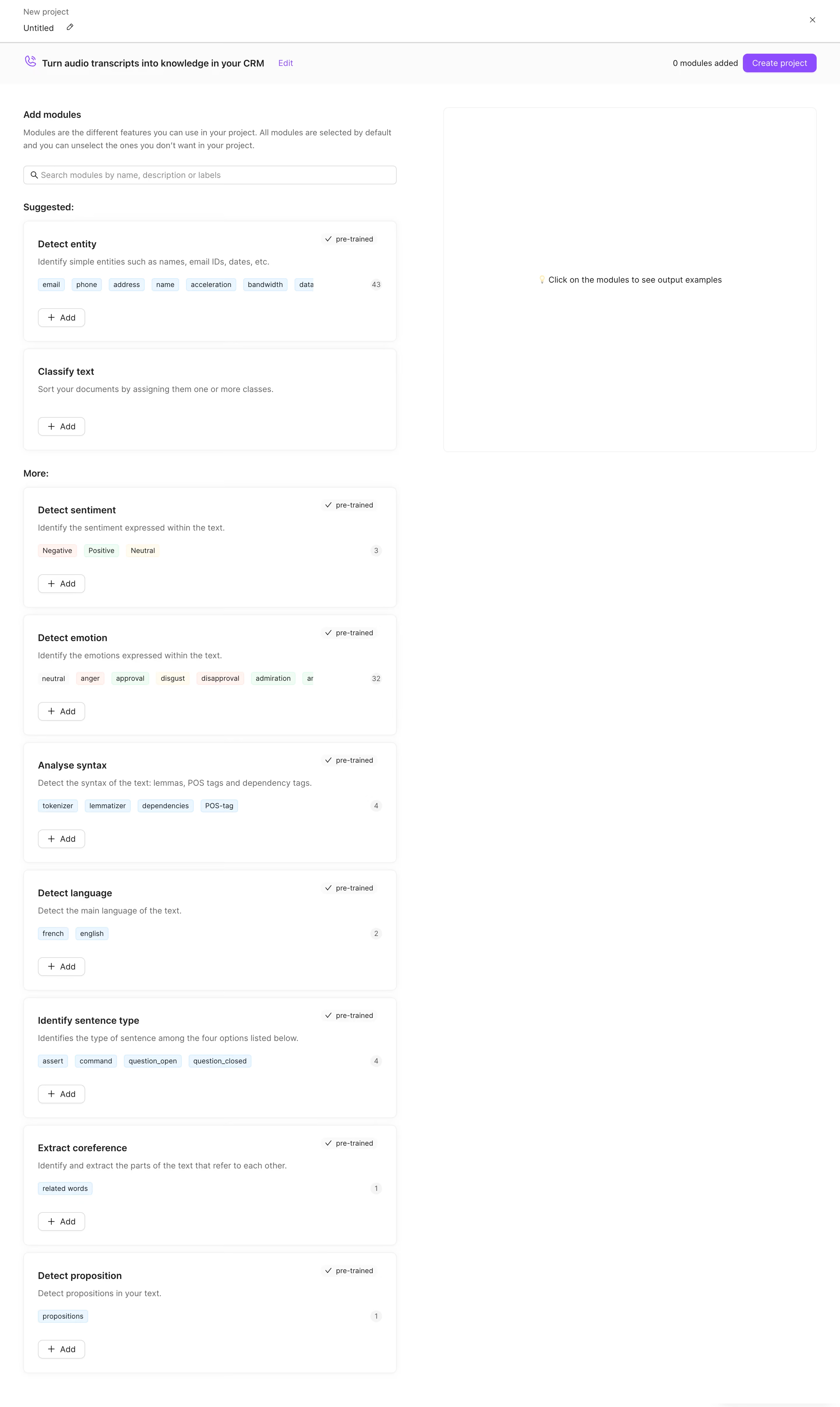
Lettria Create A Project

Lettria
The no-code AI platform for text
Designed by
No items found.

Bookmark
Bookmark

Design with AI
Thank you! Your submission has been received!
Oops! Something went wrong while submitting the form.
# Design from Reference: Lettria Create A Project
Create an original, high-fidelity visual design inspired by the reference. Prioritize composition, typography, colors, spacing, and component styling over technical implementation.
## Reference
- **Product:** Lettria
- **Category:** Add & Edit
- **Screenshot:** https://cdn.prod.website-files.com/5e9dc792e1210c5325f7ebbc/6acb6e912837b9f3168fb25d_6acb6c6f516caa34e805169c_cms-cdfa08b8e22e7b4c1b52a573.webp
Analyze the screenshot first. If inaccessible, request it rather than guessing.
## Content
{{content.instructions}}
{{content.data}}
Preserve essential messaging and factual accuracy. Adapt structure and copy length for visual balance; never invent product claims.
## Visual Design
### Overall aesthetic
- **Style:** Minimal white application workspace for assembling a text-analysis project from reusable modules.
- **Character:** Neutral sans-serif text, fine gray borders, extremely soft card shadows and restrained purple actions. Pastel category chips provide localized color without overwhelming the workspace.
- **Density:** A compact two-row header sits above a long single-column module catalogue; a large empty preview area balances the detailed left column.
### Page composition
- **Screenshot scale:** 2880 × 4824 image px. Reconstruction estimates below assume a 2× capture, giving approximately 1440 × 2412 CSS px; the actual capture scale is unverified.
- **Project header:** A roughly 72 CSS px-high row spans the page. The upper-left New project label sits above an editable Untitled name and pencil icon; a close icon is aligned near the upper-right edge.
- **Configuration bar:** A second shallow band, approximately 72 CSS px high, contains a purple outlined icon, a bold project-use-case sentence and an Edit link on the left. A zero-modules counter and Create project button align right.
- **Main grid:** Approximately 40 CSS px outer margins frame two equal columns around 640 CSS px wide, separated by about 80 CSS px. Both start near y=185 CSS px.
- **Catalogue introduction:** The left column begins with Add modules, a two-line explanatory paragraph and a full-width search input. Suggested and More headings subdivide the list.
- **Suggested modules:** Detect entity and Classify text appear first. The first includes a row of pale blue chips, a small count and a pre-trained badge; the second uses a simpler title, description and Add control.
- **Additional modules:** Seven stacked cards cover sentiment, emotion, syntax, language, sentence type, coreference and proposition detection. Their heights vary slightly with content while their widths and alignments remain consistent.
- **Preview region:** A large outlined rectangle occupies the upper right, approximately 640 × 590 CSS px. A tiny lightbulb and centered instruction explain that selecting modules reveals output examples. The rest of the right column remains blank through the long capture.
### Information hierarchy
- **Task context:** Project name and use-case summary establish what is being configured before the module catalogue begins.
- **Primary action:** The filled purple Create project button is the strongest action on the page. Its adjacent counter reports the captured state as zero modules added.
- **Selection hierarchy:** Suggested modules precede the broader More group, directing attention without large promotional cards or illustrations.
- **Card hierarchy:** Bold module name, muted one-line description, optional colored output labels, then an outlined Add button. Pre-trained status is quieter and sits at the upper right.
- **Preview instruction:** The right panel uses a low-density centered message rather than sample output. No populated preview or selected-module state is visible.
### Typography
- **Family:** Neutral sans serif with conventional application typography. Exact font identity is unverified.
- **Header context:** Small gray project context is approximately 14 CSS px; the editable project name is approximately 14–16 px, regular weight.
- **Use-case summary:** Approximately 16 px and semibold, paired with a smaller purple Edit link around 14 px.
- **Section and card titles:** Approximately 16 px, weight 600, with 22–24 px line-height. Hierarchy relies on placement and spacing more than dramatic size changes.
- **Descriptions:** Approximately 14 px with 21–22 px leading, regular weight and muted gray. The introductory explanation wraps into two lines.
- **Chips and badges:** Approximately 12 px with tight 16–18 px leading. Search text and button labels are around 14 px.
- **Measurement qualification:** Font sizes, weights and line heights are visual CSS estimates under the assumed 2× scale, not browser-extracted values.
### Colors & surfaces
- **Canvas:** Sampled sRGB #FFFFFF dominates both the workspace and card interiors. Sampled #FBFBFB appears in subtle secondary surface areas.
- **Text:** Sampled #1F1F1F provides a dark neutral reference for prominent text. Supporting descriptions and header context are visibly lighter gray.
- **Neutral details:** Sampled #D9D9D9 and #F0F0F0 occur among the fine neutral interface tones; borders, small count surfaces and separators stay low contrast against white.
- **Output chips:** Sampled #EAF6FF supplies a pale blue surface used by entity, syntax, language and related output labels. Sentiment and emotion chips also introduce pale pink, green and cream.
- **Action accent:** Purple appears in Create project, Edit and the use-case icon. Its exact hex is not established by the dominant-color sample; select the final purple against the visible reference rather than presenting a guessed measurement.
- **Shadow treatment:** Soft pale gray shadows gently lift catalogue cards; the empty preview uses a thin outline without similarly pronounced elevation.
### Components
- **Module cards:** Approximately 640 CSS px wide, usually 200–210 px tall, with roughly 24 px internal padding, 8 px radii and fine borders. The simpler classification card is shorter.
- **Card spacing:** Roughly 12–16 CSS px separates adjacent cards, preserving a continuous selectable catalogue rather than isolated feature sections.
- **Search field:** Approximately 640 × 32 CSS px, rounded by about 5–6 px, with a small magnifier at left and muted placeholder text.
- **Status badge:** A compact checkmark and pre-trained label sit near each applicable card's upper-right corner on a very pale surface.
- **Output labels:** Small rectangular chips use 3–4 px corner radii, close horizontal spacing and compact padding. A circular or pill-like number at the far right summarizes the label count.
- **Add buttons:** Approximately 80 × 32 CSS px, white with a thin gray outline, a leading plus and a modest 6–8 px radius. Hover and selected states are not shown.
- **Primary button:** Create project is approximately 125 × 32 CSS px with purple fill, white text and rounded corners.
- **Preview panel:** A thin neutral border and approximately 8 px radius define its empty area. The helper message is centered both horizontally and vertically.
### Visual rhythm
- **Repeated structure:** The module title, description, output-chip row and Add control recur at consistent left edges throughout the catalogue.
- **Whitespace balance:** The long detailed left side contrasts with a mostly empty right side. This asymmetry makes room for contextual examples without compressing the module list.
- **Section rhythm:** Small Suggested and More headings separate groups with moderate vertical gaps; there are no large background-color changes or decorative dividers.
- **Interaction pacing:** Compact header actions stay visually separate from the larger content cards. Repeated subdued Add controls avoid competing with the single filled project-creation action.
### Responsive
- **Evidence limit:** Only a wide desktop capture is available; the following are recommendations.
- **Column recommendation:** Stack the preview beneath the selected card or expose it through an explicit preview action when two 640 px columns no longer fit comfortably.
- **Header recommendation:** Allow the use-case summary to wrap while preserving the project counter and creation action in a clear action area.
- **Card recommendation:** Reduce outer margins to 16–24 px and keep card padding around 20–24 px. Let output labels wrap rather than clipping essential content.
- **Touch recommendation:** Increase the effective hit areas of compact Add, Edit and close controls to approximately 44 px.
### Adaptation guidance
- **Retain the workflow:** Separate project identity, module selection and contextual output preview into distinct regions.
- **Map real modules:** Replace the visible NLP capabilities with the target product's actual selectable building blocks. Preserve title, concise explanation, optional status and one clear add action.
- **Use chips purposefully:** Show real output categories or supported types; retain compact counters when the complete label list is too long.
- **Preserve restraint:** Use white surfaces, fine borders, subtle shadows and one primary accent. Reserve pastel colors for meaningful module metadata.
- **Keep state accurate:** Derive selection counters and action availability from actual application state. Do not infer selected behavior or preview content from this empty-state capture.
Use this context to reproduce the reference's visual language: layout, typography, colors, spacing, borders, radii, and distinctive elements. The screenshot takes priority if descriptions conflict.
## Direction
{{preferences.fidelityInstructions}}
## Output
{{output.instructions}}
Deliver a polished, cohesive design with precise alignment, hierarchy, and spacing. Produce the requested visual artifact, not just a description. If unsupported, explain the limitation.


Category
Patterns
No items found.
Tech Stack


Added on
April 28, 2023


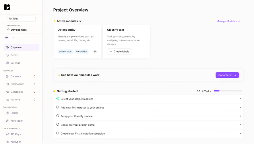


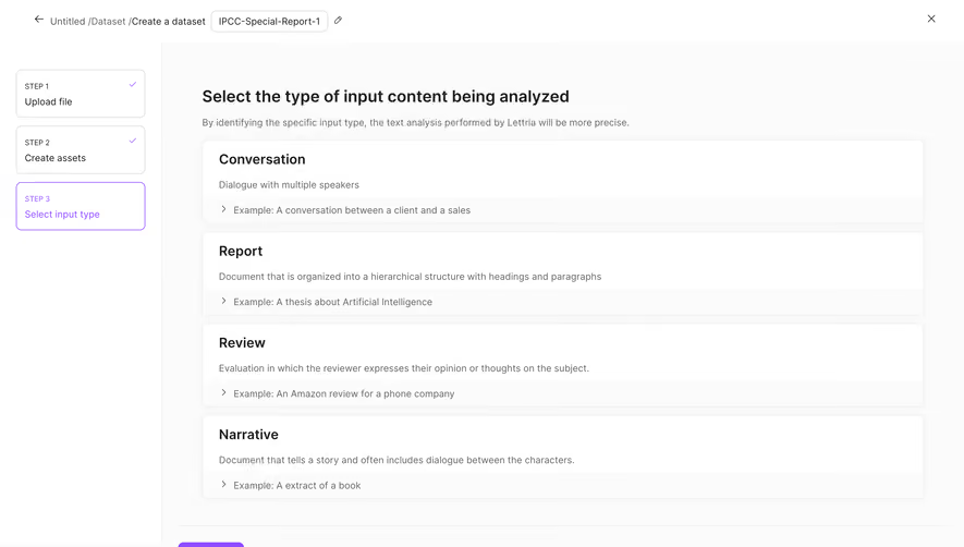


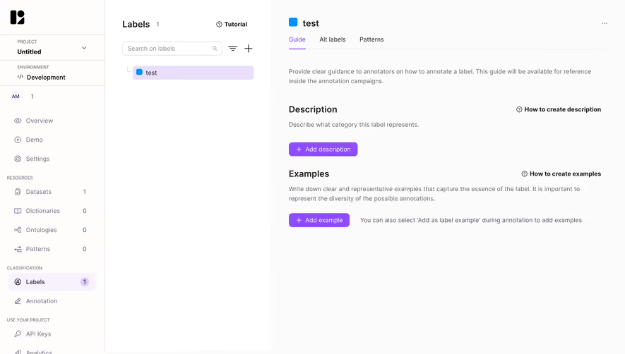

Similar screens






Upgrade to SaaSFrame Pro now to see similar examples.
Monthly
$18 /month
Billed $18 monthly
Browse all screens & flows
Filter and search screens & flows
Search text in screenshots
Access Figma files
Access mobile versions
Join now
Quarterly
$16 /month
Billed $48 quarterly
Browse all screens & flows
Filter and search screens & flows
Search text in screenshots
Access Figma files
Access mobile versions
Join now
Yearly
$15 /month
Billed $180 yearly
Browse all screens & flows
Filter and search screens & flows
Search text in screenshots
Access Figma files
Access mobile versions
Join now