Design with AI
Generate a new design based on this screen using your own content.
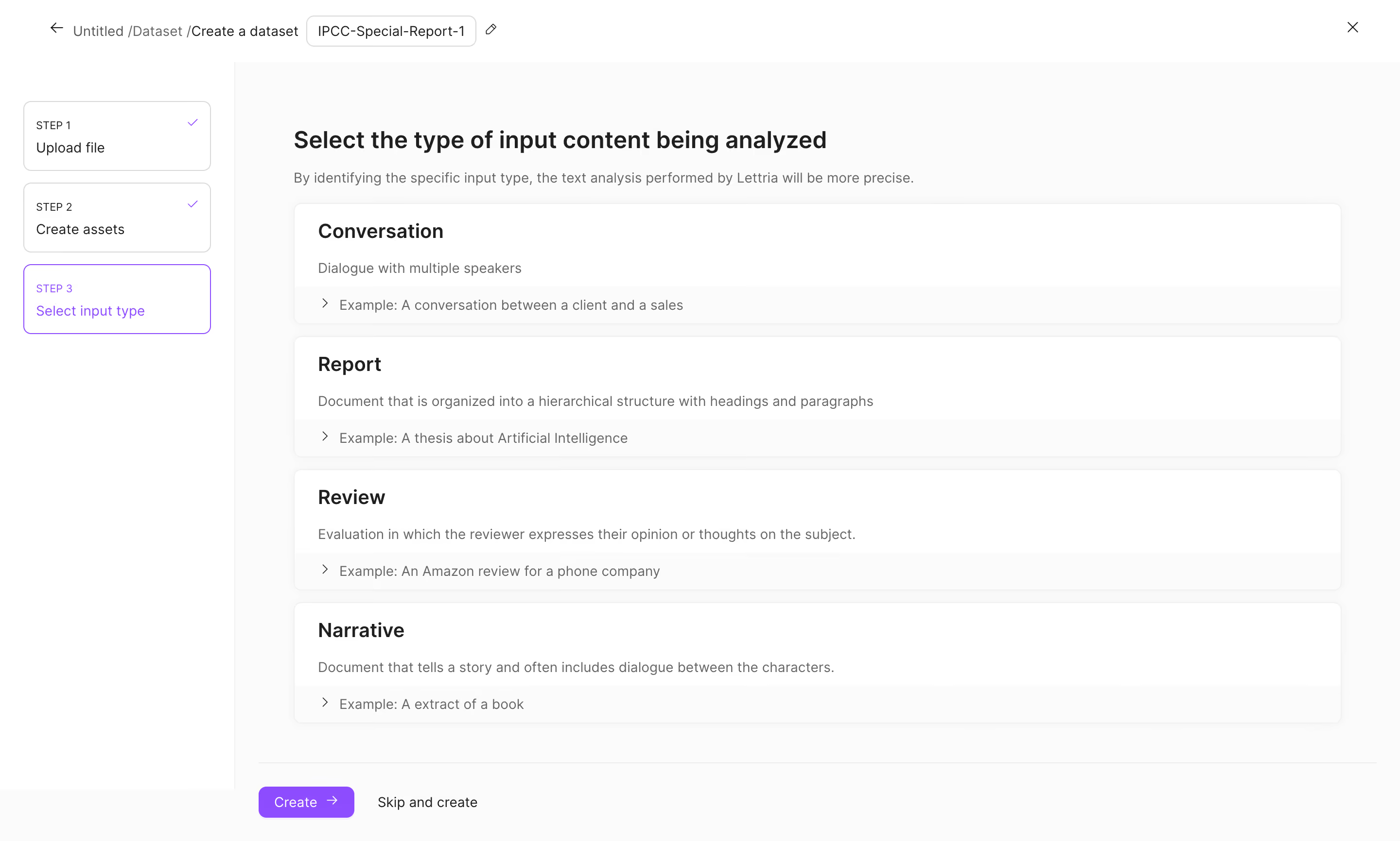
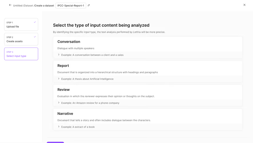
# Design from Reference: Lettria Create A Dataset
Create an original, high-fidelity visual design inspired by the reference. Prioritize composition, typography, colors, spacing, and component styling over technical implementation.
## Reference
- **Product:** Lettria
- **Category:** Add & Edit
- **Screenshot:** https://cdn.prod.website-files.com/5e9dc792e1210c5325f7ebbc/6acb6d9bb206c0d3f8f3a498_6acb6be1bf2e69a0c03bbc0d_cms-e63108a9a100ddce9d12efab.webp
Analyze the screenshot first. If inaccessible, request it rather than guessing.
## Content
{{content.instructions}}
{{content.data}}
Preserve essential messaging and factual accuracy. Adapt structure and copy length for visual balance; never invent product claims.
## Visual Design
### Overall aesthetic
- **Character:** Airy dataset-creation wizard with large selectable content-type cards and subtle purple progress accents.
### Page composition
- **Capture:** 2880 × 1732 screenshot pixels; estimated 2× CSS scale.
- **Structure:** Breadcrumb/name header, left three-step progress rail, main input-type heading and four stacked option cards, then footer Create/Skip actions.
### Information hierarchy
- **Priority:** Active Step 3 and main instruction establish the task; card titles distinguish Conversation, Report, Review and Narrative, each with description and collapsible example.
### Typography
- **Family:** Sans serif; exact family unverified.
- **Estimated CSS sizes:** Main heading 24px, option titles 20px, body 14px and uppercase step labels 11px.
### Colors & surfaces
- **Measured palette:** White #FFFFFF, canvas #FBFBFB, example-strip #F9F9F9/#F8F8F8 and subtle borders #F0F0F0/#F7F7F7.
- **Accents:** Purple active-step border, completion ticks and Create button.
### Components
- **Elements:** Dataset-name chip with edit icon, outlined step cards, broad option panels with chevron examples, close control and primary/secondary footer actions.
- **Estimated geometry:** Progress rail 240px wide, main padding 60px, option radii 8px, approximately 124px option height and 32px action height.
### Visual rhythm
- **Spacing:** Repeated large cards provide an orderly decision list; subtle shadows separate them without heavy borders.
### Responsive
- **Suggested adaptation:** Convert steps to a compact horizontal indicator, let options fill the width and keep footer actions visible. Mobile behavior is unverified.
### Adaptation guidance
- **Transfer:** Preserve the explicit step state and title/description/example hierarchy. Match content-type options to the real processing model.
Use this context to reproduce the reference's visual language: layout, typography, colors, spacing, borders, radii, and distinctive elements. The screenshot takes priority if descriptions conflict.
## Direction
{{preferences.fidelityInstructions}}
## Output
{{output.instructions}}
Deliver a polished, cohesive design with precise alignment, hierarchy, and spacing. Produce the requested visual artifact, not just a description. If unsupported, explain the limitation.