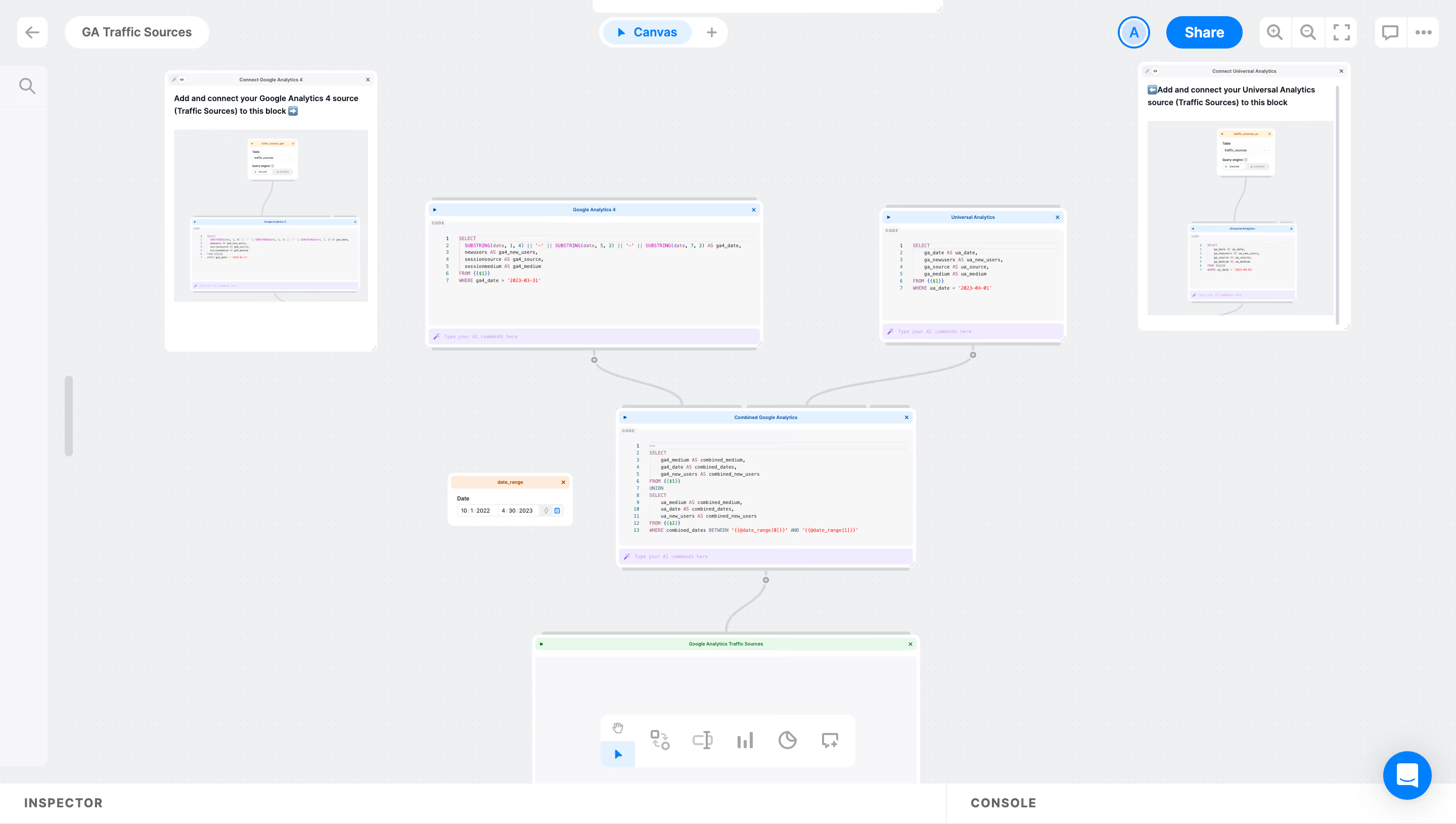
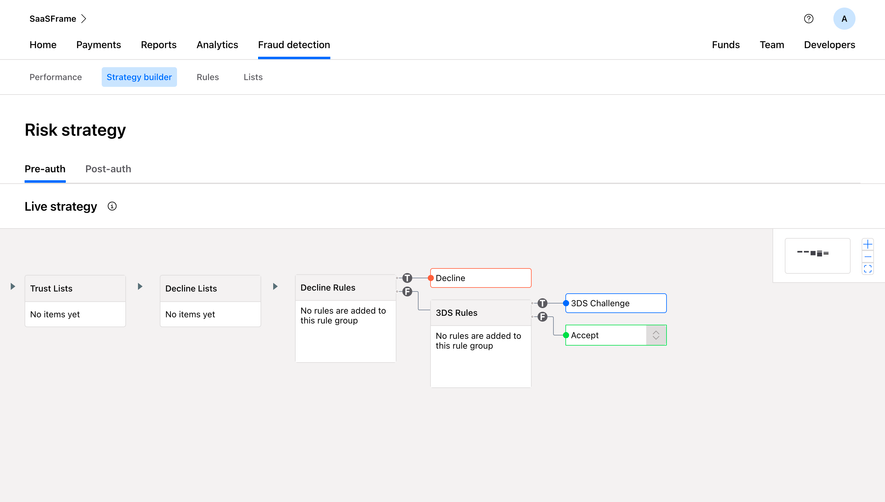
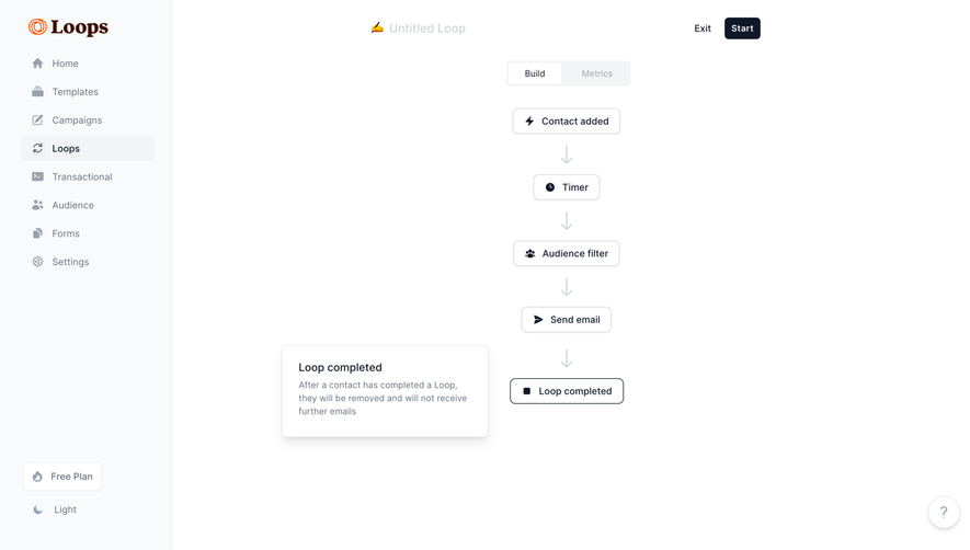
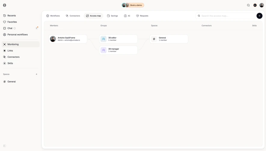
Generate a new design based on this screen using your own content.
Thank you! Your submission has been received!
Oops! Something went wrong while submitting the form.
# Design from Reference: Latitude Flowchart
Create an original, high-fidelity visual design inspired by the reference. Prioritize composition, typography, colors, spacing, and component styling over technical implementation.
## Reference
- **Product:** Latitude
- **Category:** Flowchart
- **Screenshot:** https://cdn.prod.website-files.com/5e9dc792e1210c5325f7ebbc/6acad5cfd05a3f53c0a6e4f2_6acad54a50cf4647822d63a0_cms-12dcddea516bb3b5af516667.webp
Analyze the screenshot first. If inaccessible, request it rather than guessing.
## Content
{{content.instructions}}
{{content.data}}
Preserve essential messaging and factual accuracy. Adapt structure and copy length for visual balance; never invent product claims.
## Visual Design
Use this context to reproduce the reference's visual language: layout, typography, colors, spacing, borders, radii, and distinctive elements. The screenshot takes priority if descriptions conflict.
## Direction
{{preferences.fidelityInstructions}}
## Output
{{output.instructions}}
Deliver a polished, cohesive design with precise alignment, hierarchy, and spacing. Produce the requested visual artifact, not just a description. If unsupported, explain the limitation.
Latitude’s project page exudes a minimalist and modern vibe, tailored for creative professionals and startups. Its spacious layout, abundant white space, and understated interface elements put focus directly on user content, fostering an atmosphere of clarity and efficiency without visual clutter.
Layout and Structure
The structure is linear yet modular: a slim left sidebar provides persistent navigation, while the main area is dedicated to detailed project views and management tools. With no traditional hero section, content takes center stage from the outset. Feature cards, collapsible panels, and draggable modules allow users to interact and reorganize tasks smoothly.
Visual Elements
Crisp line icons, micro-animations, and soft drop shadows accentuate interactivity without overpowering the interface. SVG-based illustrations punctuate section dividers, lending a lightweight, inventive character. User avatars and clean toggle switches maintain visual connectivity with minimal distraction.
Color Palette and Typography
A restrained palette—predominantly muted gray backgrounds with confident bursts of teal and soft blue—supports readability and guides attention to call-to-actions. The sans-serif typography is contemporary and legible; bold weights distinguish section headings from subtler details, establishing clear informational hierarchy.
User Experience Patterns
Navigation is streamlined: sidebar icons expand on hover, while intuitive floating action buttons prompt project creation or collaboration. Inline editing and modals keep users engaged in context. The absence of unnecessary forms or steps allows for lightning-fast workflow, keeping the UX focused and frictionless.
Unique or Notable Design Choices
Latitude’s commitment to unobtrusive innovation stands out—animated placeholders and dot loaders sustain momentum during content refreshes. Drag-and-drop, color-coded tags, and ephemeral toast notifications bring an energetic, thoughtful touch that feels simultaneously trustworthy and cutting-edge.