Generate a new design based on this screen using your own content.
Thank you! Your submission has been received!
Oops! Something went wrong while submitting the form.
# Design from Reference: Koyeb Careers Page
Create an original, high-fidelity visual design inspired by the reference. Prioritize composition, typography, colors, spacing, and component styling over technical implementation.
## Reference
- **Product:** Koyeb
- **Category:** Careers Page
- **Screenshot:** https://cdn.prod.website-files.com/5e9dc792e1210c5325f7ebbc/6acad12cb2165b6c7fffacf6_6acad0b65a5fdf4c302f6daa_cms-be268008f6f51651a45ba532.webp
Analyze the screenshot first. If inaccessible, request it rather than guessing.
## Content
{{content.instructions}}
{{content.data}}
Preserve essential messaging and factual accuracy. Adapt structure and copy length for visual balance; never invent product claims.
## Visual Design
Use this context to reproduce the reference's visual language: layout, typography, colors, spacing, borders, radii, and distinctive elements. The screenshot takes priority if descriptions conflict.
## Direction
{{preferences.fidelityInstructions}}
## Output
{{output.instructions}}
Deliver a polished, cohesive design with precise alignment, hierarchy, and spacing. Produce the requested visual artifact, not just a description. If unsupported, explain the limitation.
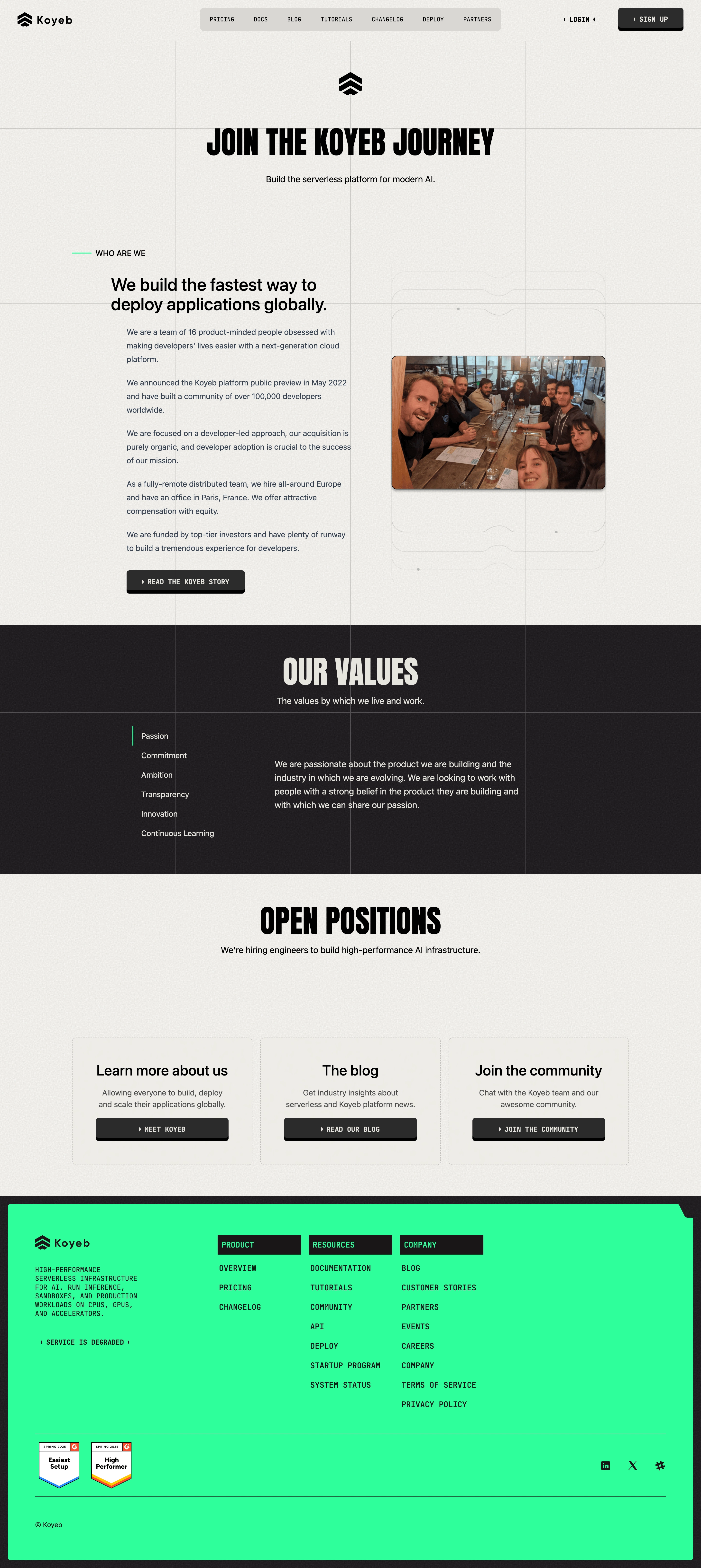
First thing that hits you is the typography. Koyeb goes all-in on a condensed, uppercase display font for headers like "JOIN THE KOYEB JOURNEY" and "OUR VALUES" that feels almost brutalist. Then they pair it with a monospace font for navigation and buttons. It's an unusual combo that gives the whole page a developer-tool identity without trying too hard.
Restrained palette, sharp structure
The color story is dead simple. Black, white, and that bright green accent in the footer and value indicators. No gradients, no illustrations cluttering things up. Just a single team photo breaking the monotony. The dotted grid background adds subtle texture without competing for attention.
Clear content hierarchy
The page flows naturally: mission statement, company info, values, open positions, then three CTA cards at the bottom. Each section gets breathing room with generous whitespace. The values section uses a left-border highlight on "Passion" to show active state, which is a clean interaction pattern. Those green-outlined buttons in the footer cards pop hard against the light background. The whole thing feels intentionally stripped back, like it was designed by engineers who actually care about craft.