
Thank you! Your submission has been received!
Oops! Something went wrong while submitting the form.
Get SaaSFrame Pro
Monthly
$18
Quarterly
$48
Yearly
$180
Upgrade to access this feature
Browse all screens & flows
Filter and search screens & flows
Access Figma files
Access mobile versions
Bookmark screens & flows
Join now
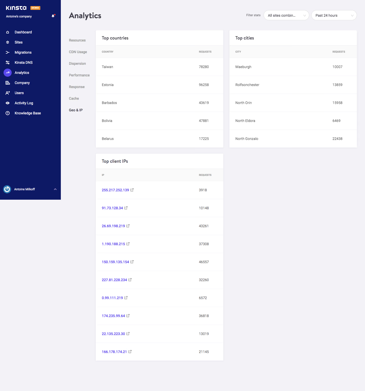
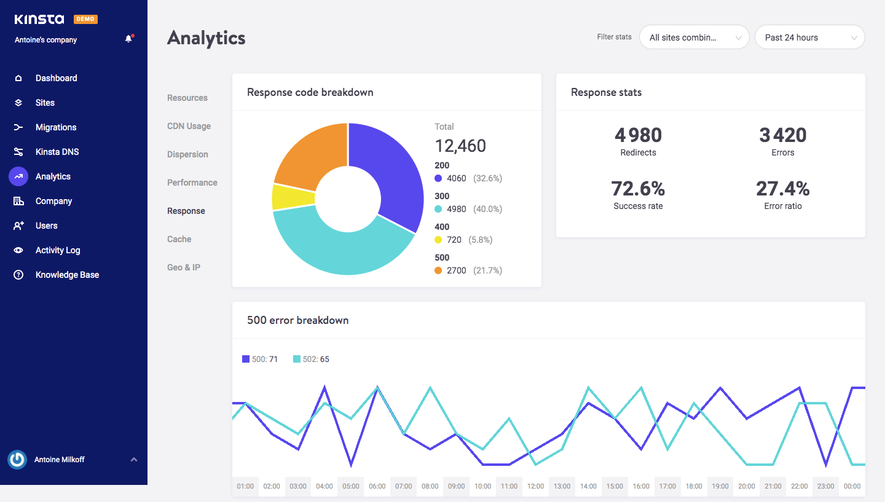
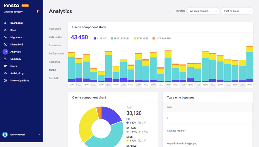
Kinsta Analytics

Kinsta
WordPress Hosting Tool
Designed by
No items found.

Bookmark
Bookmark

Design with AI
Thank you! Your submission has been received!
Oops! Something went wrong while submitting the form.
# Design from Reference: Kinsta Analytics
Create an original, high-fidelity visual design inspired by the reference. Prioritize composition, typography, colors, spacing, and component styling over technical implementation.
## Reference
- **Product:** Kinsta
- **Category:** Analytics
- **Screenshot:** https://cdn.prod.website-files.com/5e9dc792e1210c5325f7ebbc/6acbc682edc235600abc90f3_6acbc0bf7ce271b12870d81f_cms-88e2b71034c8a0d6e08f1b06.webp
Analyze the screenshot first. If inaccessible, request it rather than guessing.
## Content
{{content.instructions}}
{{content.data}}
Preserve essential messaging and factual accuracy. Adapt structure and copy length for visual balance; never invent product claims.
## Visual Design
### Overall aesthetic
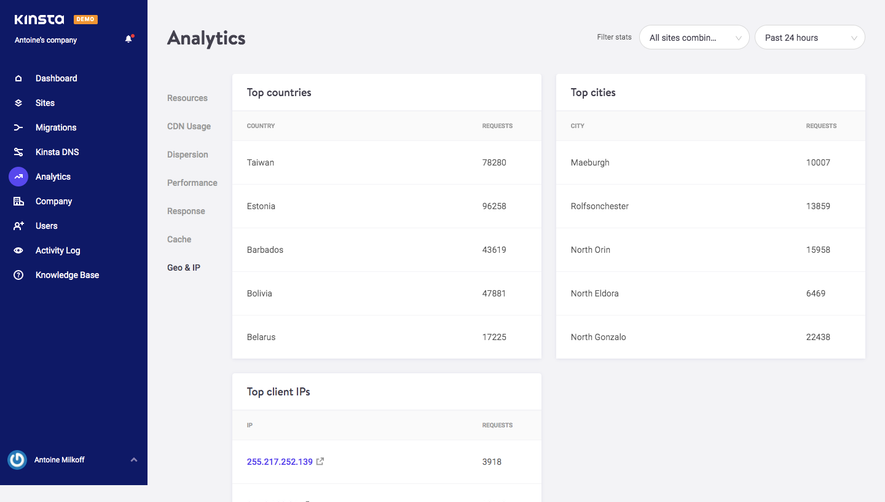
- **Character:** A spacious hosting analytics dashboard with a dark navy navigation rail and light, table-oriented workspace.
- **Density:** The design favors large row heights and generous blank space over compact data density; purple accents identify the selected navigation item and linked values.
### Page composition
- **Image dimensions:** The source is 1440 × 1545 pixels. Measurements below are observed image pixels; a 1× CSS scale is plausible but unverified.
- **Primary shell:** A roughly 240-pixel navy rail sits at left. The workspace begins with an Analytics heading and two right-aligned filter pills.
- **Content grid:** A narrow secondary navigation column precedes two equal cards, each about 504 pixels wide, separated by roughly 24 pixels. A third card sits beneath the left card; the lower-right area remains empty.
- **Full capture:** The sidebar ends around the initial viewport height while the analytics content continues downward on the pale page surface.
### Information hierarchy
- **Navigation:** Brand, demo badge and company identity lead the primary rail; Analytics is marked by a purple circular icon background. Geo & IP is emphasized in the secondary navigation.
- **Data grouping:** Top countries and Top cities appear side by side, each with five data rows. Top client IPs follows below with ten rows.
- **Scan order:** Bold card titles lead into subdued uppercase table headers; labels align left and request counts form a consistent right-side column.
### Typography
- **Family:** A compact sans serif is used throughout; the precise font is unverified.
- **Headings:** The page title is approximately 32 pixels and bold. Card titles are around 18 pixels, semibold, with roughly 24-pixel line height.
- **Tables:** Data text is around 14 pixels with a 20-pixel line height. Uppercase column headings are approximately 10 pixels, bold and gray.
- **Navigation:** Primary navigation is around 14 pixels and semibold; secondary categories are similarly sized with muted inactive labels.
### Colors & surfaces
- **Measured palette:** ICC-aware sRGB sampling identifies #0E1966 for the navy rail, #F3F3F6 for the workspace, #FFFFFF for cards and #FAFAFA for light table-header areas.
- **Accent roles:** Purple marks linked IP values and the active circular navigation icon; the demo badge is orange. These small accents contrast with the otherwise subdued palette.
- **Separation:** Very light horizontal rules divide rows. Card corners are only slightly rounded, around 4 pixels, with faint shadows rather than heavy outlines.
### Components
- **Filter controls:** Two white pill-shaped selectors, each roughly 180 × 40 image pixels, have thin gray borders, left-aligned labels and small downward chevrons.
- **Top cards:** Approximately 60-pixel title bars sit above 48-pixel table headers and spacious rows near 71 pixels high.
- **IP table:** The taller card repeats the same construction. Purple address links include tiny external-link symbols, while request counts align in a separate right column; individual addresses need not be reproduced.
- **Rail utilities:** Icon-and-label rows repeat vertically; a user identity block with avatar and chevron anchors the bottom of the dark rail.
### Visual rhythm
- **Grid spacing:** About 24 pixels separates adjacent cards and stacked cards; table interiors use approximately 24-pixel horizontal padding.
- **Row cadence:** Repeated large row heights and hairline rules create a calm, easily scanned rhythm.
- **Whitespace:** The empty lower-right region preserves the two-column grid rather than stretching the final table across the workspace.
### Responsive
- **Recommendation:** Collapse the primary rail into a drawer at narrow widths and convert secondary categories into a compact selector or horizontal navigation.
- **Recommendation:** Stack the analytics cards in reading order, retain label/count alignment, and allow the filter controls to wrap above them. No mobile state is shown.
### Adaptation guidance
- **Preserve:** Keep the navy navigation contrast, pale workspace, restrained card edges and repeated two-column table geometry.
- **Scale:** Use a flexible equal-width card grid with a minimum readable card width; maintain approximately 24-pixel gaps and table padding.
- **Data treatment:** Provide clear selected navigation states, accessible link names and tabular numeric alignment. The pictured values are captured demo content, not current analytics.
Use this context to reproduce the reference's visual language: layout, typography, colors, spacing, borders, radii, and distinctive elements. The screenshot takes priority if descriptions conflict.
## Direction
{{preferences.fidelityInstructions}}
## Output
{{output.instructions}}
Deliver a polished, cohesive design with precise alignment, hierarchy, and spacing. Produce the requested visual artifact, not just a description. If unsupported, explain the limitation.


Category
Patterns
No items found.
Tech Stack

Added on
February 4, 2023
Found in 1 flow

Similar screens






Upgrade to SaaSFrame Pro now to see similar examples.
Monthly
$18 /month
Billed $18 monthly
Browse all screens & flows
Filter and search screens & flows
Search text in screenshots
Access Figma files
Access mobile versions
Join now
Quarterly
$16 /month
Billed $48 quarterly
Browse all screens & flows
Filter and search screens & flows
Search text in screenshots
Access Figma files
Access mobile versions
Join now
Yearly
$15 /month
Billed $180 yearly
Browse all screens & flows
Filter and search screens & flows
Search text in screenshots
Access Figma files
Access mobile versions
Join now