Design with AI
Generate a new design based on this screen using your own content.
# Design from Reference: June Product Hunt Emails
Create an original, high-fidelity visual design inspired by the reference. Prioritize composition, typography, colors, spacing, and component styling over technical implementation.
## Reference
- **Product:** June
- **Category:** Product Hunt Emails
- **Screenshot:** https://cdn.prod.website-files.com/5e9dc792e1210c5325f7ebbc/6acb6adcbf2e69a0c03b6a54_6acb6a1855968e6fef8860ea_cms-fe7d6dd31959db1fea478dfa.webp
Analyze the screenshot first. If inaccessible, request it rather than guessing.
## Content
{{content.instructions}}
{{content.data}}
Preserve essential messaging and factual accuracy. Adapt structure and copy length for visual balance; never invent product claims.
## Visual Design
### Overall aesthetic
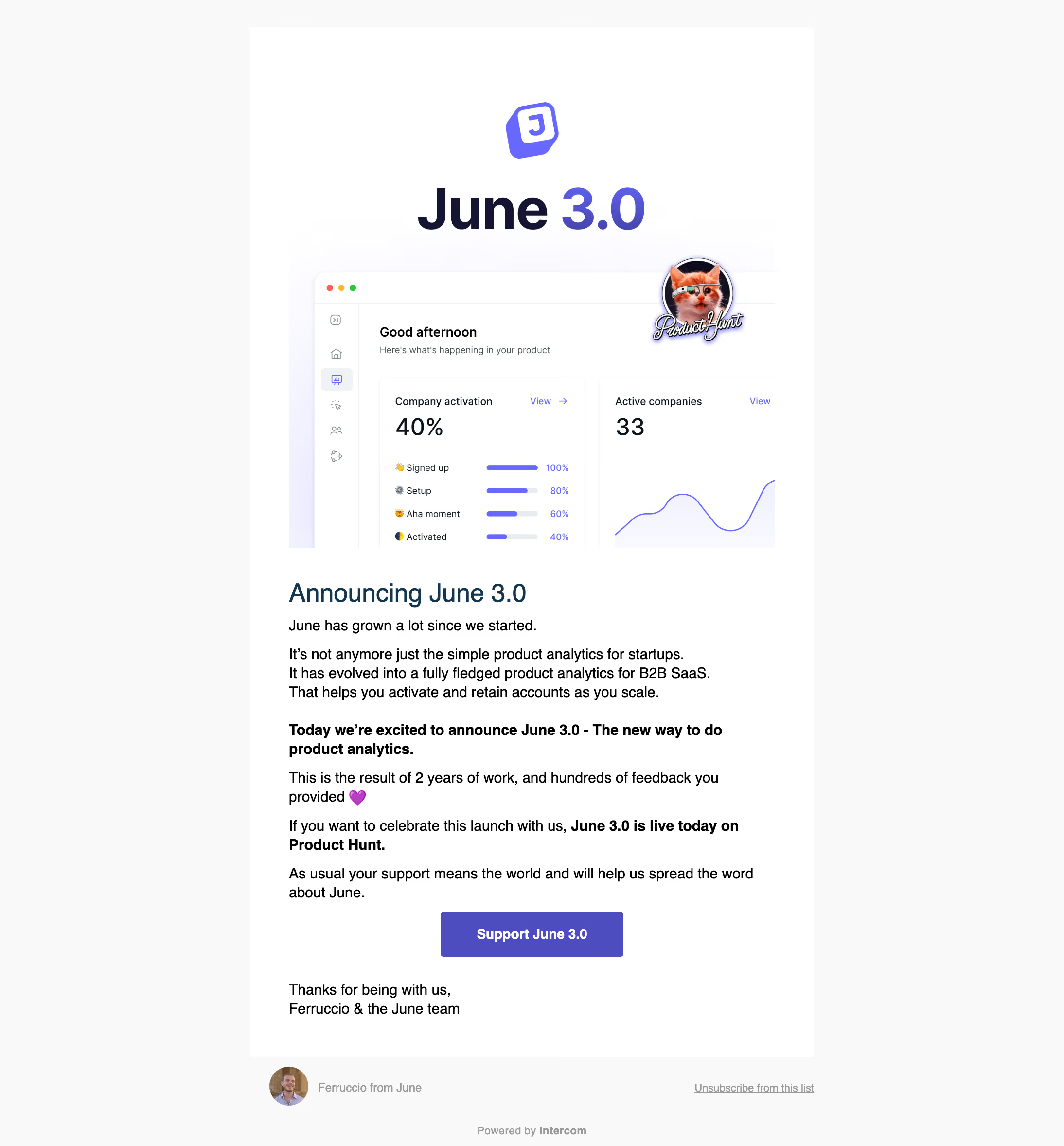
- **Style:** A product-launch email combines a large branded hero image, simple black text and a single purple support action.
- **Character:** Friendly and direct, with dashboard imagery, launch badge artwork and occasional bold emphasis.
### Page composition
- **Capture:** The original is 2188 × 2356 pixels. Sizes below refer to the 1400-pixel-wide inspection rendition, not verified CSS dimensions.
- **Email column:** A white column around 742 inspection pixels wide is centered on a light-gray outer background.
- **Hero:** A tall image combines a tilted brand symbol, oversized version title, cropped analytics dashboard and overlapping launch-platform badge.
- **Message:** Below the image, a left-aligned heading and several short paragraphs lead to a centered purple button and two-line signoff.
- **Footer:** Outside the white panel, a small sender portrait/name sits left, unsubscribe link right and service attribution centered beneath.
### Information hierarchy
- **Hero branding:** Large version typography and dashboard image establish the launch.
- **Message heading:** A dark blue announcement heading introduces regular black paragraphs.
- **Emphasis:** Bold passages identify the launch announcement and support request without introducing extra components.
- **Action:** One centered filled button provides the main action; the signoff and administrative footer remain secondary.
### Typography
- **Family:** A neutral sans serif is used for the email text; exact identity is unverified.
- **Heading:** Approximately 34 inspection pixels, medium weight, dark blue.
- **Body:** About 20 pixels with 25–27-pixel line height; bold spans are visibly heavier at the same size.
- **Button:** Approximately 18 pixels, bold, white and centered.
- **Footer:** Around 14 pixels, muted gray; the unsubscribe link is underlined.
### Colors & surfaces
- **Measured base:** Outer background #F9F9F9 and email white #FFFFFF dominate.
- **Text:** Black #000000 appears in body copy.
- **Action:** Sampled purple #4D4DBF supplies the filled CTA.
- **Hero accents:** Violet brand elements, pale lavender glows and dark navy version text appear in the artwork; exact gradient stops are unverified.
- **Depth:** The email panel is flat; subtle shadows and rounded app-window details belong to the embedded hero image.
### Components
- **Hero image:** Approximately 640 pixels wide in the inspection rendition, with cropped dashboard cards, violet chart marks and a circular illustrated launch badge overlapping its upper-right area.
- **CTA:** Approximately 240 × 60 inspection pixels with a small 4-pixel radius and generous horizontal label padding.
- **Paragraphs:** Unboxed text blocks share a left edge, with bold sentences and a small heart emoji adding emphasis.
- **Sender footer:** A small circular portrait precedes the sender name; administrative links remain text-only.
### Visual rhythm
- **Spacing:** Hero and heading have a clear gap; paragraphs use roughly 15–25-pixel separation.
- **Alignment:** Most content aligns left, while hero branding, main button and service attribution are centered.
- **Density:** The large visual opening gives way to compact prose and a quieter footer.
### Responsive
- **Evidence:** One email capture is observed; mobile rendering is unverified.
- **Recommended column:** Use a fluid email container with reduced side padding, natural paragraph wrapping and a responsive hero image.
- **Recommended action:** Maintain a comfortable button target and avoid shrinking its text to match the unusually large source image.
- **Footer recommendation:** Permit sender and unsubscribe areas to stack on narrow screens.
### Adaptation guidance
- **Preserve:** Keep the prominent launch artwork, concise prose, selective bold emphasis and single purple action.
- **Scale:** Establish intended email CSS width before translating inspection dimensions.
- **Assets:** Use supplied brand and product artwork rather than reconstructing unobserved dashboard details.
- **Scope:** Describe the launch presentation only; the screenshot does not establish current product claims or the action's destination behavior.
Use this context to reproduce the reference's visual language: layout, typography, colors, spacing, borders, radii, and distinctive elements. The screenshot takes priority if descriptions conflict.
## Direction
{{preferences.fidelityInstructions}}
## Output
{{output.instructions}}
Deliver a polished, cohesive design with precise alignment, hierarchy, and spacing. Produce the requested visual artifact, not just a description. If unsupported, explain the limitation.