Design with AI
Generate a new design based on this screen using your own content.
# Design from Reference: June Create Element
Create an original, high-fidelity visual design inspired by the reference. Prioritize composition, typography, colors, spacing, and component styling over technical implementation.
## Reference
- **Product:** June
- **Category:** Add & Edit
- **Screenshot:** https://cdn.prod.website-files.com/5e9dc792e1210c5325f7ebbc/6acbbd063b6b24eada548828_6acbbc2ead8ac5752784f2a8_cms-2da35374196f5e737da026dd.webp
Analyze the screenshot first. If inaccessible, request it rather than guessing.
## Content
{{content.instructions}}
{{content.data}}
Preserve essential messaging and factual accuracy. Adapt structure and copy length for visual balance; never invent product claims.
## Visual Design
### Overall aesthetic
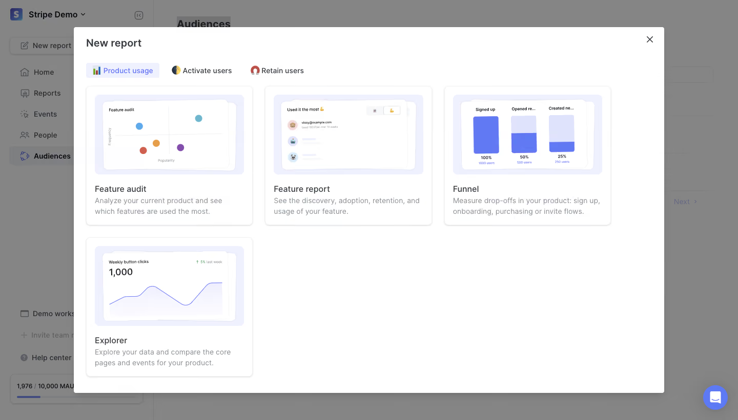
- **Character:** A report-template picker presented as a large white modal over a dimmed analytics dashboard.
- **Evidence scale:** Original 1440 × 821 pixels. Dimensions are image-pixel estimates; CSS scale is unverified.
### Page composition
- **Overlay:** Gray scrim covers the underlying dashboard, whose workspace/sidebar, Audiences page and chat control remain visible.
- **Modal:** Approximately 1152 × 714 px white rectangle begins around x144, y53.
- **Header:** New report title left and small close icon right.
- **Tabs:** Three icon-led category tabs sit below; Product usage is selected.
- **Grid:** Four report cards occupy a three-column arrangement: three across the first row and Explorer alone at lower left.
### Information hierarchy
- **Task:** The title identifies report creation; categories narrow the report purpose.
- **Selection emphasis:** Selected tab uses a pale lavender fill and blue text.
- **Card anatomy:** Large schematic preview, medium-weight report name and short gray description.
- **Report types:** Scatter plot, ranked people list, three-stage funnel and line-chart explorer are visually differentiated.
### Typography
- **Modal heading:** Unverified sans-serif, approximately 20 px semibold, 28 px line height.
- **Tabs:** Around 14 px medium.
- **Card titles:** Approximately 16 px medium; descriptions around 14 px regular with 20 px line height.
- **Preview labels:** Tiny text belongs to the embedded illustrations, not the primary reading hierarchy.
### Colors & surfaces
- **Foreground:** White #FFFFFF modal/cards.
- **Scrim:** Sampled #858585 gray is composited overlay appearance, not confirmed underlying background.
- **Preview/selection:** Pale #F0F1FE.
- **Accent:** Blue #617AF4 appears in chart/selection family.
- **Structure:** Fine pale-gray card borders and soft gray shadows; dark gray headings and muted blue-gray body copy.
### Components
- **Modal shell:** Small approximately 4 px radius and subtle shadow.
- **Template cards:** Approximately 326 × 272 px, 8 px radii, thin borders and soft lower shadows.
- **Preview regions:** Approximately 292 × 156 px pale-lavender rounded containers with inset white mini-panels.
- **Charts:** Colored scatter dots, small user avatars, blue funnel bars and a smooth blue line with faint area fill.
- **Close:** Small unboxed cross at upper right.
- **Background:** Left navigation and bottom usage meter are dimmed; circular blue support control remains visible outside the modal.
### Visual rhythm
- **Grid gaps:** Approximately 24 px between cards horizontally and vertically.
- **Insets:** Modal uses roughly 24 px outer content padding; cards use about 16 px text padding.
- **Whitespace:** Two empty lower grid positions keep the picker sparse.
- **Alignment:** Preview bounds and title baselines align consistently across the first row.
### Responsive
- **Observed limit:** Desktop modal only; mobile picker layout is unverified.
- **Recommendation:** Collapse the grid and let the modal scroll within viewport gutters.
- **Interaction recommendation:** Keep title/close reachable and expose category/template selection through keyboard focus and accessible labels.
### Adaptation guidance
- **Retain:** Use representative visual previews to distinguish report templates before users commit.
- **Implement:** Keep tab emphasis light and card anatomy consistent.
- **Verify:** Confirm fonts, scale and actual template-selection behavior separately; no report was created.
Use this context to reproduce the reference's visual language: layout, typography, colors, spacing, borders, radii, and distinctive elements. The screenshot takes priority if descriptions conflict.
## Direction
{{preferences.fidelityInstructions}}
## Output
{{output.instructions}}
Deliver a polished, cohesive design with precise alignment, hierarchy, and spacing. Produce the requested visual artifact, not just a description. If unsupported, explain the limitation.