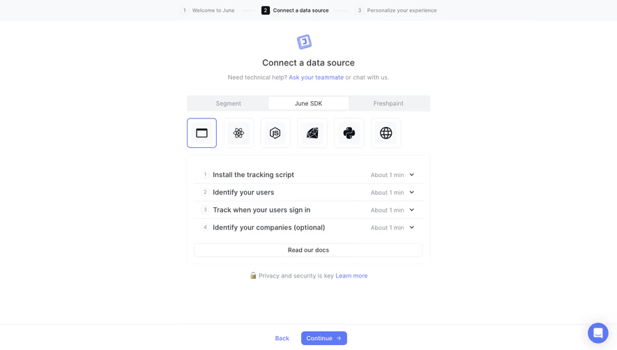
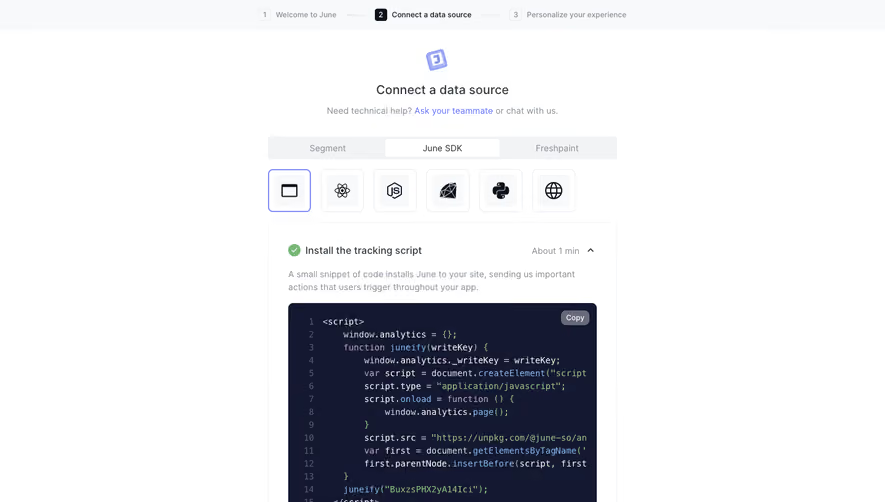
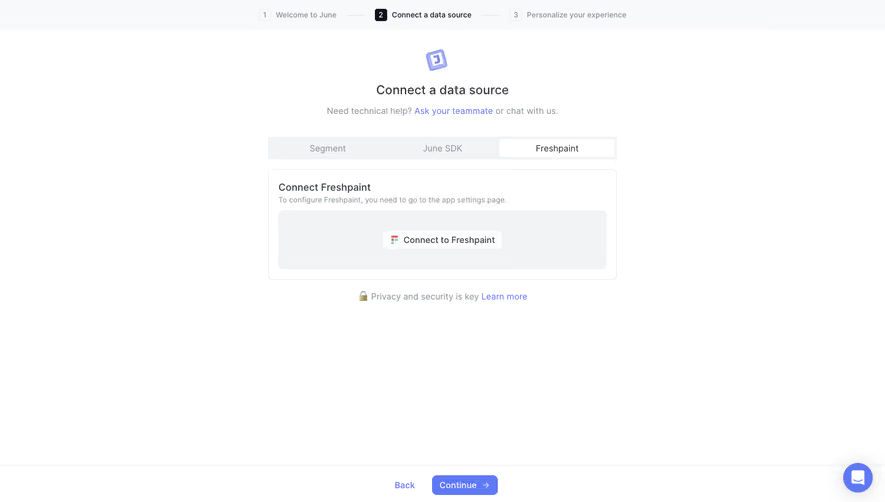
Design with AI
Generate a new design based on this screen using your own content.
# Design from Reference: June Account Setup
Create an original, high-fidelity visual design inspired by the reference. Prioritize composition, typography, colors, spacing, and component styling over technical implementation.
## Reference
- **Product:** June
- **Category:** Account Setup
- **Screenshot:** https://cdn.prod.website-files.com/5e9dc792e1210c5325f7ebbc/6acbbc796325e7e23e4c974e_6acbbbcca4008ddb7475eba4_cms-f2e4bab7adb6552c6ce59b6c.webp
Analyze the screenshot first. If inaccessible, request it rather than guessing.
## Content
{{content.instructions}}
{{content.data}}
Preserve essential messaging and factual accuracy. Adapt structure and copy length for visual balance; never invent product claims.
## Visual Design
### Overall aesthetic
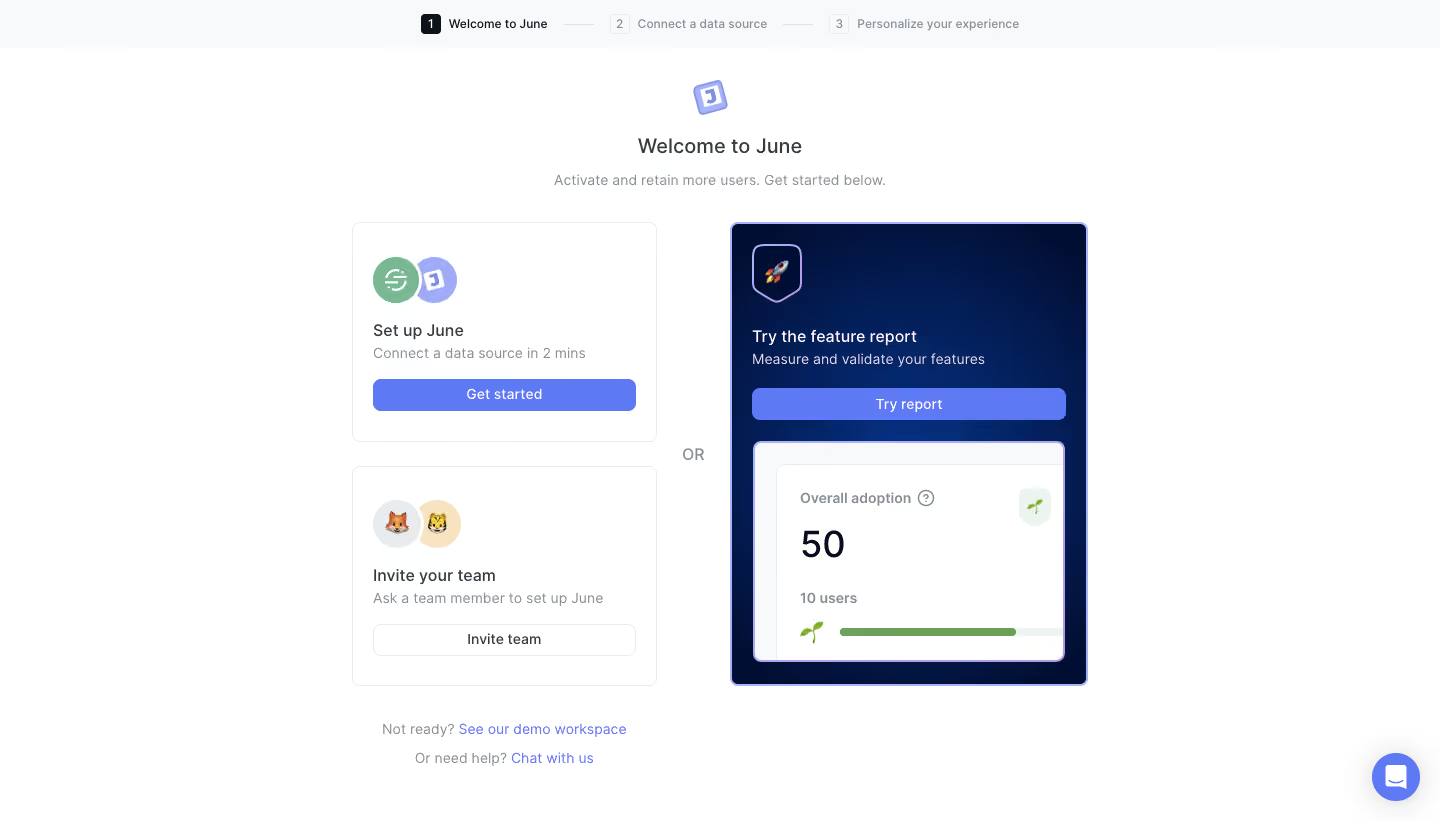
- **Style:** Airy analytics onboarding with compact white option cards, periwinkle actions and a contrasting navy report-preview card.
- **Capture scale:** Source 1440 × 821px. Measurements below refer to screenshot pixels; CSS/device scale is unverified.
### Page composition
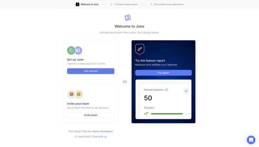
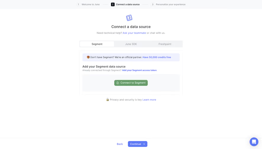
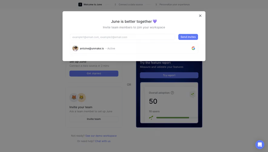
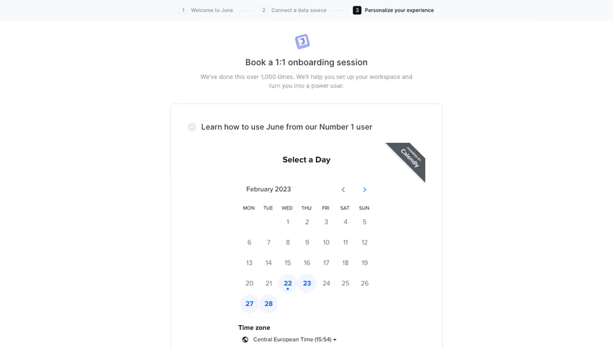
- **Progress:** A pale top strip contains three linked stages: Welcome to June, Connect a data source and Personalize your experience, with the first active.
- **Introduction:** A small tilted June mark, Welcome to June heading and muted one-line subtitle are centered above the choices.
- **Choices:** Two roughly 305px-wide white cards stack at left; an approximately 356 × 462px navy report card occupies the right. OR sits in the gap between the routes.
- **Support:** Demo-workspace and chat links sit beneath the left column, with a circular chat widget at the lower-right viewport edge.
### Information hierarchy
- **Setup route:** Set up June offers data-source connection and a blue Get started action.
- **Delegation route:** Invite your team offers a secondary outlined Invite team action.
- **Exploration route:** Try the feature report uses a dark visual container, blue Try report button and a large adoption-report preview.
- **Secondary help:** Two centered helper lines offer a demo workspace and direct chat.
### Typography
- **Family:** Neutral sans-serif with slightly open spacing; exact font identity is unverified.
- **Roles:** Estimated welcome title 20px medium, option headings 16px medium, descriptions/buttons 14px and step labels 12px.
- **Preview:** The large example value is around 36px, with smaller muted report labels.
### Colors & surfaces
- **Sampled palette:** ICC-aware sRGB samples include white #FFFFFF, pale #F8F9FA, periwinkle #5E79F4, navy #010E33, border #E9ECEF and lavender #A9B3F7.
- **Accent roles:** Periwinkle fills primary buttons and links; green appears in the source icon and adoption illustration.
- **Contrast:** The report card reverses to white/light text on navy, with a lavender border around its inner white preview.
### Components
- **White cards:** Approximately 305 × 220px each, with 8px corners, thin pale borders and around 20px padding.
- **Illustration badges:** Overlapping circles introduce setup and team cards; the team option uses small animal-avatar emoji.
- **Buttons:** Full inner-width controls around 32px high, with 7px corners. Get started/Try report are filled; Invite team is outlined.
- **Report preview:** White inset panel includes Overall adoption, large numeric value, a small user count, green progress bar and sprout motif.
- **Progress steps:** Numbered squares and thin connecting rules differentiate the dark active stage from muted future stages.
### Visual rhythm
- **Alignment:** Left cards share width and padding; the report card spans their combined height. Buttons align with their card content edges.
- **Whitespace:** Broad page margins and clear vertical gaps keep three alternative paths easy to compare.
- **Emphasis:** The large navy card supplies the strongest visual weight without removing the left setup action's prominence.
### Responsive
- **Recommended adaptation:** Only desktop is observed. Stack the setup, team and report routes on narrow screens, retaining the distinction between configuration and exploration.
- **Progress:** Shorten or wrap step labels while preserving their sequence; prevent the chat widget from covering support links.
### Adaptation guidance
- **Preserve:** Keep direct setup, team delegation and product exploration as clearly separated choices.
- **Adapt:** Use actual data-source timing, report preview and onboarding stages. Treat preview numbers as illustrative content rather than product-performance claims.
Use this context to reproduce the reference's visual language: layout, typography, colors, spacing, borders, radii, and distinctive elements. The screenshot takes priority if descriptions conflict.
## Direction
{{preferences.fidelityInstructions}}
## Output
{{output.instructions}}
Deliver a polished, cohesive design with precise alignment, hierarchy, and spacing. Produce the requested visual artifact, not just a description. If unsupported, explain the limitation.