Overall Style and Aesthetic
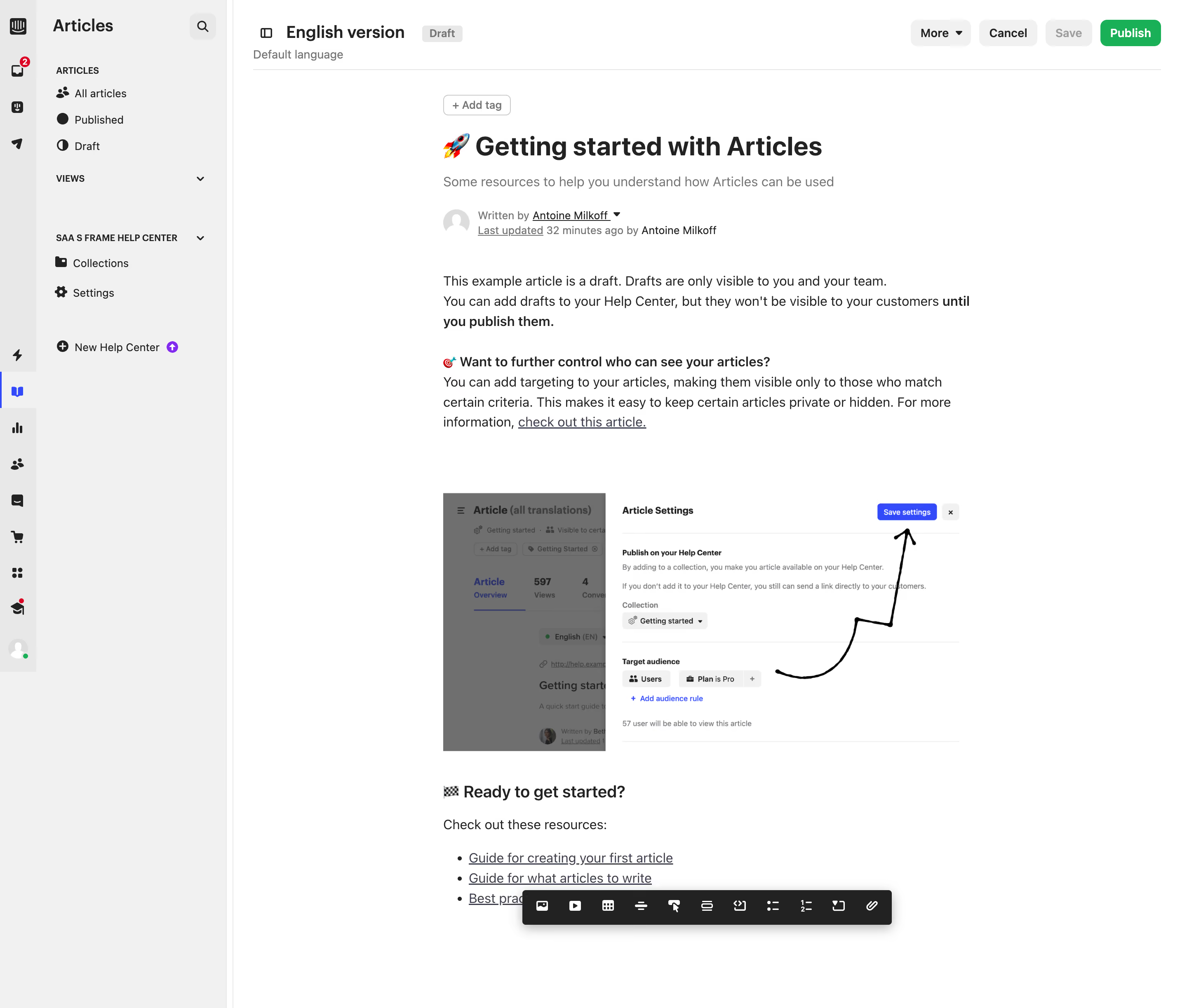
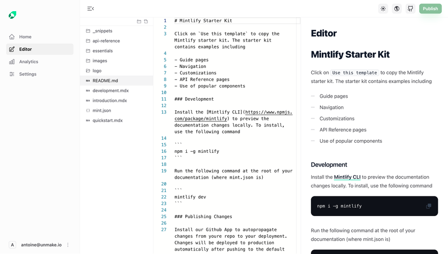
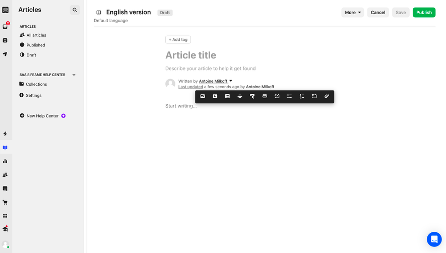
Intercom’s article editing page embraces a clean, understated modernism—its interface is streamlined and professional, favoring function over flourish. The aesthetic leans minimalist, with ample white space that fosters focus and reduces cognitive load. Carefully chosen accent colors, like Intercom’s signature blue, instill a sense of trust and clarity, while subtle contrasts guide attention without overwhelming the senses. Layout and Structure
The layout is intentionally structured for productivity. A persistent sidebar groups navigation and essential actions to the left, leaving the content canvas unobstructed in the center. Key operations—such as editing, formatting, and publishing—float at the top or to the side, ensuring they’re always within reach. Supporting modals and toggles appear contextually, preserving workspace flexibility and flow. Visual Elements
Iconography is sharp, lightweight, and expressive—aiding quick comprehension with minimal visual noise. Micro-animations (like status indicators and dropdowns) inject subtle energy that reassures users their actions are registered. There’s a purposeful lack of distraction from illustrations or photography, keeping users immersed in content creation. Color Palette and Typography
The palette pivots around cool, calming tones—crisp whites, soft grays, and blues—that keep the interface approachable and readable. Typography is pragmatic and accessible, leveraging clean sans-serif fonts for high legibility and clear hierarchy, with deliberate use of bold and size variation to guide the eye. User Experience Patterns & Notable Choices
Navigation is frictionless with persistent, well-placed CTAs and a clearly demarcated path for actions like save, preview, and publish. Intercom’s “always-on” feedback—autosave ticks, real-time validation—elevates confidence and minimizes user anxiety. Unique to this page is the balance between editorial freedom and operational efficiency; everything is optimized for uninterrupted writing, reflecting Intercom’s innovative yet quietly supportive tone.