Design with AI
Generate a new design based on this screen using your own content.
# Design from Reference: Intercom Account Setup
Create an original, high-fidelity visual design inspired by the reference. Prioritize composition, typography, colors, spacing, and component styling over technical implementation.
## Reference
- **Product:** Intercom
- **Category:** Account Setup
- **Screenshot:** https://cdn.prod.website-files.com/5e9dc792e1210c5325f7ebbc/6acad621fef6904ce0090d70_6acad5a61d50254551a12da7_cms-39e738fc0cf3d74a82214274.webp
Analyze the screenshot first. If inaccessible, request it rather than guessing.
## Content
{{content.instructions}}
{{content.data}}
Preserve essential messaging and factual accuracy. Adapt structure and copy length for visual balance; never invent product claims.
## Visual Design
### Overall aesthetic
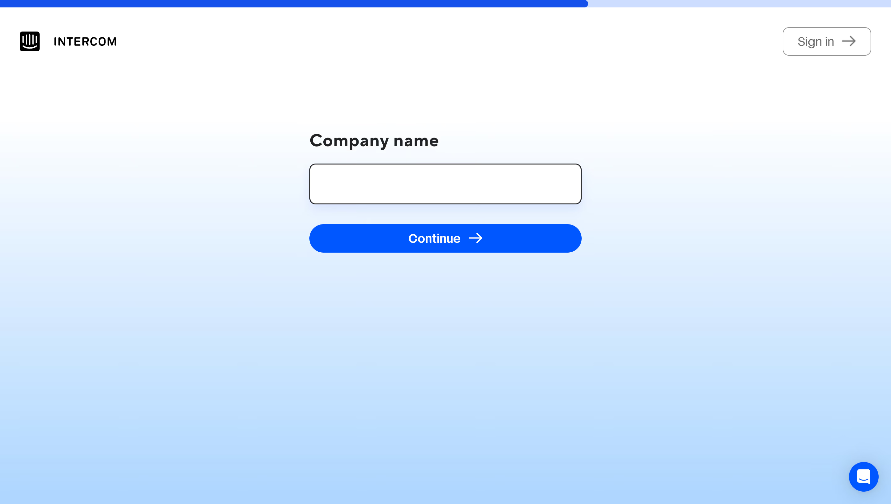
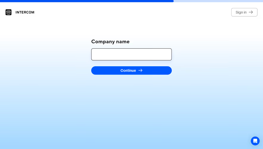
- **Style:** Highly focused signup step with a white-to-sky-blue background and a single company-name input.
- **Character:** Large empty space, black brand elements, strong electric-blue progression action, and minimal surrounding explanation.
- **Surface treatment:** Form elements float directly on the gradient; no enclosing card is visible.
### Page composition
- **Capture and scale:** 2880 × 1630 image px. Estimated CSS dimensions assume a 2× capture, approximately 1440 × 815 CSS px; scale is unverified.
- **Top progress:** Thin full-width pale-blue track with a solid blue portion covering about two-thirds of the width.
- **Header:** Black product logo and wordmark at upper left; outlined Sign in control with right arrow at upper right.
- **Form:** Centered horizontally, approximately 440px wide, positioned in the upper-middle portion of the page.
- **Field group:** Company name label, empty outlined input, and full-width blue Continue pill in a vertical stack.
- **Support:** Small blue chat circle at the lower-right corner.
### Information hierarchy
- **Task label:** Company name is the dominant text near the form and directly identifies the required entry.
- **Primary action:** Saturated blue Continue button is the strongest filled element.
- **Secondary route:** Sign in remains in the header with a thin outline.
- **Progress cue:** Top bar gives visual step context without a visible numeric label; exact step count is unverified.
### Typography
- **Family:** Neutral sans serif with rounded forms; exact family is unverified.
- **Field label:** Approximately 28px bold with 34px line-height and slightly open tracking.
- **Primary action:** Approximately 20px semibold, centered alongside a right arrow.
- **Sign-in label:** Approximately 20px regular.
- **Brand wordmark:** Small black uppercase lettering, approximately 18px.
- **Precision:** CSS sizes, weights, and tracking are pixel-based estimates under the unverified 2× assumption.
### Colors & surfaces
- **Top canvas and field:** Sampled #FFFFFF.
- **Primary blue:** Sampled #0059FF on the progression action and related emphasis.
- **Gradient tones:** Sampled #A3D7FF, #AFDCFF, #B6DFFF, #C7E7FF, and #D9EEFF across the pale-blue lower canvas.
- **Dark roles:** Near-black logo, field label, and input outline contrast with the bright background.
- **Secondary outline:** Gray border and label distinguish Sign in without competing with Continue.
- **Sampling:** Blue shades reflect the rendered gradient, not proof of discrete CSS stops; available profile handling precedes sampling.
### Components
- **Progress track:** Approximately 12px high at the top; filled blue segment has a rounded trailing end.
- **Input:** Approximately 440 × 66px, white fill, dark 1–2px outline, 9–10px radius, and a subtle shadow.
- **Continue button:** Approximately 440 × 47px, blue fill, white centered label, right-arrow icon, and pill radius.
- **Sign-in control:** Approximately 142 × 46px, white/transparent appearance, thin gray border, rounded corners, and arrow.
- **Chat launcher:** Approximately 48px blue circle containing a white chat icon with a small soft shadow.
- **State:** Input is empty; validation, typing, loading, and subsequent steps are not shown.
### Visual rhythm
- **Form alignment:** Label, input, and primary button share the same left/right edges.
- **Vertical gaps:** Roughly 20–24px separates label and field; about 32px separates field and Continue.
- **Whitespace:** Large blank lower area reinforces the single-task focus.
- **Peripheral balance:** Brand and sign-in controls occupy opposite upper corners; support occupies the lower-right corner.
### Responsive
- **Observed state:** Desktop only; mobile behavior is unverified.
- **Form recommendation:** Use a 440px maximum width with 20–24px side gutters.
- **Header recommendation:** Keep brand and sign-in visible without crowding the form on short screens.
- **Input recommendation:** Preserve a comfortable control height and place validation text below the field if needed.
- **Support recommendation:** Keep the floating launcher clear of the main action and virtual keyboard.
### Adaptation guidance
- **Preserve:** One visible field, a strong blue primary action, restrained header, and soft blue atmospheric background.
- **Starting dimensions:** Approximately 440px form width, 66px field height, 47px button height, and 28px label under the unverified 2× scale.
- **Progress modeling:** Connect the bar to actual onboarding progress rather than copying its visual proportion as a fixed value.
- **Interaction recommendation:** Provide an associated label, deliberate validation, keyboard submission, and visible focus.
- **Content fidelity:** Add only supplied onboarding requirements; the still image does not establish business rules or completion behavior.
Use this context to reproduce the reference's visual language: layout, typography, colors, spacing, borders, radii, and distinctive elements. The screenshot takes priority if descriptions conflict.
## Direction
{{preferences.fidelityInstructions}}
## Output
{{output.instructions}}
Deliver a polished, cohesive design with precise alignment, hierarchy, and spacing. Produce the requested visual artifact, not just a description. If unsupported, explain the limitation.