
Thank you! Your submission has been received!
Oops! Something went wrong while submitting the form.
Get SaaSFrame Pro
Monthly
$18
Quarterly
$48
Yearly
$180
Upgrade to access this feature
Browse all screens & flows
Filter and search screens & flows
Access Figma files
Access mobile versions
Bookmark screens & flows
Join now
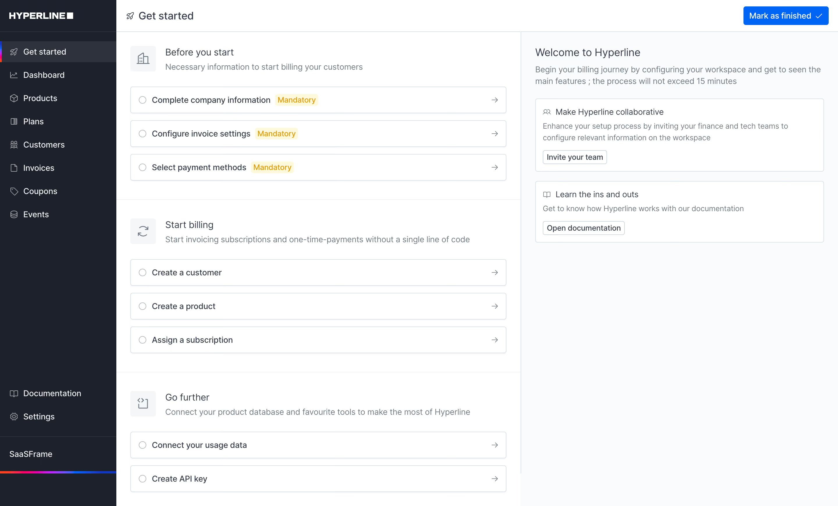
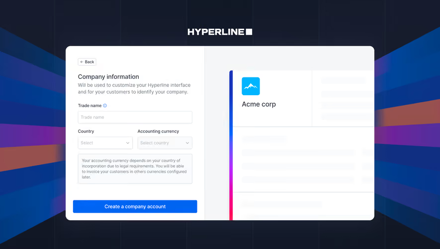
Hyperline Welcome Screen

Hyperline
Billing & subscriptions for B2B SaaS
Designed by
No items found.

Bookmark
Bookmark

Design with AI
Thank you! Your submission has been received!
Oops! Something went wrong while submitting the form.
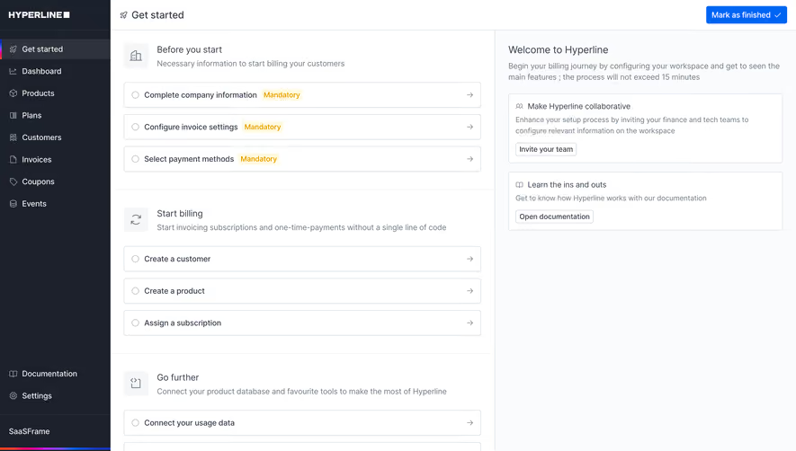
# Design from Reference: Hyperline Welcome Screen
Create an original, high-fidelity visual design inspired by the reference. Prioritize composition, typography, colors, spacing, and component styling over technical implementation.
## Reference
- **Product:** Hyperline
- **Category:** Welcome Screen
- **Screenshot:** https://cdn.prod.website-files.com/5e9dc792e1210c5325f7ebbc/6acbcc4ee13ab9df8f0532dd_6acbcafaeb51262691a54b78_cms-5540501dbc574c55ce065afb.webp
Analyze the screenshot first. If inaccessible, request it rather than guessing.
## Content
{{content.instructions}}
{{content.data}}
Preserve essential messaging and factual accuracy. Adapt structure and copy length for visual balance; never invent product claims.
## Visual Design
### Overall aesthetic
- **Character:** A restrained billing-product onboarding dashboard combines a dark navigation rail with a pale, structured checklist workspace.
- **Capture scale:** The screenshot measures 2881 × 1742 image pixels. An approximately 1440 × 871 CSS viewport at 2× density is estimated, not verified.
- **Visual language:** Thin gray borders, small line icons, compact typography and a single blue completion action emphasize operational clarity.
### Page composition
- **Navigation rail:** An approximately 200px CSS-wide dark sidebar contains the brand, selected Get started item, seven main navigation destinations and lower documentation/settings links.
- **Workspace header:** A roughly 54px-high white top bar holds a small rocket icon and page title at left, with a blue completion button at far right.
- **Checklist column:** The central region is approximately 695px wide and divided into Before you start, Start billing and Go further sections.
- **Support column:** A pale right region roughly 545px wide begins with a welcome heading and explanatory paragraph, followed by two bordered assistance cards.
- **Account area:** The bottom sidebar shows a workspace name and a narrow multicolor stripe above the remaining dark area.
### Information hierarchy
- **Task grouping:** Each checklist section starts with a pale icon square, title and muted description, followed by bordered task rows.
- **Mandatory steps:** The first three rows carry small amber Mandatory badges; later billing and integration rows have no such badges.
- **Progress affordances:** Empty circular indicators appear at the left of each task, with right-pointing arrows aligned at the opposite edge.
- **Supporting guidance:** Team invitation and documentation cards have quiet outlined actions; the top-right completion button has the strongest fill.
### Typography
- **Family:** A neutral interface sans-serif is visible; exact font identity is unverified.
- **Page title:** Approximately 20px CSS, medium weight, with 24px line-height.
- **Section and welcome titles:** Approximately 16–18px regular-to-medium weight, with 22–26px line-height.
- **Rows and descriptions:** Approximately 14px, with descriptions around 20px line-height; checklist labels are darker than supporting copy.
- **Navigation and badges:** Navigation is approximately 14px; small amber badges use compact text around 13px.
### Colors & surfaces
- **Sidebar:** Sampled #1C212C, #1B202C and #1C212D establish the dark navy-gray navigation surface.
- **Selected navigation:** Sampled #2D323C is a lighter dark-row treatment; a narrow multicolor marker reinforces selection.
- **Main surface:** Sampled #FFFFFF fills the checklist and cards; #FAFBFC supports the pale right-side region.
- **Borders:** Sampled #DBE1E8 supplies the thin cool-gray panel and row outlines.
- **Accents:** Bright blue highlights the completion button; amber text on a pale yellow badge identifies mandatory steps. These accent colors are visually observed without asserting exact tokens.
### Components
- **Checklist rows:** Approximately 646px wide and 45px high, with 1px borders, 4px radii, small circular status markers and roughly 14px horizontal padding.
- **Section icons:** Approximately 44px square pale tiles hold fine gray line icons for company setup, billing and integration.
- **Support cards:** White rectangles use thin gray borders, approximately 4px radii and 12–16px padding, with title/icon, muted description and compact outlined button.
- **Completion button:** Approximately 146 × 32px, blue with white text and a trailing checkmark; corners are lightly rounded.
- **Sidebar items:** Compact icon-and-label rows are around 40px high, with bottom utility links separated from the main navigation by flexible space.
### Visual rhythm
- **Checklist spacing:** Around 12px separates task rows; section headers and their rows have roughly 24px spacing.
- **Region divisions:** Thin horizontal rules divide checklist groups, and a vertical border separates the guidance column.
- **Content padding:** The central column uses approximately 24px horizontal inset; the right column follows the same padding scale.
- **Open space:** The guidance column remains mostly empty below its two cards, keeping attention on the checklist.
### Responsive
- **Evidence limit:** Only the desktop layout is visible; mobile navigation, task completion and expanded states are unverified.
- **Column recommendation:** Move guidance below the checklist when the combined workspace becomes too narrow.
- **Navigation recommendation:** Collapse the sidebar into a drawer or compact rail, preserving the selected state and workspace access.
- **Task recommendation:** Allow long task labels and mandatory badges to wrap while maintaining the status indicator, arrow and comfortable touch height.
### Adaptation guidance
- **Checklist system:** Model sections and task rows consistently, with explicit status and requirement metadata rather than relying on badge color alone.
- **Hierarchy:** Keep completion blue, supporting actions outlined and navigation subdued; preserve the distinction between setup work and optional guidance.
- **Layout:** Use a fixed desktop rail, flexible main area and separately constrained support column; align padding across header and content.
- **Accessibility:** Provide semantic navigation, visible focus, accessible names for task icons and announced completion states. The screenshot alone does not establish these behaviors.
Use this context to reproduce the reference's visual language: layout, typography, colors, spacing, borders, radii, and distinctive elements. The screenshot takes priority if descriptions conflict.
## Direction
{{preferences.fidelityInstructions}}
## Output
{{output.instructions}}
Deliver a polished, cohesive design with precise alignment, hierarchy, and spacing. Produce the requested visual artifact, not just a description. If unsupported, explain the limitation.


Category
Tech Stack

Added on
November 2, 2023

Similar screens






Upgrade to SaaSFrame Pro now to see similar examples.
Monthly
$18 /month
Billed $18 monthly
Browse all screens & flows
Filter and search screens & flows
Search text in screenshots
Access Figma files
Access mobile versions
Join now
Quarterly
$16 /month
Billed $48 quarterly
Browse all screens & flows
Filter and search screens & flows
Search text in screenshots
Access Figma files
Access mobile versions
Join now
Yearly
$15 /month
Billed $180 yearly
Browse all screens & flows
Filter and search screens & flows
Search text in screenshots
Access Figma files
Access mobile versions
Join now