Design with AI
Generate a new design based on this screen using your own content.
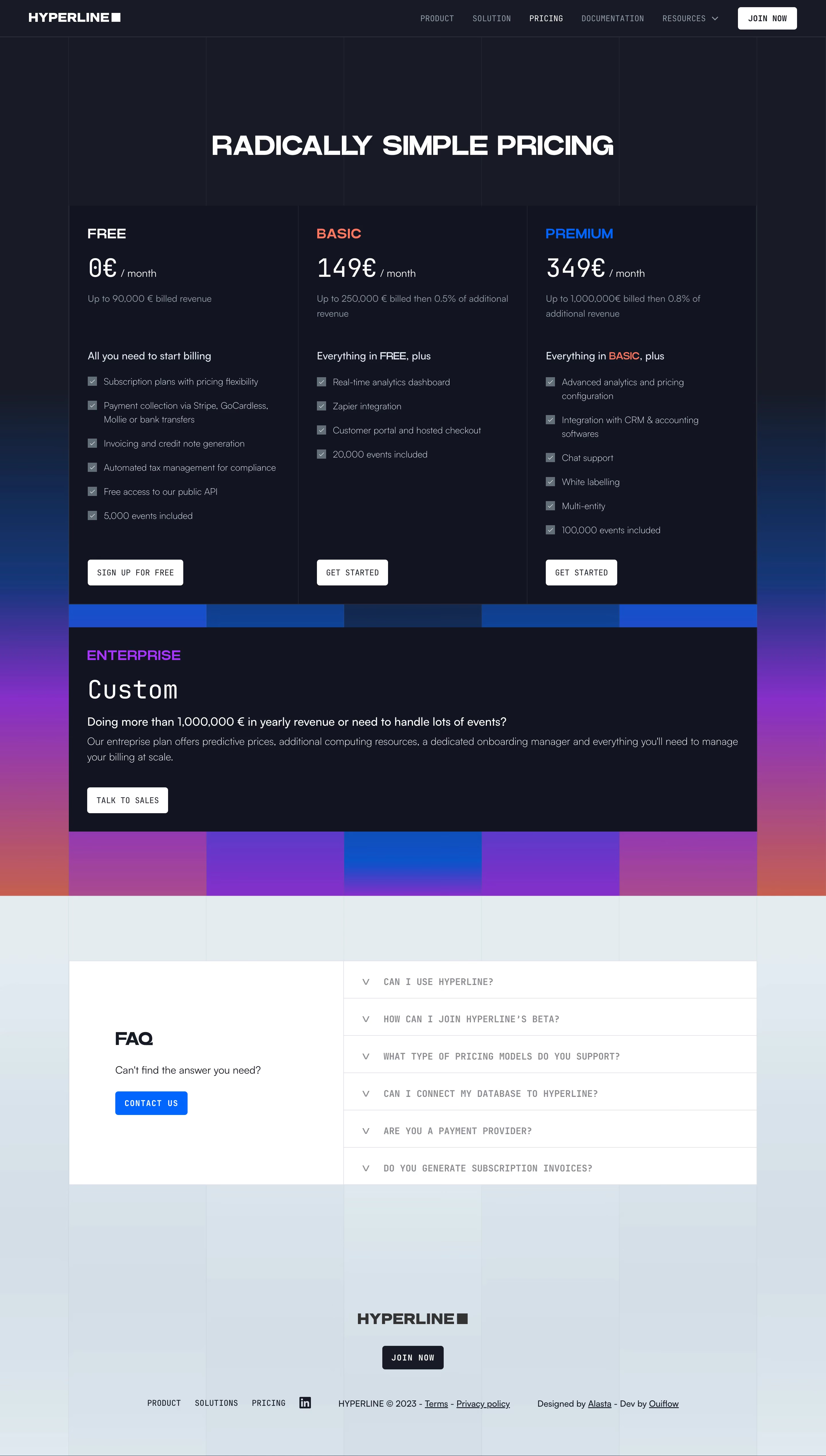
# Design from Reference: Hyperline Pricing Page
Create an original, high-fidelity visual design inspired by the reference. Prioritize composition, typography, colors, spacing, and component styling over technical implementation.
## Reference
- **Product:** Hyperline
- **Category:** Pricing Page
- **Screenshot:** https://cdn.prod.website-files.com/5e9dc792e1210c5325f7ebbc/6acad7e71025e911ae520ead_6acad76fb08637d50f294968_cms-89e3ac34dfab6f65d9da69e9.webp
Analyze the screenshot first. If inaccessible, request it rather than guessing.
## Content
{{content.instructions}}
{{content.data}}
Preserve essential messaging and factual accuracy. Adapt structure and copy length for visual balance; never invent product claims.
## Visual Design
### Overall aesthetic
- **Style:** A dark technical pricing page with a visible column grid, uppercase headings, monospaced utilities, and vivid blue/violet gradient geometry.
- **Character:** Structured and assertive, with square-edged plan panels and a contrasting pale FAQ/footer region.
### Page composition
- **Capture and scale:** 2880 × 5076 screenshot pixels, consistent with estimated 2× capture. Following sizes are estimated CSS pixels.
- **Header/hero:** A dark navigation row precedes a centered pricing headline. Fine vertical rules extend through the opening background.
- **Pricing:** Three equal dark columns present Free, Basic, and Premium, followed by a full-width Enterprise panel. Colored rectangular gradient blocks sit behind/between pricing regions.
- **Lower area:** A pale blue-gray region contains a white split FAQ panel: introduction/contact left and six closed accordion rows right. Centered brand/join action and compact legal/navigation form the footer.
### Information hierarchy
- **Plans:** Uppercase plan names, large numeric prices, revenue qualifiers, inheritance statements, and checkmarked lists establish a clear hierarchy.
- **Enterprise:** The full-width custom plan is secondary to the three-way comparison but visually distinct through purple labeling.
- **Support:** FAQ is a separate light region with a blue contact action.
### Typography
- **Family:** Geometric sans serif display/body plus monospaced utility text; exact families unverified.
- **Display:** Hero around 46–48 px CSS bold uppercase. Plan titles about 24 px; prices approximately 44 px monospace.
- **Body:** Feature descriptions 15–16 px with 24 px line-height. Navigation, buttons, and FAQ questions use uppercase monospace around 13–15 px.
### Colors & surfaces
- **Dark surfaces:** Sampled sRGB #111522 and #161B27 define pricing and surrounding shell.
- **Light region:** Sampled #E1ECF2 and nearby #D3DFE8, #D4E0E9, #D5E1EA, #D2DEE8 form the lower blue-gray field; #FFFFFF defines FAQ/actions.
- **Accents:** Blue, coral, and purple distinguish plan labels and gradient blocks. Exact saturated values are unverified.
- **Text:** White headings and muted cool-gray descriptions maintain hierarchy on dark panels.
### Components
- **Plan panels:** Three square-edged columns share thin boundaries and generous padding. White rectangular actions sit near their bottoms.
- **Feature markers:** Small gray filled squares with white checks align beside multiline feature labels.
- **Enterprise:** A broad dark block uses title, large Custom label, short explanation, and white sales action.
- **FAQ:** Thin rules divide six uppercase question rows with small chevrons. The white introduction panel has a bold heading and compact blue button.
- **Grid:** Fine vertical lines remain visible through dark and light background regions, reinforcing consistent column divisions.
### Visual rhythm
- **Spacing:** Use large 100–150 px opening/section intervals, compact 20–28 px feature spacing, and aligned bottom actions.
- **Contrast:** The dark-to-light transition is a major chapter break; keep internal panels restrained rather than adding more gradients.
### Responsive
- **Observed state:** Desktop only; FAQ answers unseen.
- **Recommended reflow:** Stack plans/Enterprise, move FAQ introduction above rows, and simplify background grid divisions on phones.
### Adaptation guidance
- **Preserve:** Retain square pricing geometry, dark/light contrast, technical typography, and localized gradient blocks.
- **Adapt:** Use verified prices, revenue thresholds, features, and support terms.
- **Avoid:** Do not infer hidden FAQ answers or copy the reference's commercial claims.
Use this context to reproduce the reference's visual language: layout, typography, colors, spacing, borders, radii, and distinctive elements. The screenshot takes priority if descriptions conflict.
## Direction
{{preferences.fidelityInstructions}}
## Output
{{output.instructions}}
Deliver a polished, cohesive design with precise alignment, hierarchy, and spacing. Produce the requested visual artifact, not just a description. If unsupported, explain the limitation.