Generate a new design based on this screen using your own content.
Thank you! Your submission has been received!
Oops! Something went wrong while submitting the form.
# Design from Reference: Hume AI Text to Speech Playground
Create an original, high-fidelity visual design inspired by the reference. Prioritize composition, typography, colors, spacing, and component styling over technical implementation.
## Reference
- **Product:** Hume AI
- **Category:** Playground
- **Screenshot:** https://cdn.prod.website-files.com/5e9dc792e1210c5325f7ebbc/6acc0f7fe540d8db93de595b_6acc0e53abaeae850906fa83_cms-ae06d4ea460941d8a610d84b-v3.webp
Analyze the screenshot first. If inaccessible, request it rather than guessing.
## Content
{{content.instructions}}
{{content.data}}
Preserve essential messaging and factual accuracy. Adapt structure and copy length for visual balance; never invent product claims.
## Visual Design
Use this context to reproduce the reference's visual language: layout, typography, colors, spacing, borders, radii, and distinctive elements. The screenshot takes priority if descriptions conflict.
## Direction
{{preferences.fidelityInstructions}}
## Output
{{output.instructions}}
Deliver a polished, cohesive design with precise alignment, hierarchy, and spacing. Produce the requested visual artifact, not just a description. If unsupported, explain the limitation.
Hume's Text to Speech Playground Nails the Tool-First Layout
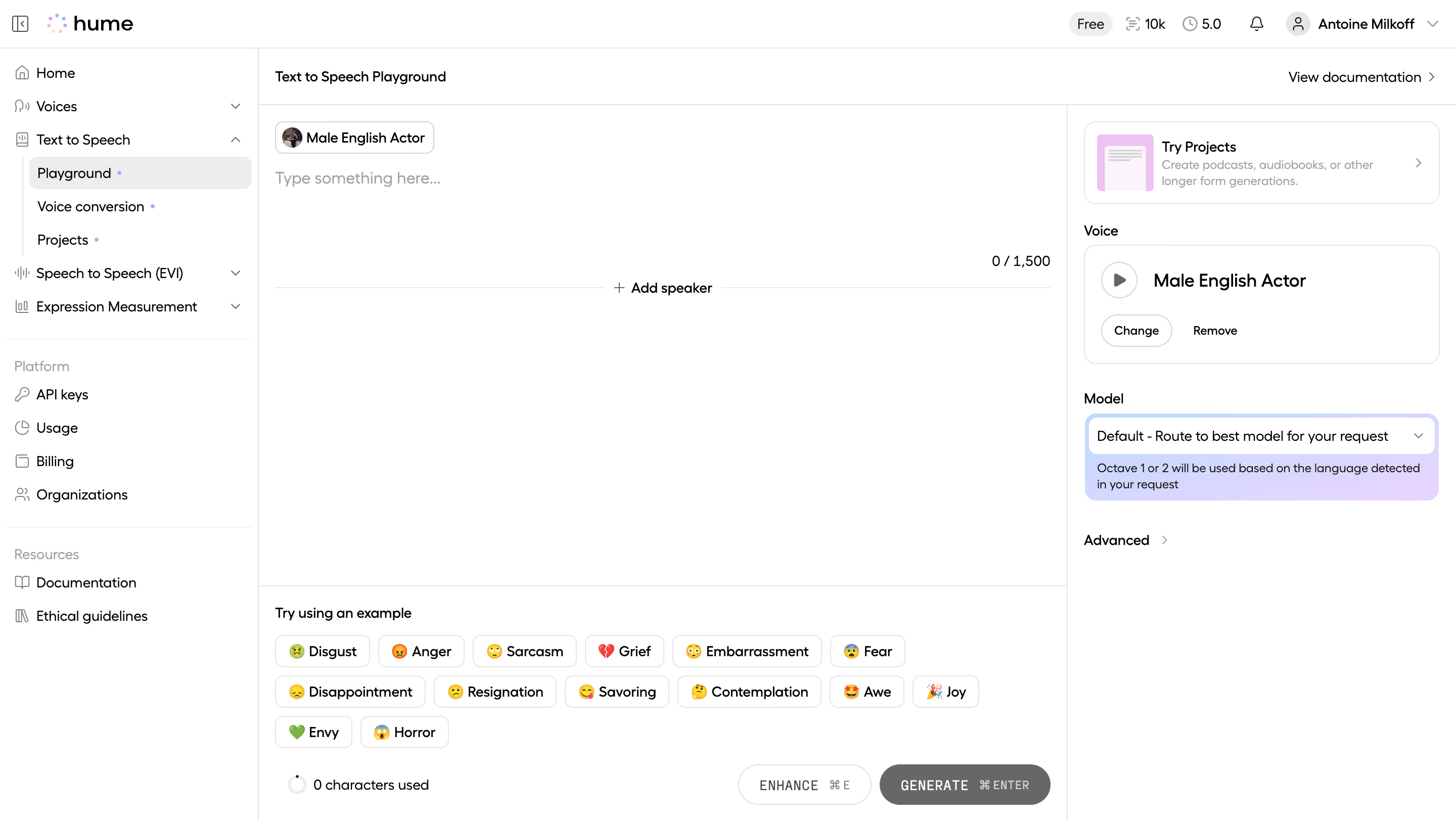
First thing you notice is how clean the workspace feels. The left sidebar keeps navigation tight without competing for attention. Playground, Voice conversion, Projects... everything's tucked away but findable. The main content area is just a big open text field with a speaker chip up top. No clutter. You know exactly what to do.
Emotion Tags Are the Star Here
Those emoji-tagged emotion buttons at the bottom? Disgust, Anger, Sarcasm, Grief. They're doing heavy UX lifting. They lower the barrier to trying the tool and they look fun. The pill-shaped chips with emojis feel playful without being childish. Smart move for an AI product that could easily feel sterile.
Right Panel Keeps Controls Contextual
Voice selection and model settings live on the right side, out of the way but always present. The "Male English Actor" card with a play button is immediately scannable. Typography is simple, likely Inter or something similarly neutral. The purple highlight on the model dropdown adds just enough color to break the monochrome palette. The whole page whispers "just start typing."